A code template
“The simple graph has brought more information to the data analyst’s mind than any other device.”
— John Tukey
Let’s begin with a question to explore.
mpg
You can test your hypothesis with the mpg dataset that comes in the ggplot2 package. mpg contains observations collected on 38 models of cars by the US Environmental Protection Agency.
To see the mpg data frame, type mpg in the code block below and click “Run Code”.
mpgGood job! We’ll use interactive code chunks like this throughout these tutorials. Whenever you encounter one, you can click Run Code to run (or re-run) the code in the chunk. If there is a Solution tab, you can click it to see the answer.
Among the variables in mpg are:
displ, a car’s engine size, in liters.hwy, a car’s fuel efficiency on the highway, in miles per gallon (mpg). A car with a low mpg consumes more fuel than a car with a high mpg when they travel the same distance.
Now let’s use this data to make our first graph.
A plot
The code below uses functions from the ggplot2 package to plot the relationship between displ and hwy.
To see the plot, click “Run Code.”
Can you spot the relationship?
And the answer is…
The plot shows a negative relationship between engine size (displ) and fuel efficiency (hwy). Points that have a large value of displ have a small value of hwy and vice versa.
In other words, cars with big engines use more fuel. If that was your hypothesis, you were right!
Now let’s look at how we made the plot.
ggplot()
Here’s the code that we used to make the plot. Notice that it contains three functions: ggplot(), geom_point(), and aes().
ggplot(data = mpg) +
  geom_point(mapping = aes(x = displ, y = hwy))
In R, a function is a name followed by a set of parentheses. Many functions require special information to do their jobs, and you write this information between the parentheses.
ggplot
The first function, ggplot(), creates a coordinate system that you can add layers to. The first argument of ggplot() is the dataset to use in the graph.
By itself, ggplot(data = mpg) creates an empty graph, which looks like this.
ggplot(data = mpg)
geom_point()
geom_point() adds a layer of points to the empty plot created by ggplot(). This gives us a scatterplot.
ggplot(data = mpg) +
  geom_point(mapping = aes(x = displ, y = hwy))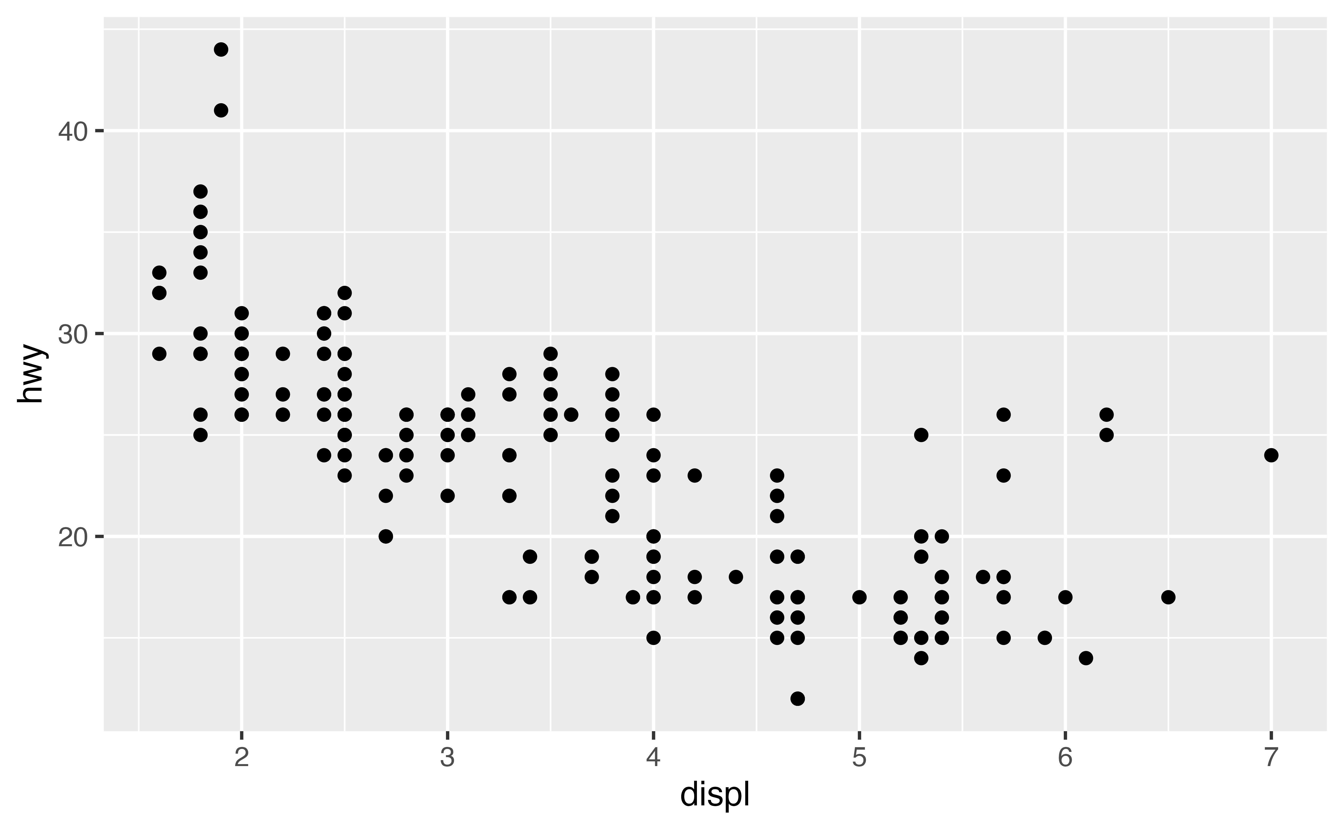
mapping = aes()
geom_point() takes a mapping argument that defines which variables in your dataset are mapped to which axes in your graph. The mapping argument is always paired with the function aes(), which you use to gather together all of the mappings that you want to create.
Here, we want to map the displ variable to the x axis and the hwy variable to the y axis, so we add x = displ and y = hwy inside of aes() (and we separate them with a comma).
Where will ggplot2 look for these mapped variables? In the data frame that we passed to the data argument, in this case, mpg.
A graphing workflow
Our code follows the common workflow for making graphs with ggplot2. To make a graph, you:
- Start the graph with
ggplot() - Add elements to the graph with a
geom_function - Select variables with the
mapping = aes()argument
A graphing template
In fact, you can turn our code into a reusable template for making graphs. To make a graph, replace the bracketed sections in the code below with a data set, a geom_ function, or a collection of mappings.
Give it a try! Replace the bracketed sections with mpg, geom_boxplot, and x = class, y = hwy to make a slightly different graph. Be sure to delete the # symbols before you run the code.
ggplot(data = mpg) +
  geom_boxplot(mapping = aes(x = class, y = hwy))
Good job! This plot uses boxplots to compare the fuel efficiencies of different types of cars. ggplot2 comes with many geom functions that each add a different type of layer to a plot. You’ll learn more about boxplots and other geoms in the tutorials that follow.
Common problems
As you start to run R code, you’re likely to run into problems. Don’t worry—it happens to everyone. I have been writing R code for years, and every day I still write code that doesn’t work!
Start by carefully comparing the code that you’re running to the code in the examples. R is extremely picky, and a misplaced character can make all the difference. Make sure that every ( is matched with a ) and every " is paired with another ". Also pay attention to capitalization; R is case sensitive.
+ location
One common problem when creating ggplot2 graphics is to put the + in the wrong place: it has to come at the end of a line, not the start. In other words, make sure you haven’t accidentally written code like this:
ggplot(data = mpg)
+ geom_point(mapping = aes(x = displ, y = hwy))
Help
If you’re still stuck, try the help. You can get help about any R function by running ?function_name in a code chunk, e.g. ?geom_point. Don’t worry if the help doesn’t seem that helpful — instead skip down to the bottom of the help page and look for a code example that matches what you’re trying to do.
If that doesn’t help, carefully read the error message that appears when you run your (non-working) code. Sometimes the answer will be buried there! But when you’re new to R, you might not yet know how to understand the error message. Another great tool is Google: try googling the error message, as it’s likely someone else has had the same problem, and has gotten help online.
Exercise 1
Run ggplot(data = mpg). What do you see?
Good job! A ggplot that has no layers looks blank. To finish the graph, add a geom function.
Exercise 2
Make a scatterplot of cty vs hwy.
Hint: Scatterplots are also called points plots and bubble plots. They use the point geom.
ggplot(data = mpg) +
  geom_point(mapping = aes(x = cty, y = hwy))
Excellent work!
Exercise 3
What happens if you make a scatterplot of class vs drv. Try it. Why is the plot not useful?
ggplot(data = mpg) +
  geom_point(mapping = aes(x = class, y = drv))
Nice job! class and drv are both categorical variables. As a result, points can only appear at certain values, where many points overlap each other. You have no idea how many points fall on top of each other at each location. Experiment with geom_count() to find a better solution.