Variation
What is variation?
Variation is the tendency of the values of a variable to change from measurement to measurement. You can see variation easily in real life; if you measure any continuous variable twice—and precisely enough—you will get two different results. This is true even if you measure quantities that are constant, like the speed of light. Each of your measurements will include a small amount of error that varies from measurement to measurement. Categorical variables can also vary if you measure across different objects (e.g. the eye colors of different people), or different times (e.g. the energy levels of an electron at different moments).
Every variable has its own pattern of variation, which can reveal useful information. The best way to understand that pattern is to visualize the distribution of the variable’s values. How you visualize the distribution of a variable will depend on whether the variable is categorical or continuous.
Categorical variables
A variable is categorical if it can take only one of a small set of values. In R, categorical variables are usually saved as factors or character vectors. You can visualize the distribution of a categorical variable with a bar chart, like the one below.
Don’t worry if you cannot make or interpret a bar chart. We’ll survey several types of charts in this tutorial, as we create a strategy for EDA. You’ll learn how to build each type of chart in the tutorials that follow.
Continuous variables
A variable is continuous if it can take any of an infinite set of smooth, ordered values. Here, smooth means that if you order the values on a line, an infinite number of values would exist between any two points on the line. For example, an infinite number of values exists between 0 and 1, e.g. 0.9, 0.99, 0.999, and so on.
Numbers and date-times are two examples of continuous variables. You can visualize the distribution of a continuous variable with a histogram, like the one below:

Frequencies
In both bar charts and histograms, tall bars show the common values of a variable, i.e. the values that appear frequently. Shorter bars show less-common values, i.e. values that appear infrequently. Places that do not have bars reveal values that were not seen in your data. To turn this information into useful questions, look for anything unexpected:
Which values are the most common? Why?
Which values are rare? Why? Does that match your expectations?
Can you see any unusual patterns? What might explain them?
Are there any outliers, which are points that don’t fit the pattern or fall far away from the rest of the data? Are they the result of data entry errors or something else?
Many of the questions above will prompt you to explore a relationship between variables, to see if the values of one variable can explain the values of another variable. We’ll get to that shortly.
Review 4: Frequencies
The bar chart below visualizes the distribution of the class variable in the mpg data set, which comes in the {ggplot2} package. The height of the bars reveal how many cars in the data set come from each class.
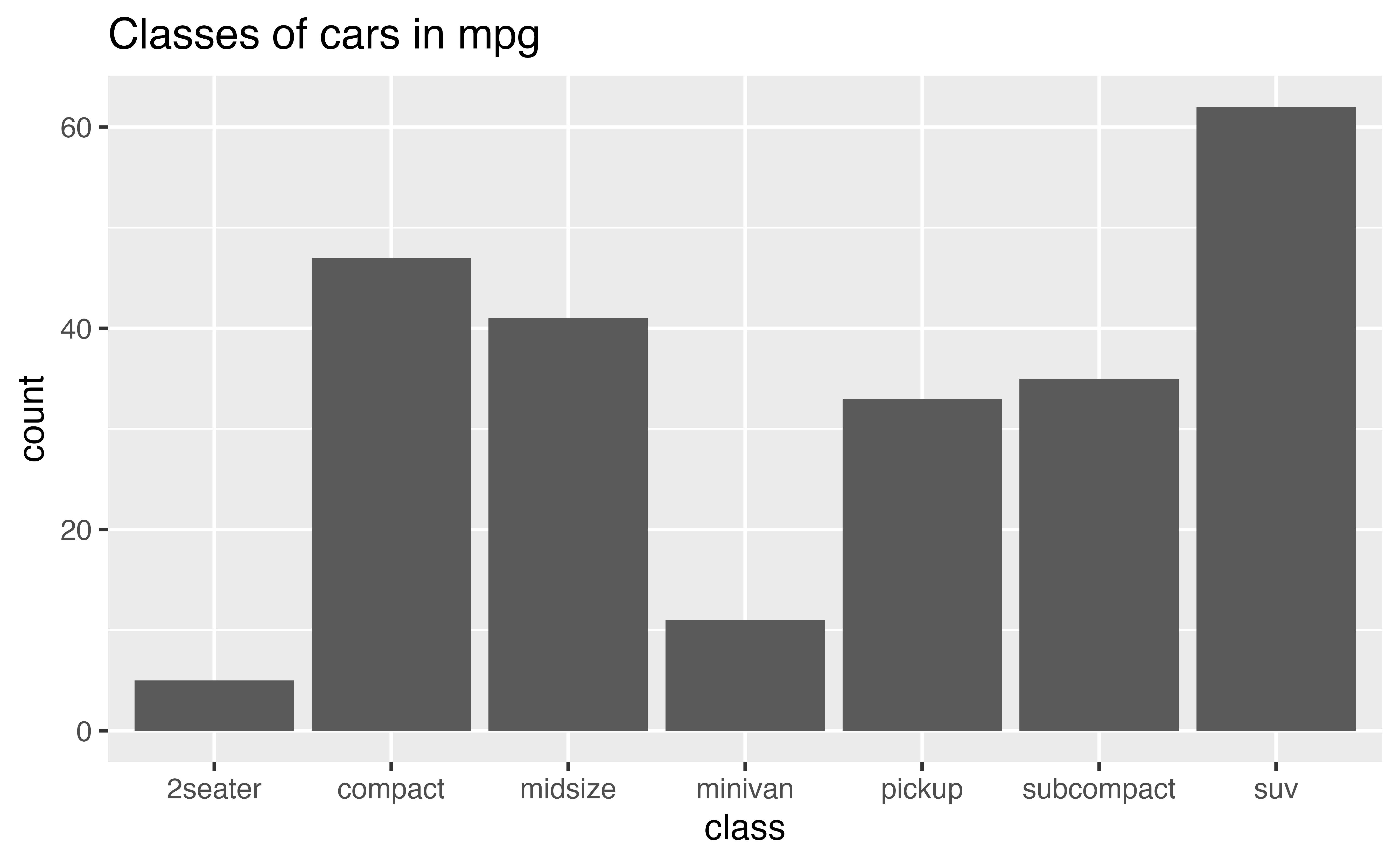
Does the distribution of cars in the mpg dataset seem to reflect the distribution of cars that you see on the road? Would your answer shape how you use this data?
Clusters
For continuous variables, clusters of similar values suggest that subgroups exist in your data. To understand the subgroups, ask:
How are the observations within each cluster similar to each other?
How are the observations in separate clusters different from each other?
How can you explain or describe the clusters?
Why might the appearance of clusters be misleading?
Review 5: Clusters
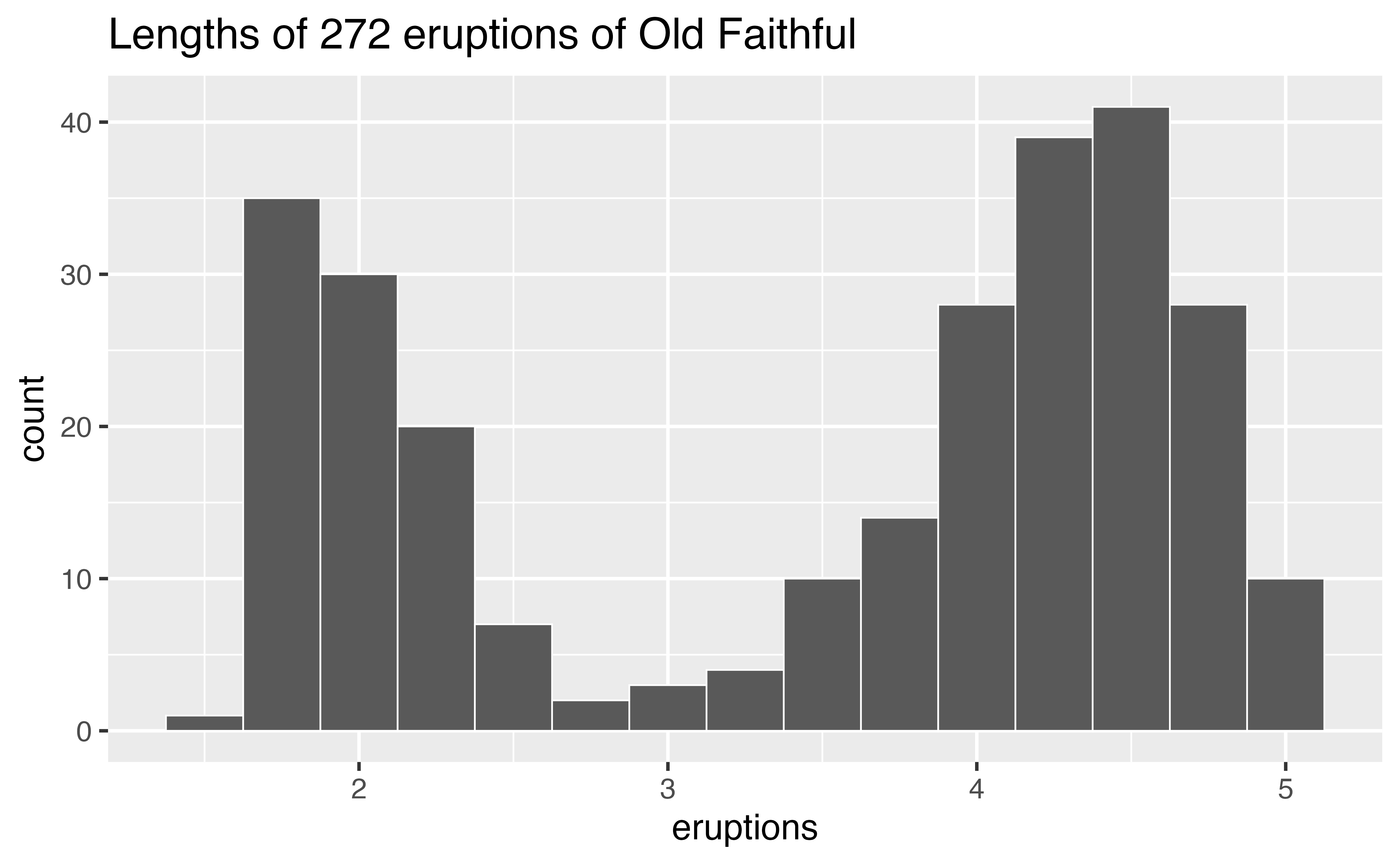
The histogram below shows the distribution of the eruptions variable in the faithful data set, which comes with R. eruptions shows the lengths (in minutes) of 272 eruptions of the Old Faithful geyser in Yellowstone National Park.
To interpret the histogram, look first at the x axis, which displays the lengths of eruptions recorded in the data. The range of the x axis shows that the shortest eruptions lasted for about one minute and the longest for about five minutes.
To see how many eruptions lasted for a specific length of time, find the length of time on the x axis and then look at the height of the bar above the length of time. For example, according to the histogram, 30 eruptions lasted for about two minutes, but only three lasted for about three minutes (the height of the bar above two is 30, the height of the bar above three is three).