Boxplots
Introduction
Watch this video:
Exercise 1 - Boxplots
How to make a boxplot
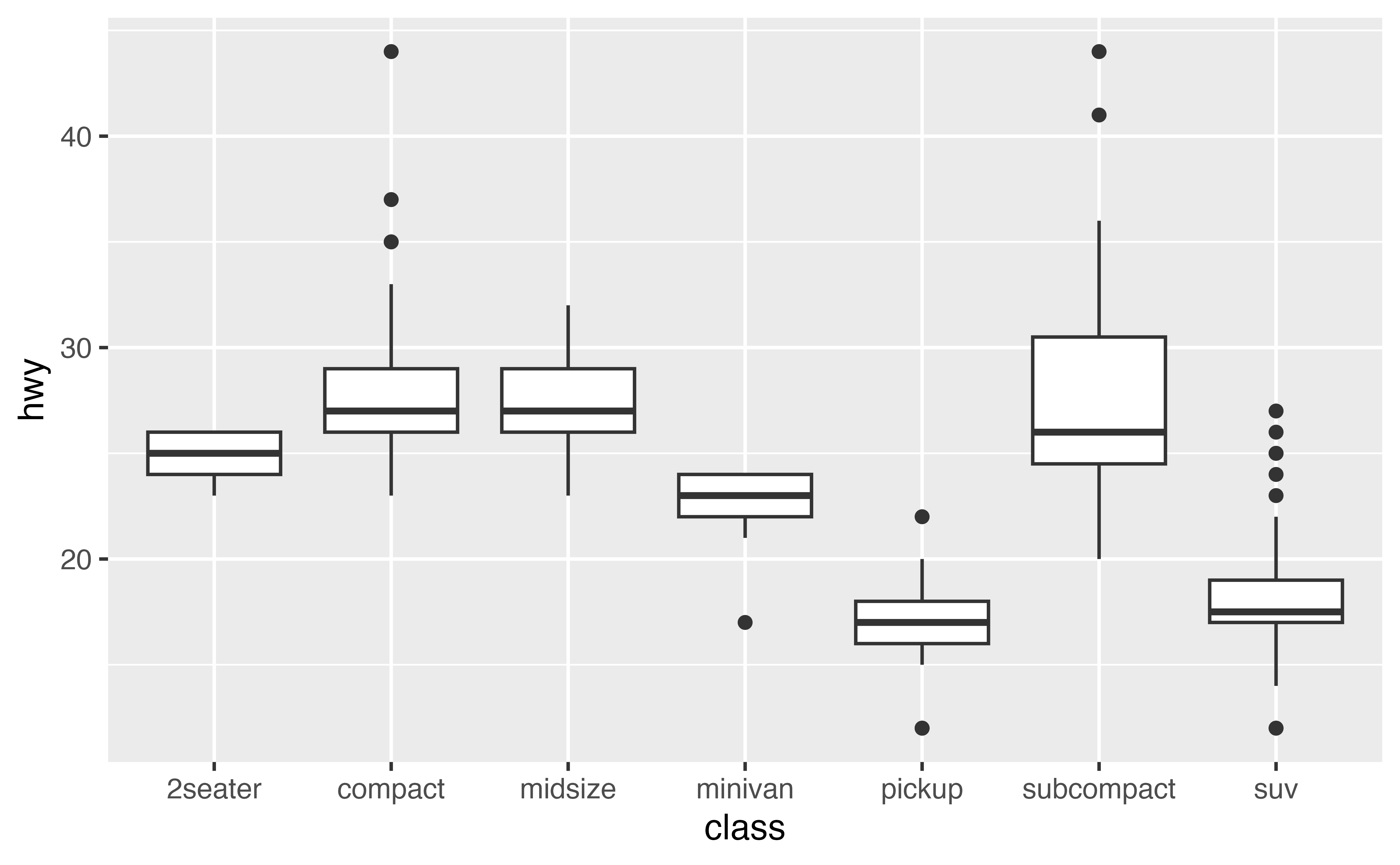
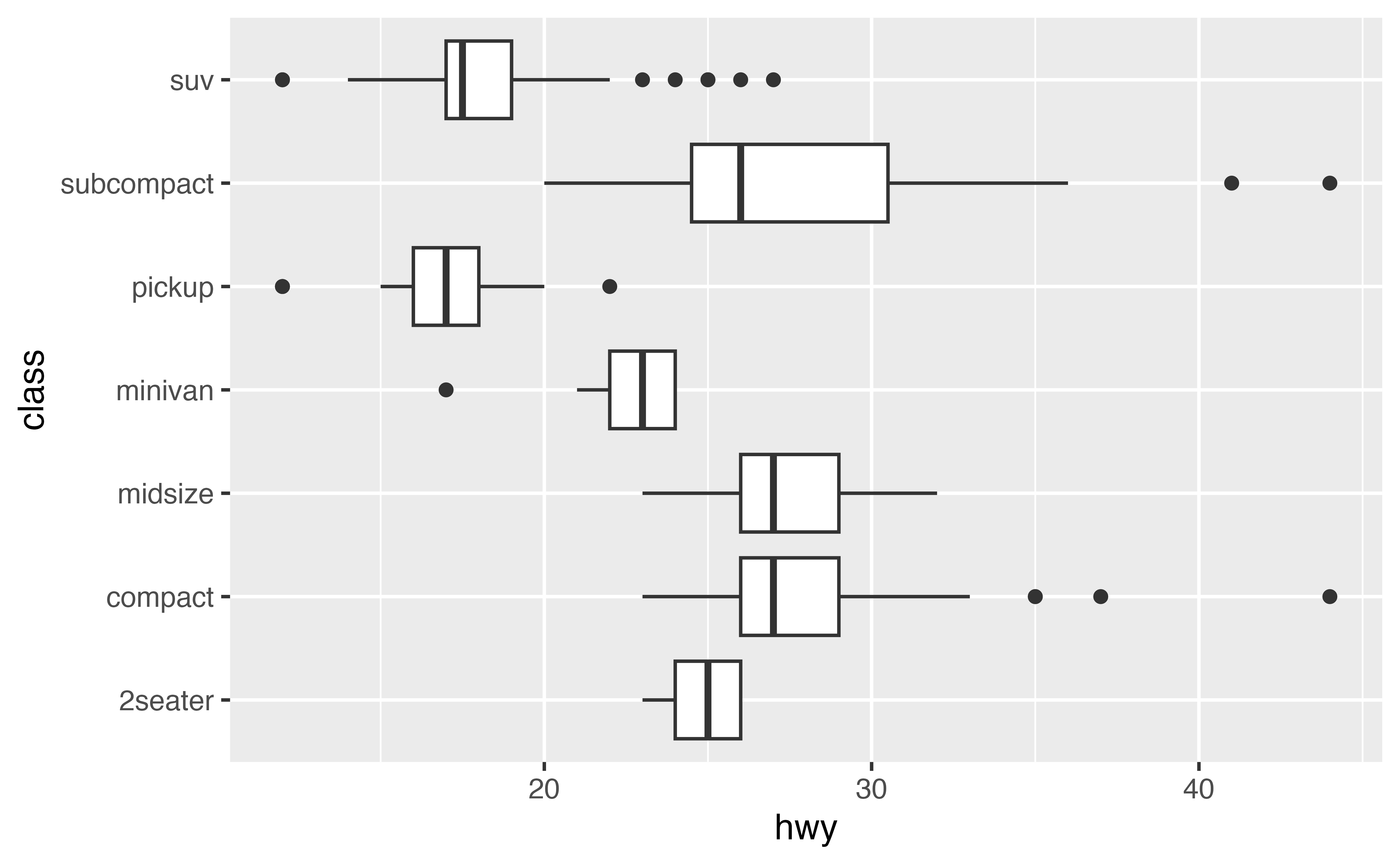
To make a boxplot with {ggplot2}, add geom_boxplot() to the ggplot2 template. For example, the code below uses boxplots to display the relationship between the class and hwy variables in the mpg dataset, which comes with {ggplot2}.
Categorical and continuous
geom_boxplot() expects one x- or y-axes to the continuous and one to be categorical. For example, here class is categorical. geom_boxplot() will automatically plot a separate boxplot for each value of \(x\). This makes it easy to compare the distributions of points with different values of \(x\).
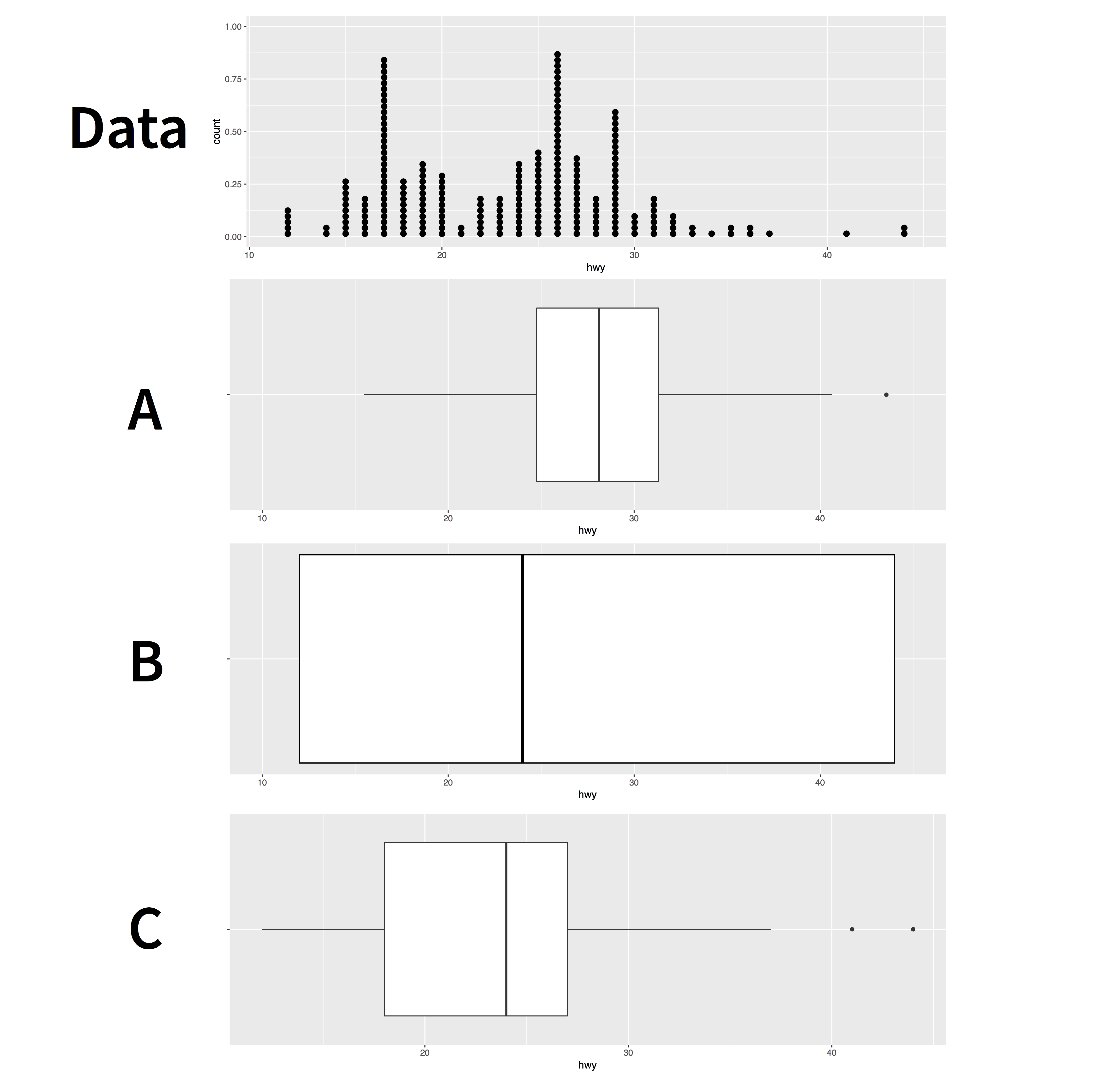
Exercise 2: Interpretation
Exercise 3: Make a boxplot
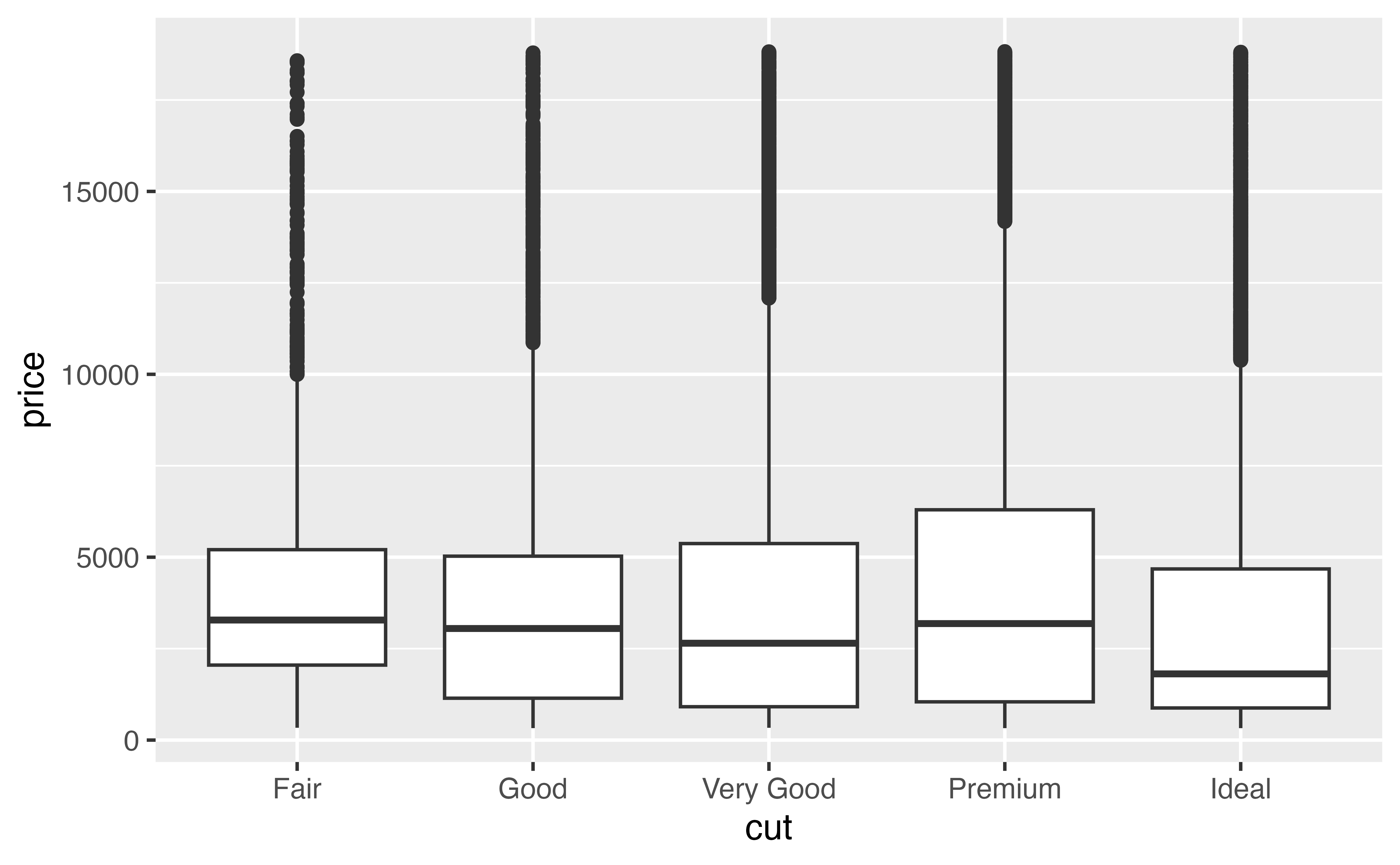
Recreate the boxplot below with the diamonds data set.

ggplot(data = diamonds) +
  geom_boxplot(mapping = aes(x = cut, y = price))
Do you notice how many outliers appear in the plot? The boxplot algorithm can identify many outliers if your data is big, perhaps too many. Let’s look at ways to suppress the appearance of outliers in your plot.
Outliers
You can change how outliers look in your boxplot with the parameters outlier.color, outlier.fill, outlier.shape, outlier.size, outlier.stroke, and outlier.alpha (outlier.shape takes a number from 1 to 25).
Unfortunately, you can’t tell geom_boxplot() to ignore outliers completely, but you can make outliers disappear by setting outlier.alpha = 0. Try it in the plot below.
ggplot(data = diamonds) +
  geom_boxplot(mapping = aes(x = cut, y = price), outlier.alpha = 0)
Aesthetics
Boxplots recognize the following aesthetics: alpha, color, fill, group, linetype, shape, size, and weight.
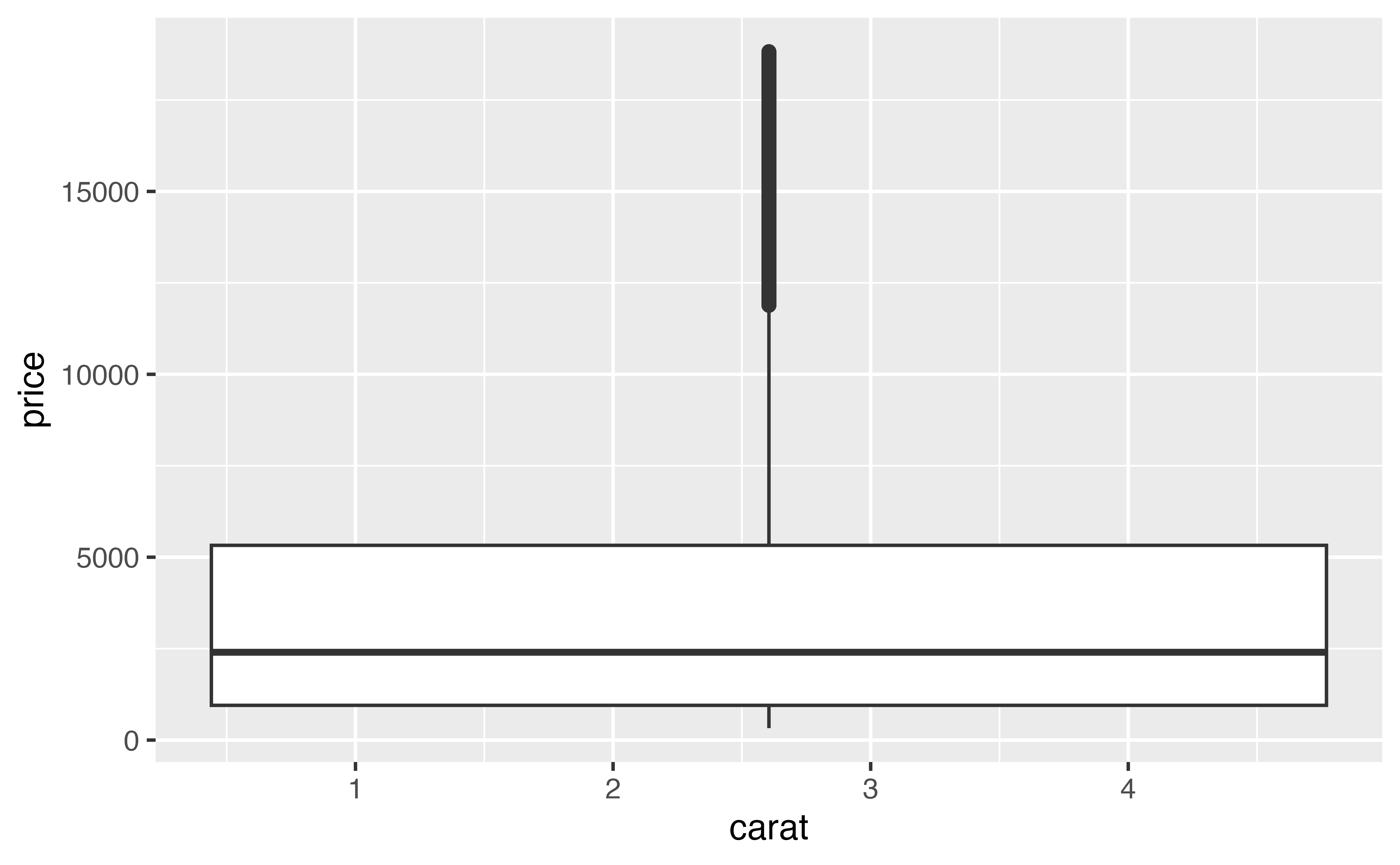
Of these group can be the most useful. Consider the plot below. It uses a continuous variable on the \(x\) axis. As a result, geom_boxplot() is not sure how to split the data into categories: it lumps all of the data into a single boxplot. The result reveals little about the relationship between carat and price.
In the next sections, we’ll use group to make a more informative plot.
How to “cut” a continuous variable
{ggplot2} provides three helper functions that you can use to split a continuous variable into categories. Each takes a continuous vector and returns a categorical vector that assigns each value to a group. For example, cut_interval() bins a vector into n equal length bins.
continuous_vector <- c(1, 2, 3, 4, 5, 6, 7, 8, 9, 10)
continuous_vector
[1] 1 2 3 4 5 6 7 8 9 10cut_interval(continuous_vector, n = 3) [1] [1,4] [1,4] [1,4] [1,4] (4,7] (4,7] (4,7] (7,10] (7,10] (7,10]
Levels: [1,4] (4,7] (7,10]The cut functions
The three cut functions are
cut_interval()which makesngroups with equal rangecut_number()which makesngroups with (approximately) equal numbers of observationscut_width()which makes groups with widthwidth
Use one of three functions below to bin continuous_vector into groups of width = 2.
cut_width(continuous_vector, width = 2)Good job! Now let’s apply the cut functions to our graph.
Exercise 4: Apply a cut function
When you set the group aesthetic of a boxplot, geom_boxplot() will draw a separate boxplot for each collection of observations that have the same value of whichever vector you map to group.
This means we can split our carat plot by mapping group to the output of a cut function, as in the code below. Study the code, then modify it to create a separate boxplot for each 0.25 wide interval of carat.
ggplot(data = diamonds) +
  geom_boxplot(mapping = aes(x = carat, y = price, group = cut_width(carat, width = 0.25)))
Good job! You can now see a relationship between price and carat. You could also make a scatterplot of these variables, but in this case, it would be a black mass of 54,000 data points.
Horizontal boxplots
So far, we’ve been using categorical variables in the \(x\) axis, which creates vertical boxplots. But what if you’d like to make horizontal boxplots, like in the plot below?
You can do this in two ways:
- Swap the
xandyaesthetics - Adding
+ coord_flip()to your plot call
Exercise 5: Horizontal boxplots
Modify the code below to make a horizontal boxplot by switching the x = and y = values:
ggplot(data = mpg) +
  geom_boxplot(mapping = aes(x = hwy, y = class))
Modify the code below to make a horizontal boxplot by adding coord_flip():
ggplot(data = mpg) +
  geom_boxplot(mapping = aes(x = class, y = hwy)) +
  coord_flip()
Good job!
coord_flip() is an example of a new coordinate system. You’ll learn much more about {ggplot2} coordinate systems in a later tutorial.
I prefer to switch the x and y aesthetics instead of flipping the coordinates because it makes working with themes and legends a lot easier.