Covariation
What is covariation?
If variation describes the behavior within a variable, covariation describes the behavior between variables. Covariation is the tendency for the values of two or more variables to vary together in a related way. The best way to spot covariation is to visualise the relationship between two or more variables. How you do that should again depend on whether your variables are categorical or continuous.
Two categorical variables
You can plot the relationship between two categorical variables with a heatmap or with geom_count():
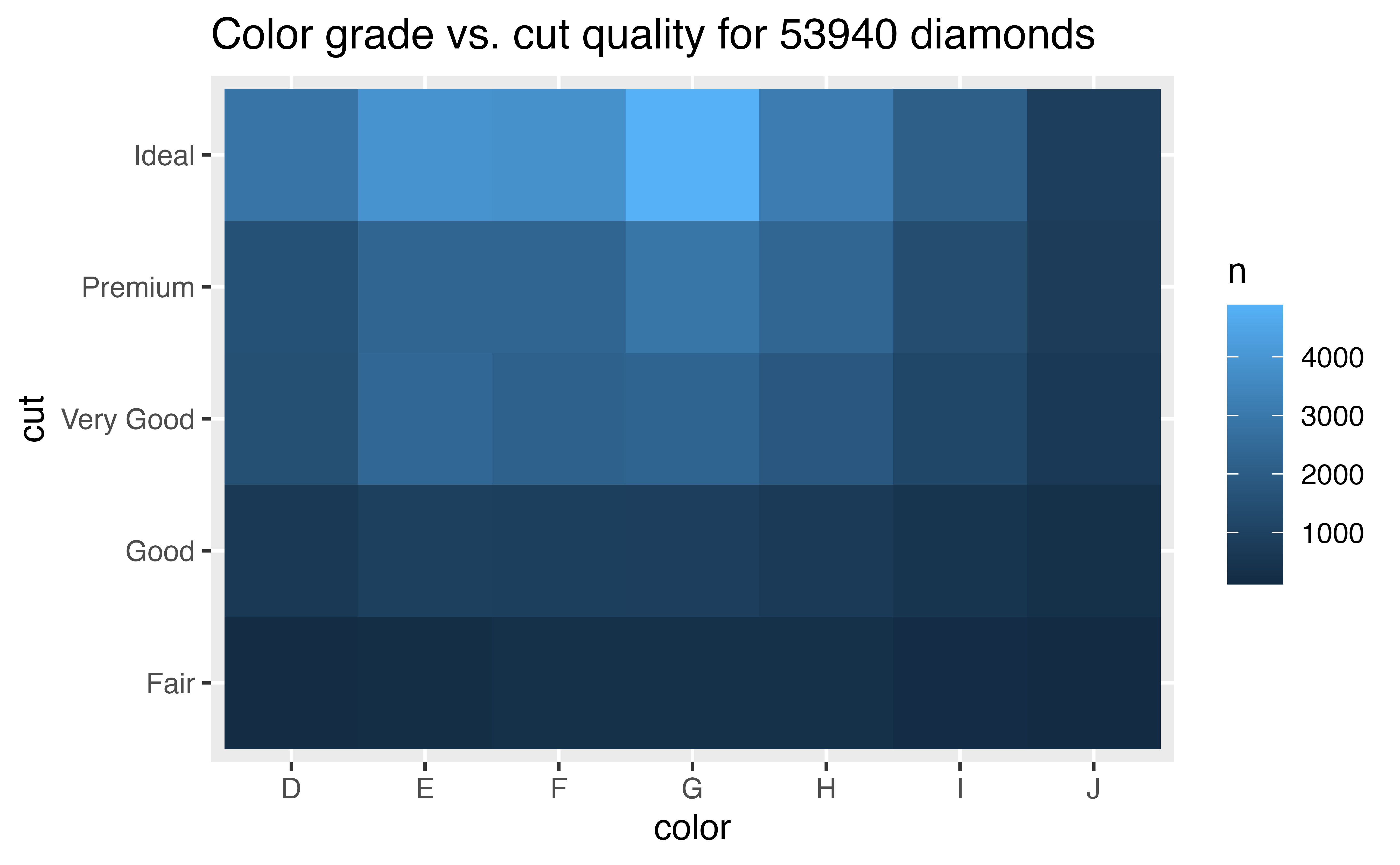
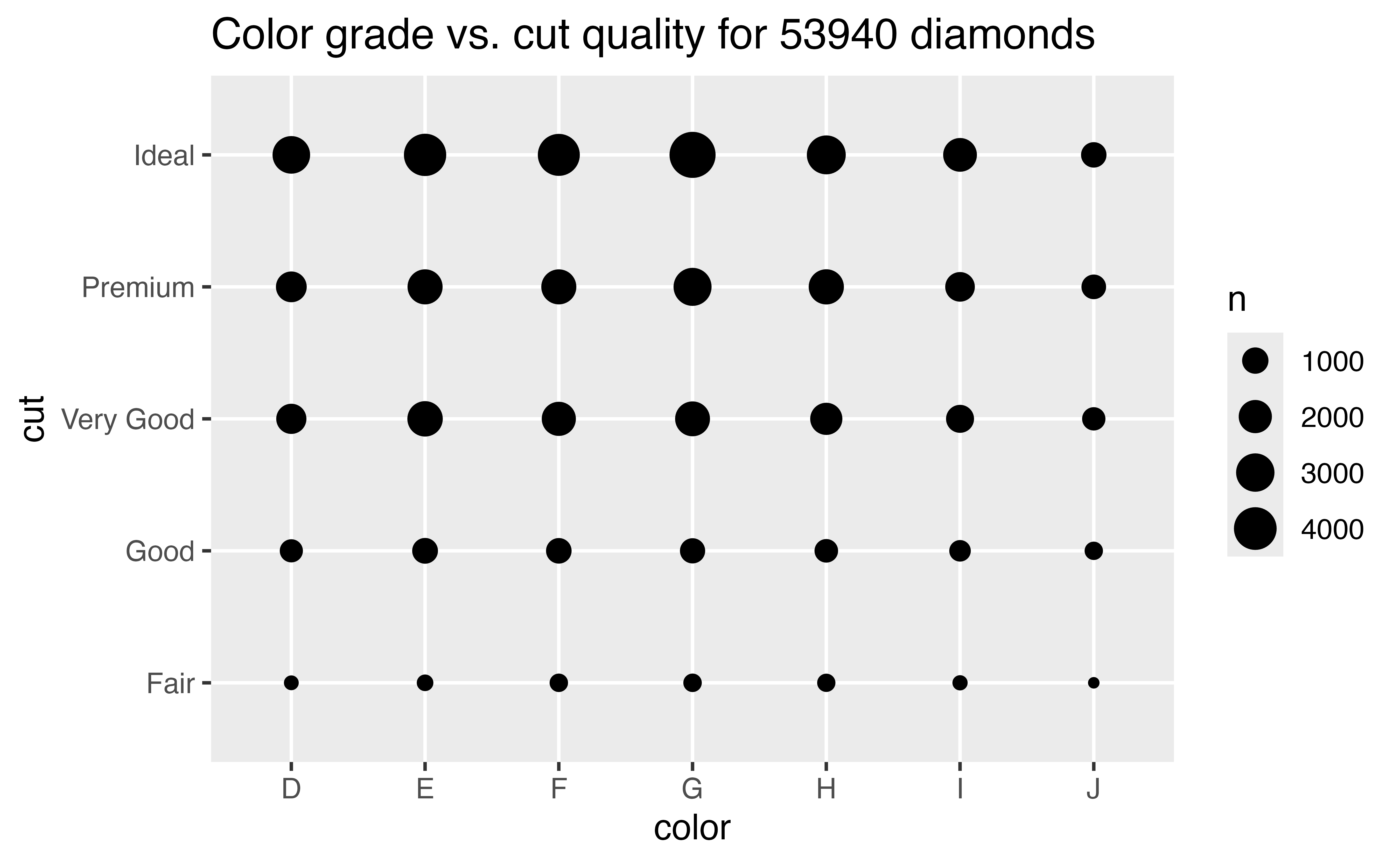
Again, don’t be concerned if you do not know how to make these graphs. For now, let’s focus on the strategy of how to use visualizations in EDA. You’ll learn how to make different types of plots in the tutorials that follow.
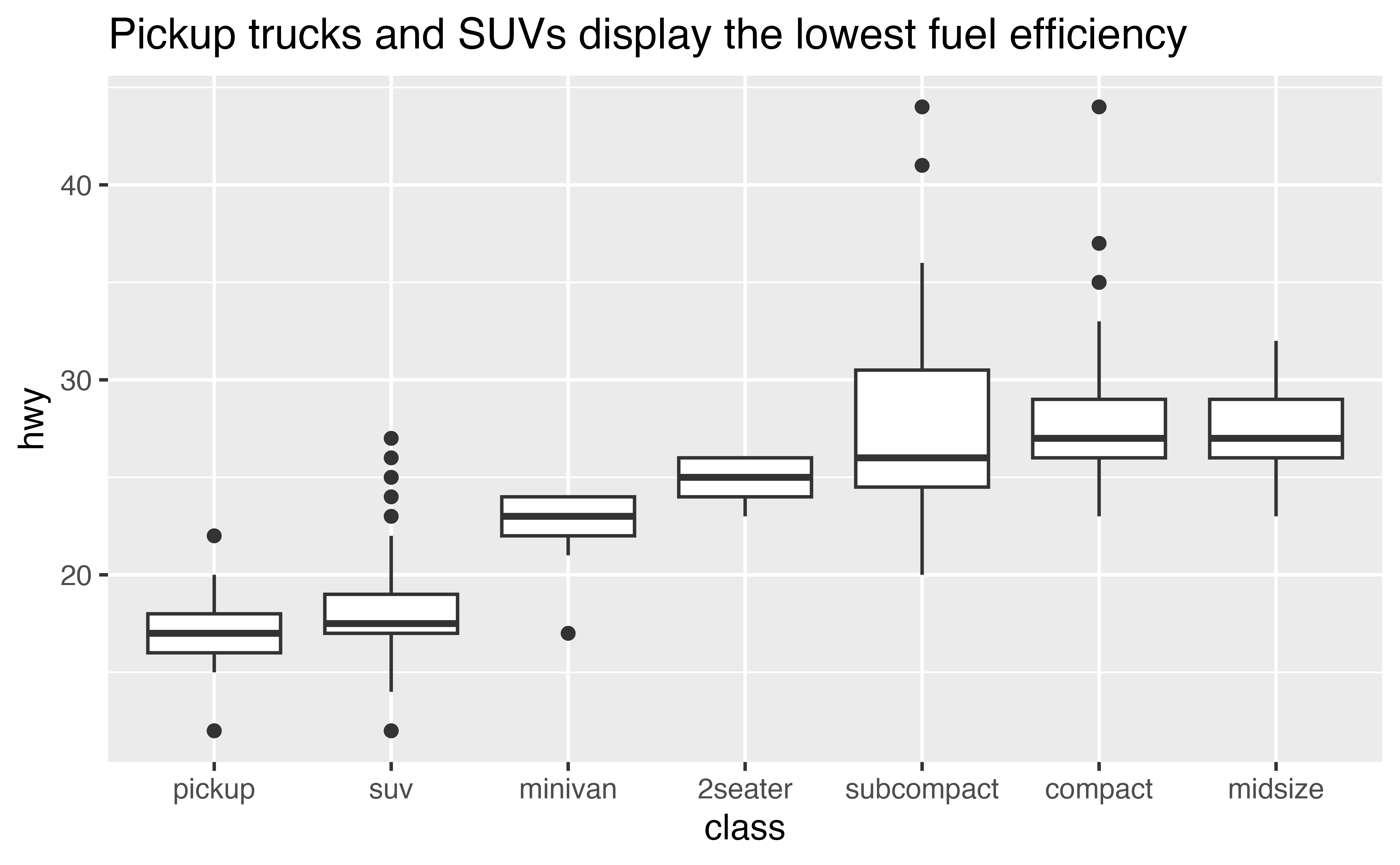
One continuous and one categorical variable
You can plot the relationship between one continuous and one categorical variable with a boxplot:
Two continuous variables
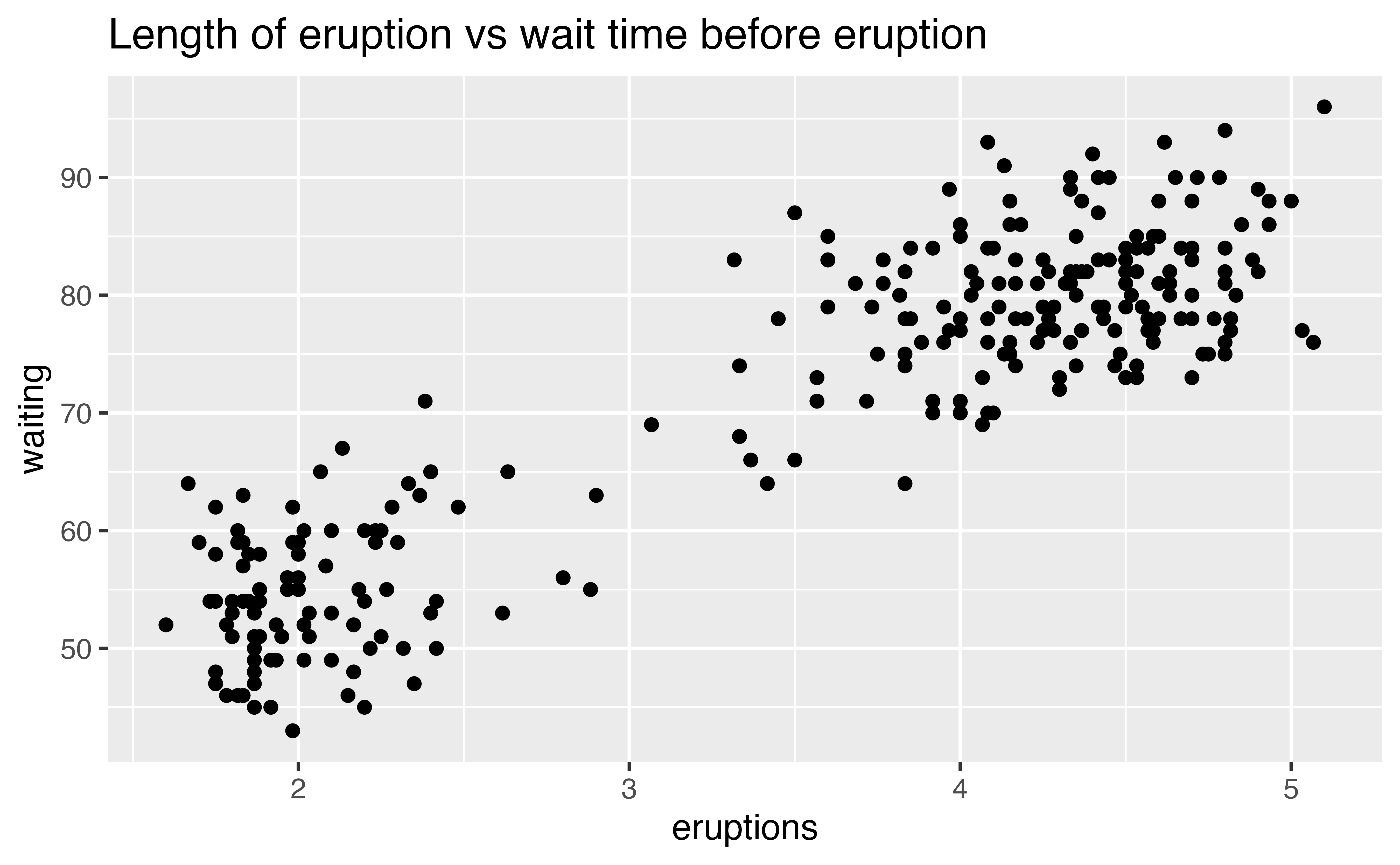
You can plot the relationship between two continuous variables with a scatterplot:

Patterns
Patterns in your data provide clues about relationships. If a systematic relationship exists between two variables it will appear as a pattern in the data. If you spot a pattern, ask yourself:
Could this pattern be due to coincidence (i.e. random chance)?
How can you describe the relationship implied by the pattern?
How strong is the relationship implied by the pattern?
What other variables might affect the relationship?
Does the relationship change if you look at individual subgroups of the data?
Remember that clusters and outliers are also a type of pattern. Two dimensional plots can reveal clusters and outliers that would not be visible in a one dimensional plot. If you spot either, ask yourself what they imply.
Review 6: Patterns
The scatterplot below shows the relationship between the length of an eruption of Old Faithful and the wait time before the eruption (i.e. the amount of time that passed between it and the previous eruption).
Uncertainty
Patterns provide a useful tool for data scientists because they reveal covariation. If you think of variation as a phenomenon that creates uncertainty, covariation is a phenomenon that reduces it. When two variables covary, you can use the values of one variable to make better predictions about the values of the second. If the covariation is due to a causal relationship (a special case), you can use the value of one variable to control the value of the second.
Recap
You’ve learned a lot in this tutorial. Here’s what you should keep with you:
- EDA is an iterative cycle built around asking and refining questions.
- These two questions are always useful:
- What type of variation occurs within my variables?
- What type of covariation occurs between my variables?
- Remember the definitions of variables, values, observations, variation, covariation, categorical, and continuous. You’ll see them again. Frequently.
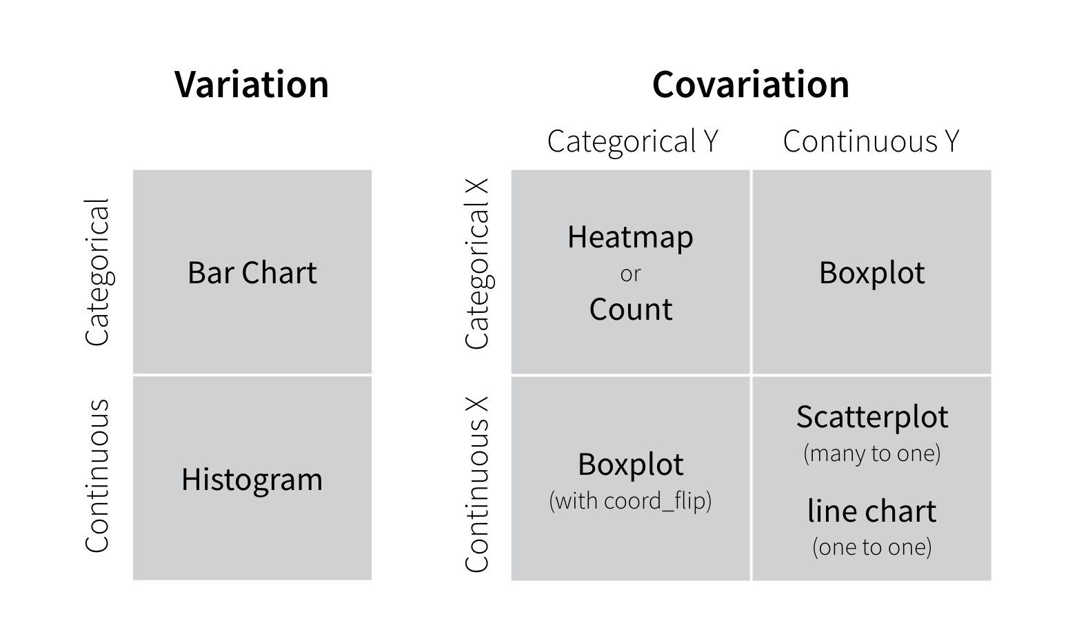
Throughout the tutorial, you also encountered several recommendations for plots that visualize variation and covariation for categorical and continuous variables. Plots are a bit like questions in EDA: you should make many quickly and try anything that strikes your fancy. You can refine your plots later to share with others. A lot of refinement will occur naturally as you iterate during EDA.
The suggestions below can serve as starting point for visualizing data. In the tutorials that follow, you will learn how to make each type of plot, as well as how to use best practices and advanced skills when visualizing data.