ggplot(data = mpg, mapping = aes(x = class, y = hwy)) +
  geom_boxplot(outlier.alpha = 0) +
  geom_jitter(width = 0) +
  coord_flip()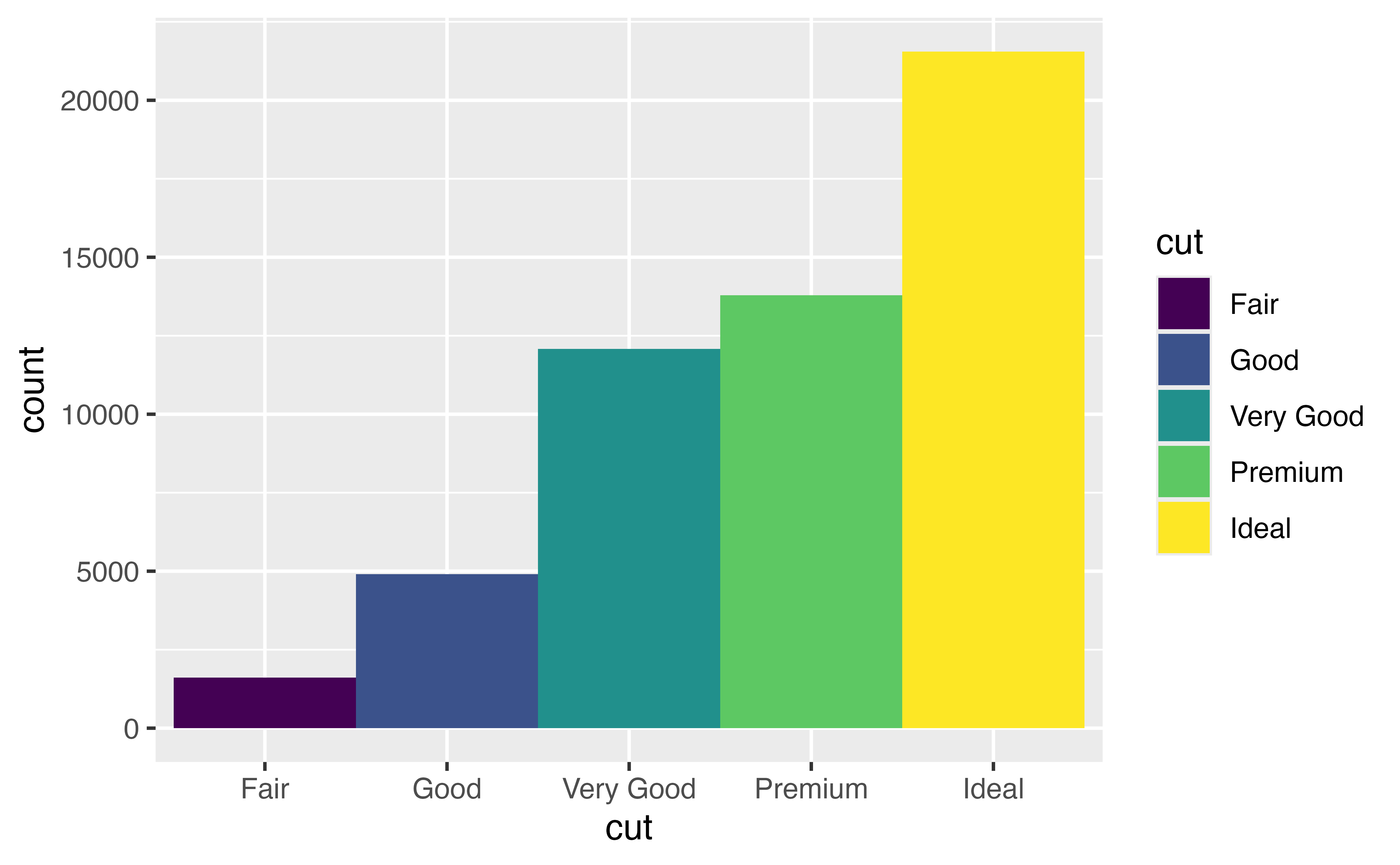
coord_flip()One way to customize a scatterplot is to plot it in a new coordinate system. {ggplot2} provides several helper functions that change the coordinate system of a plot. You’ve already seen one of these in action in the boxplots tutorial: coord_flip() flips the \(x\) and \(y\) axes of a plot.
ggplot(data = mpg, mapping = aes(x = class, y = hwy)) +
geom_boxplot(outlier.alpha = 0) +
geom_jitter(width = 0) +
coord_flip()
Altogether, {ggplot2} comes with several coord functions:
coord_cartesian(): (the default) Cartesian coordinatescoord_fixed(): Cartesian coordinates that maintain a fixed aspect ratio as the plot window is resizedcoord_flip(): Cartesian coordinates with x and y axes flippedcoord_sf(): cartographic projections for plotting mapscoord_polar() and coord_radial(): polar and radial coordinates for round plots like pie chartscoord_trans(): transformed Cartesian coordinatesBy default, {ggplot2} will draw a plot in Cartesian coordinates unless you add one of the functions above to the plot code.
coord_polar()You use each coord function like you use coord_flip(), by adding it to a {ggplot2} call.
So for example, you could add coord_polar() to a plot to make a graph that uses polar coordinates.
ggplot(data = diamonds) +
geom_bar(mapping = aes(x = cut, fill = cut), width = 1) 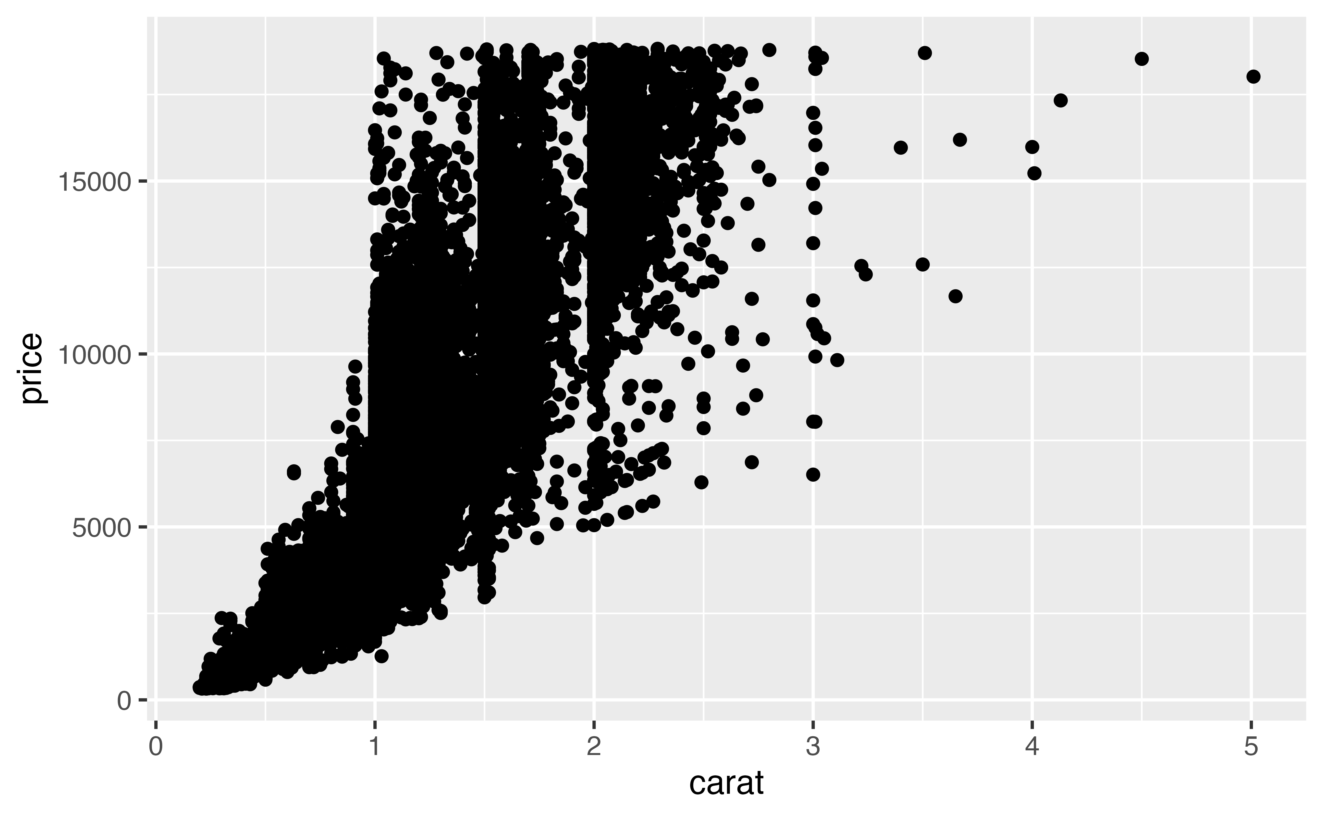
last_plot() +
  coord_polar()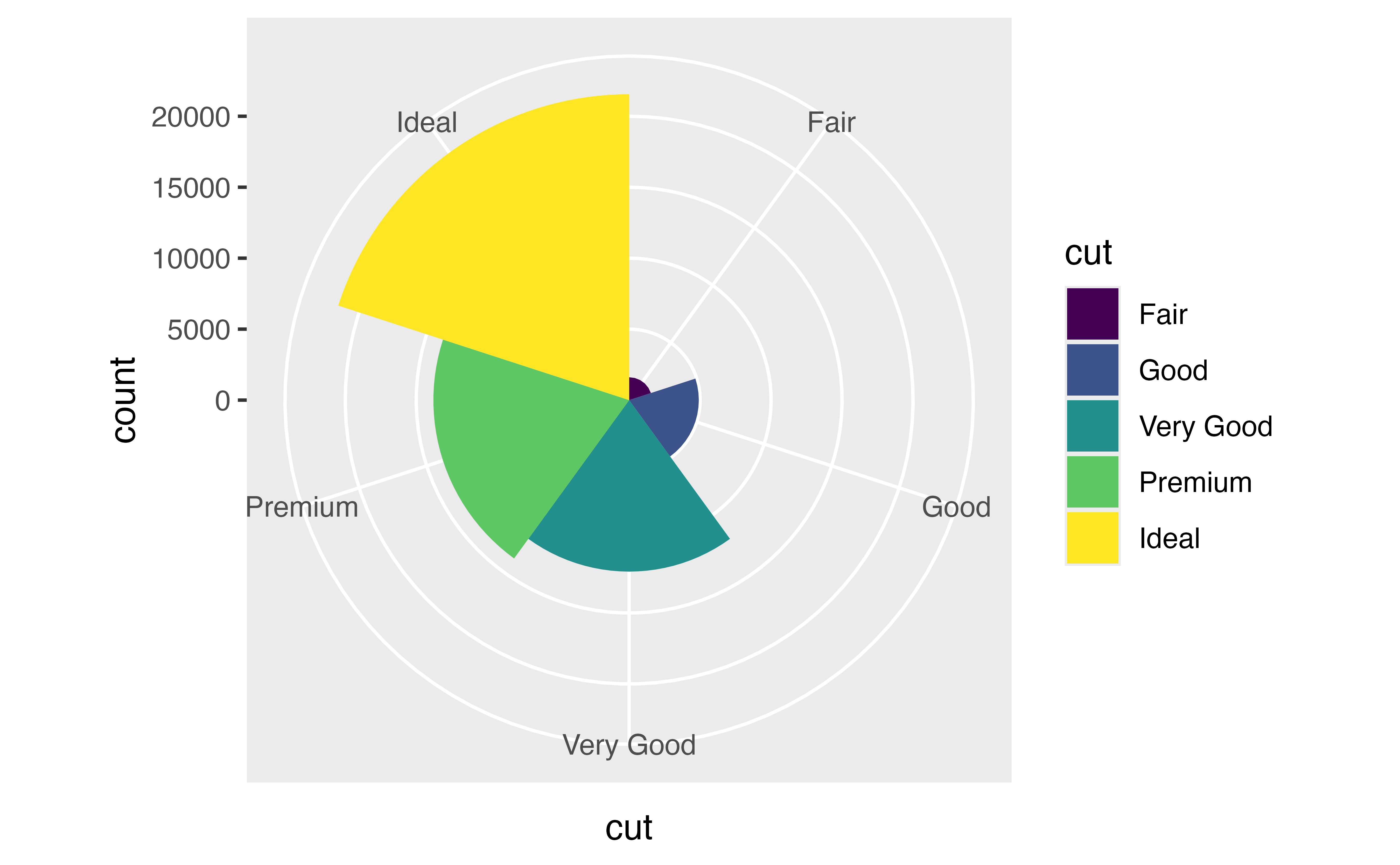
How can a coordinate system improve a scatterplot?
Consider, the scatterplot below. It shows a strong relationship between the carat size of a diamond and its price.

However, the relationship does not appear linear. It appears to have the form \(y = x^{n}\), a common relationship found in nature. You can estimate the \(n\) by replotting the data in a log-log plot.
Log-log plots graph the log of \(x\) vs. the log of \(y\), which has a valuable visual effect. If you log both sides of a relationship like
\[ y = x^{n} \]
You get a linear relationship with slope \(n\):
\[ \begin{aligned} \log(y) &= \log(x^{n}) \\ \log(y) &= n \times \log(x) \end{aligned} \]
In other words, log-log plots unbend power relationships into straight lines. Moreover, they display \(n\) as the slope of the straight line, which is reasonably easy to estimate.
Try this by using the diamonds dataset to plot log(carat) on the x-axis and log(price) on the y-axis:
ggplot(data = diamonds) +
  geom_point(mapping = aes(x = log(carat), y = log(price)))
Good job! Now let’s look at how you can do the same transformation, and others as well with a coord function.
coord_trans()coord_trans() provides a second way to do the same transformation, or similar transformations.
To use coord_trans() give it an \(x\) and/or a \(y\) argument. Set each to the name of an R function surrounded by quotation marks. coord_trans() will use the function to transform the specified axis before plotting the raw data.
Scatterplots are one of the most useful types of plots for data science. You will have many chances to use geom_point(), geom_smooth(), and geom_label_repel() in your day-to-day work.
However, this tutor introduced important two concepts that apply to more than just scatterplots: