Histograms
Introduction
Watch this video:
How to make a histogram
To make a histogram with {ggplot2}, add geom_histogram() to the ggplot2 template. For example, the code below plots a histogram of the carat variable in the diamonds dataset, which comes with {ggplot2}.
The \(y\) variable
As with geom_bar(), you do not need to give geom_histogram() a \(y\) variable. geom_histogram() will construct its own \(y\) variable by counting the number of observations that fall into each bin on the \(x\) axis. geom_histogram() will then map the counts to the \(y\) axis.
As a result, you can glance at a bar to determine how many observations fall within a bin. Bins with tall bars highlight common values of the \(x\) variable.
Exercise 1: Interpretation
binwidth
By default, {ggplot2} will choose a binwidth for your histogram that results in about 30 bins. You can set the binwidth manually with the binwidth argument, which is interpreted in the units of the x axis:
bins
Alternatively, you can set the binwidth with the bins argument which takes the total number of bins to use:
It can be hard to determine what the actual binwidths are when you use bins, since they may not be round numbers.
boundary
You can move the bins left and right along the \(x\) axis with the boundary argument. boundary takes an \(x\) value to use as the boundary between two bins ({ggplot2} will align the rest of the bins accordingly):
Exercise 2: binwidth
When you use geom_histogram(), you should always experiment with different binwidths because different size bins reveal different types of information.
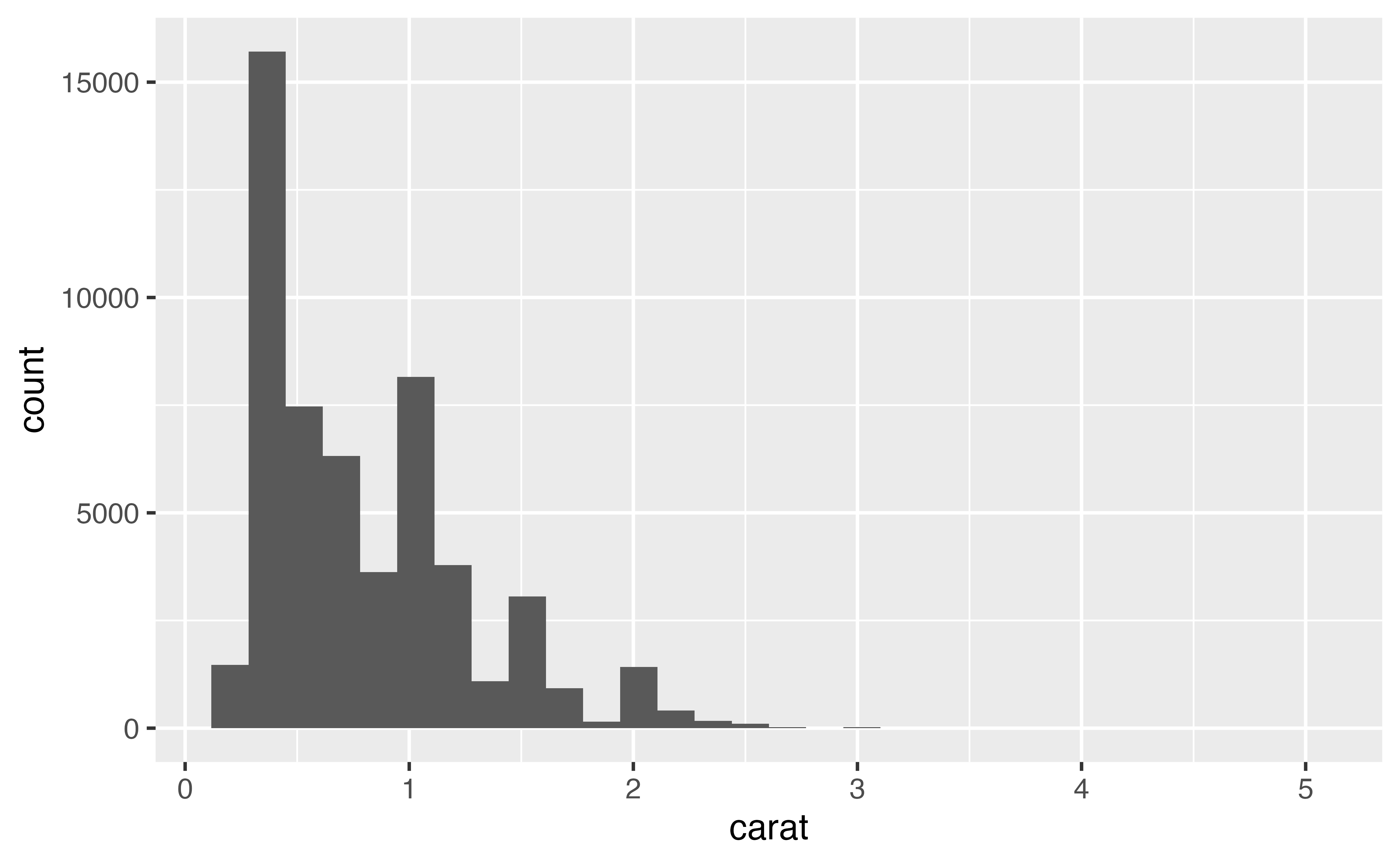
To see an example of this, make a histogram of the carat variable in the diamonds dataset. Use a bin size of 0.5 carats. What does the overall shape of the distribution look like?
ggplot(data = diamonds) +
  geom_histogram(mapping = aes(x = carat), binwidth = 0.5)
Good job! The most common diamond size is about 0.5 carats. Larger sizes become progressively less frequent as carat size increases. This accords with general knowledge about diamonds, so you may be prompted to stop exploring the distribution of carat size. But should you?
Exercise 3: another binwidth
Recreate your histogram of carat but this time use a binwidth of 0.1. Does your plot reveal new information? Look closely. Is there more than one peak? Where do the peaks occur?
ggplot(data = diamonds) +
  geom_histogram(mapping = aes(x = carat), binwidth = 0.1)
Good job! The new binwidth reveals a new phenomena: carat sizes like 0.5, 0.75, 1, 1.5, and 2 are much more common than carat sizes that do not fall near a common fraction. Why might this be?
Exercise 4: another binwidth
Recreate your histogram of carat a final time, but this time use a binwidth of 0.01 and set the first boundary to zero. Try to find one new pattern in the results.
ggplot(data = diamonds) +
  geom_histogram(mapping = aes(x = carat), binwidth = 0.01, boundary = 0)
Good job! The new binwidth reveals another phenomena: each peak is very right skewed. In other words, diamonds that are 1.01 carats are much more common than diamonds that are .99 carats. Why would that be?
Aesthetics
Visually, histograms are very similar to bar charts. As a result, they use the same aesthetics: alpha, color, fill, linetype, and size.
They also behave in the same odd way when you use the color aesthetic. Do you remember what happens?
Exercise 5: Putting it all together
Recreate the histogram below.
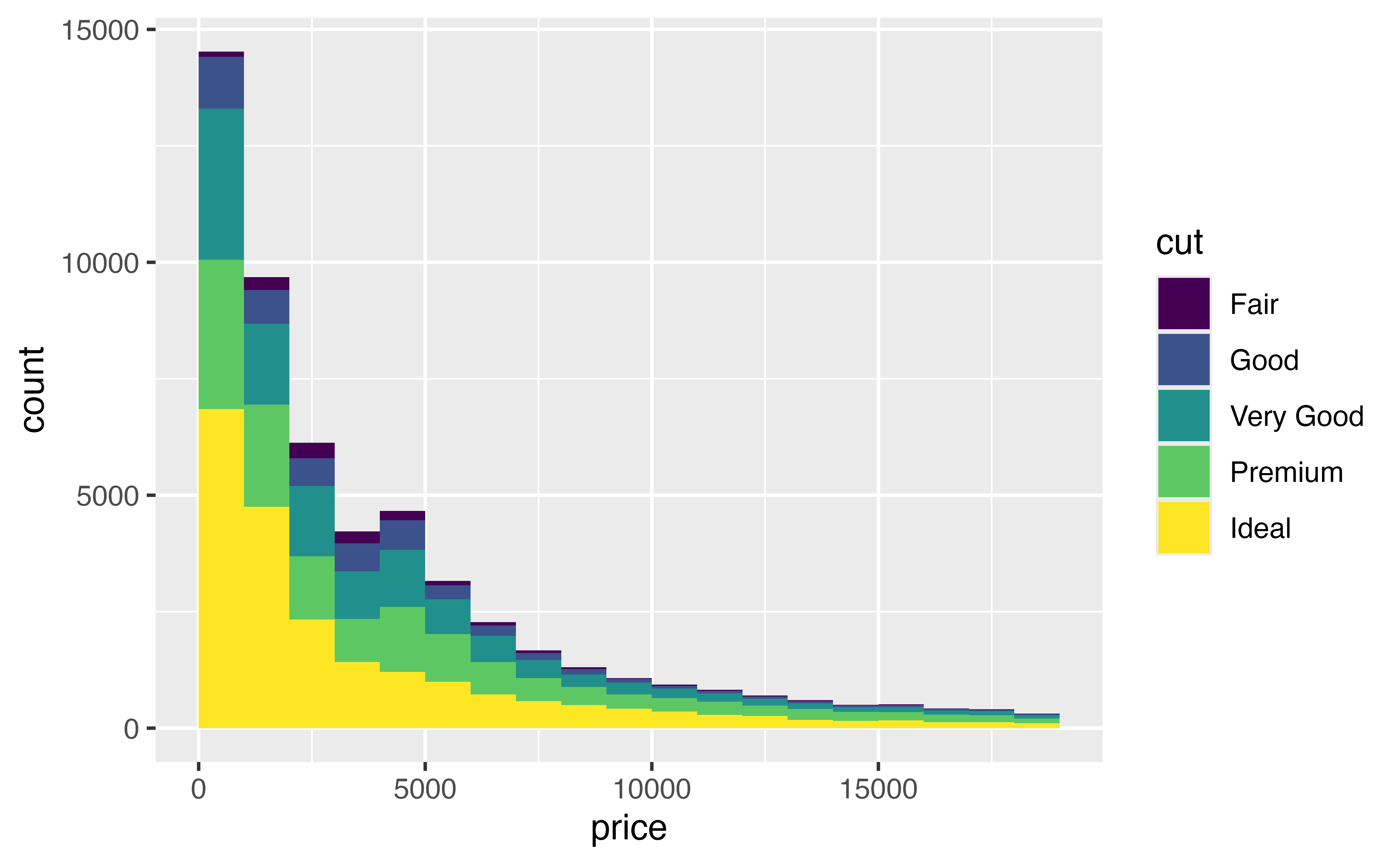
ggplot(data = diamonds) +
  geom_histogram(mapping = aes(x = price, fill = cut), binwidth = 1000, boundary = 0)
Good job! Did you ensure that each binwidth is 1000 and that the first boundary is zero?