ggplot(data = diamonds) +
  geom_bar(mapping = aes(x = cut))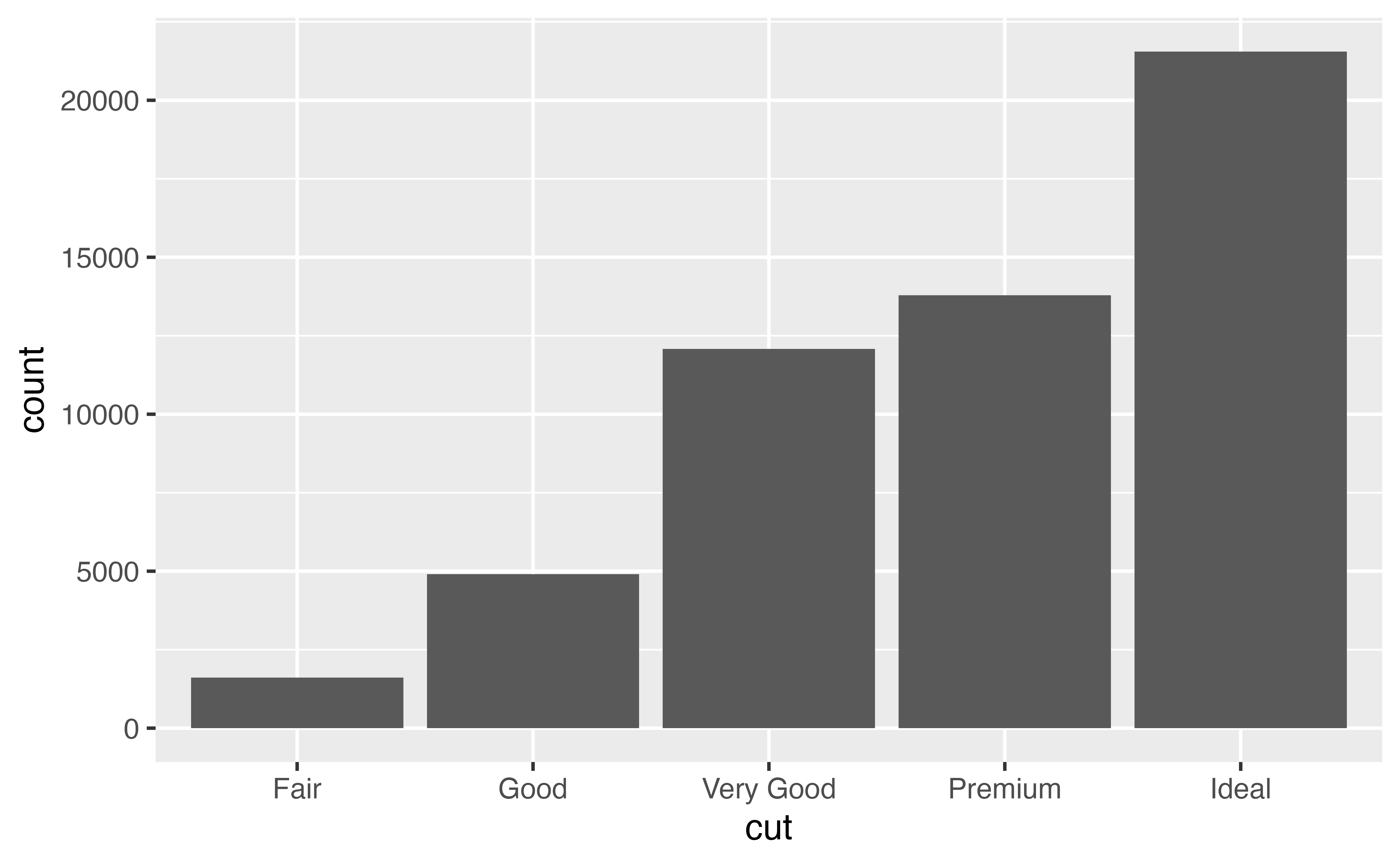
To make a bar chart with {ggplot2}, add geom_bar() to the ggplot2 template. For example, the code below plots a bar chart of the cut variable in the diamonds dataset, which comes with {ggplot2}.
ggplot(data = diamonds) +
geom_bar(mapping = aes(x = cut))
You should not supply a \(y\) aesthetic when you use geom_bar(); {ggplot2} will count how many times each \(x\) value appears in the data, and then display the counts on the \(y\) axis. So, for example, the plot above shows that over 20,000 diamonds in the data set had a value of Ideal.
You can compute this information manually with the count() function from the {dplyr} package.
diamonds |>
  count(cut)
# A tibble: 5 × 2
cut n
<ord> <int>
1 Fair 1610
2 Good 4906
3 Very Good 12082
4 Premium 13791
5 Ideal 21551geom_col()Sometimes, you may want to map the heights of the bars not to counts, but to a variable in the data set. To do this, use geom_col(), which is short for column.
ggplot(data = pressure) +
  geom_col(mapping = aes(x = temperature, y = pressure))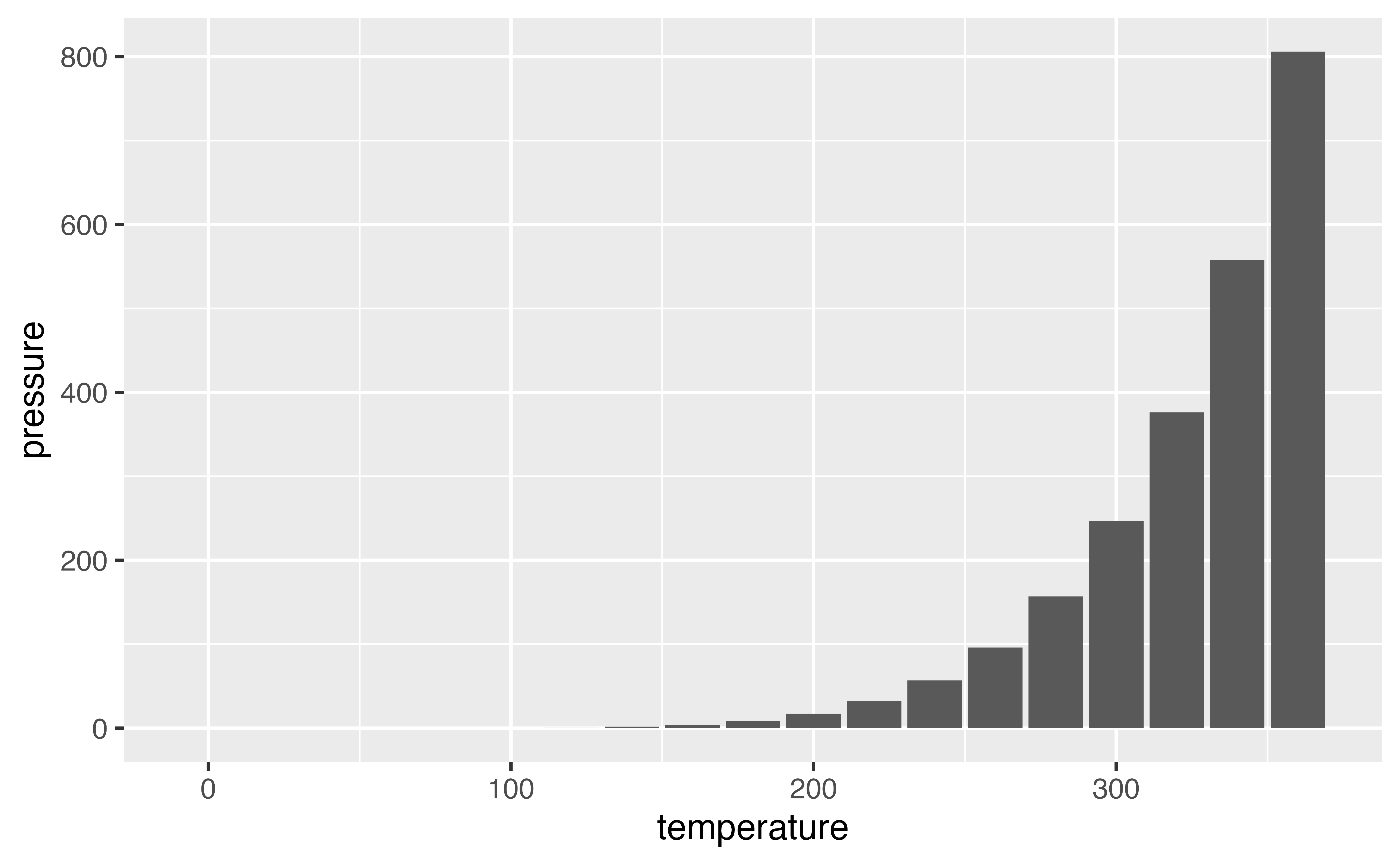
geom_col() dataWhen you use geom_col(), your \(x\) and \(y\) values should have a one to one relationship, as they do in the pressure data set (i.e. each value of temperature is paired with a single value of pressure).
pressure temperature pressure
1 0 0.0002
2 20 0.0012
3 40 0.0060
4 60 0.0300
5 80 0.0900
6 100 0.2700
7 120 0.7500
8 140 1.8500
9 160 4.2000
10 180 8.8000
11 200 17.3000
12 220 32.1000
13 240 57.0000
14 260 96.0000
15 280 157.0000
16 300 247.0000
17 320 376.0000
18 340 558.0000
19 360 806.0000Use the code chunk below to plot the distribution of the color variable in the diamonds data set, which comes in the {ggplot2} package.
ggplot(data = diamonds) +
  geom_bar(mapping = aes(x = color))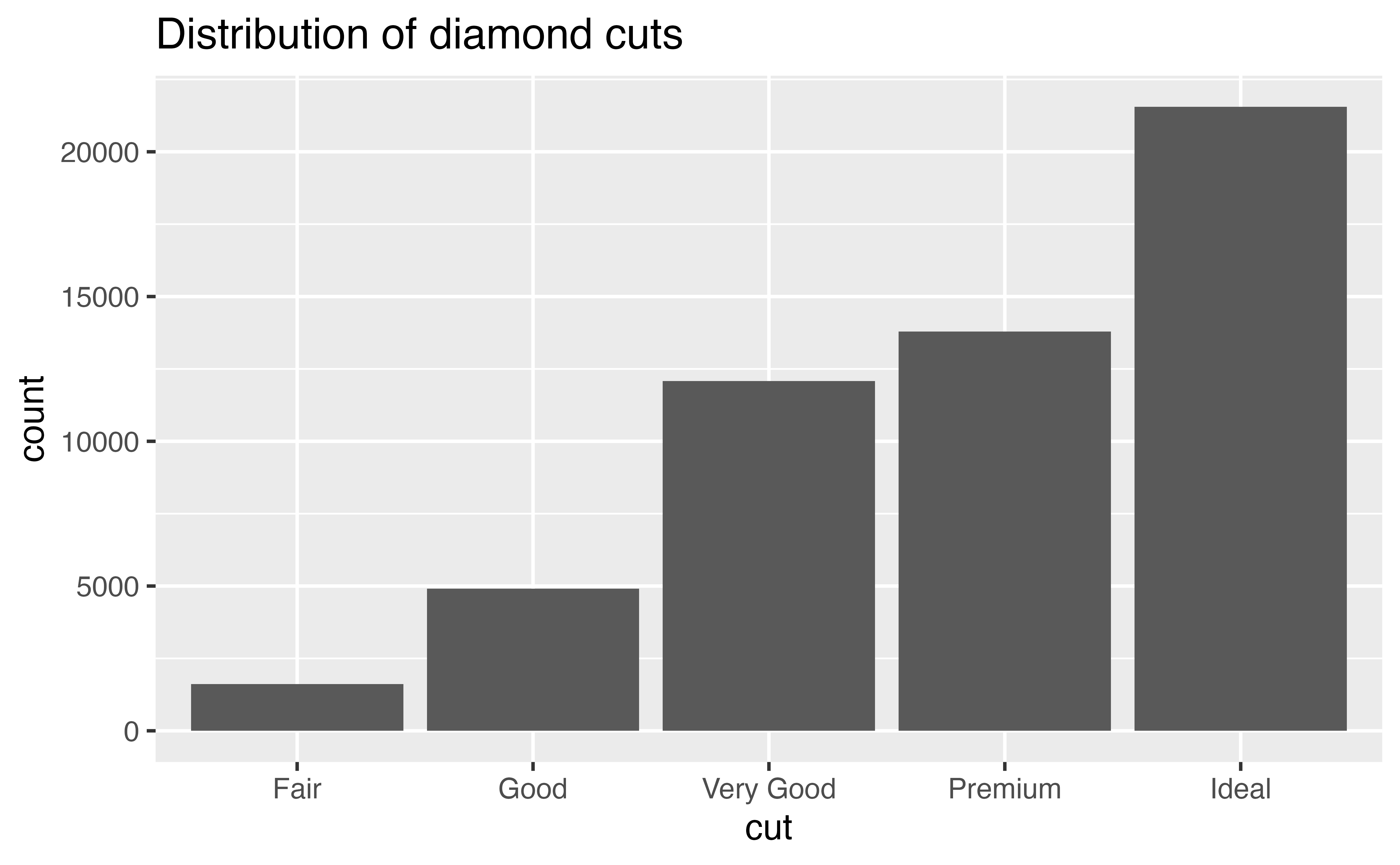
Diagnose the error below and then fix the code chunk to make a plot.
ggplot(data = pressure) +
geom_col(mapping = aes(x = temperature, y = pressure))count() and geom_col()Recreate the bar graph of color from exercise one, but this time first use count() to manually compute the heights of the bars. Then use geom_col() to plot the results as a bar graph. Does your graph look the same as in exercise one?
diamonds |>
  count(color) |>
  ggplot() +
    geom_col(mapping = aes(x = color, y = n))