Aesthetic mappings
“The greatest value of a picture is when it forces us to notice what we never expected to see.”
— John Tukey
A closer look
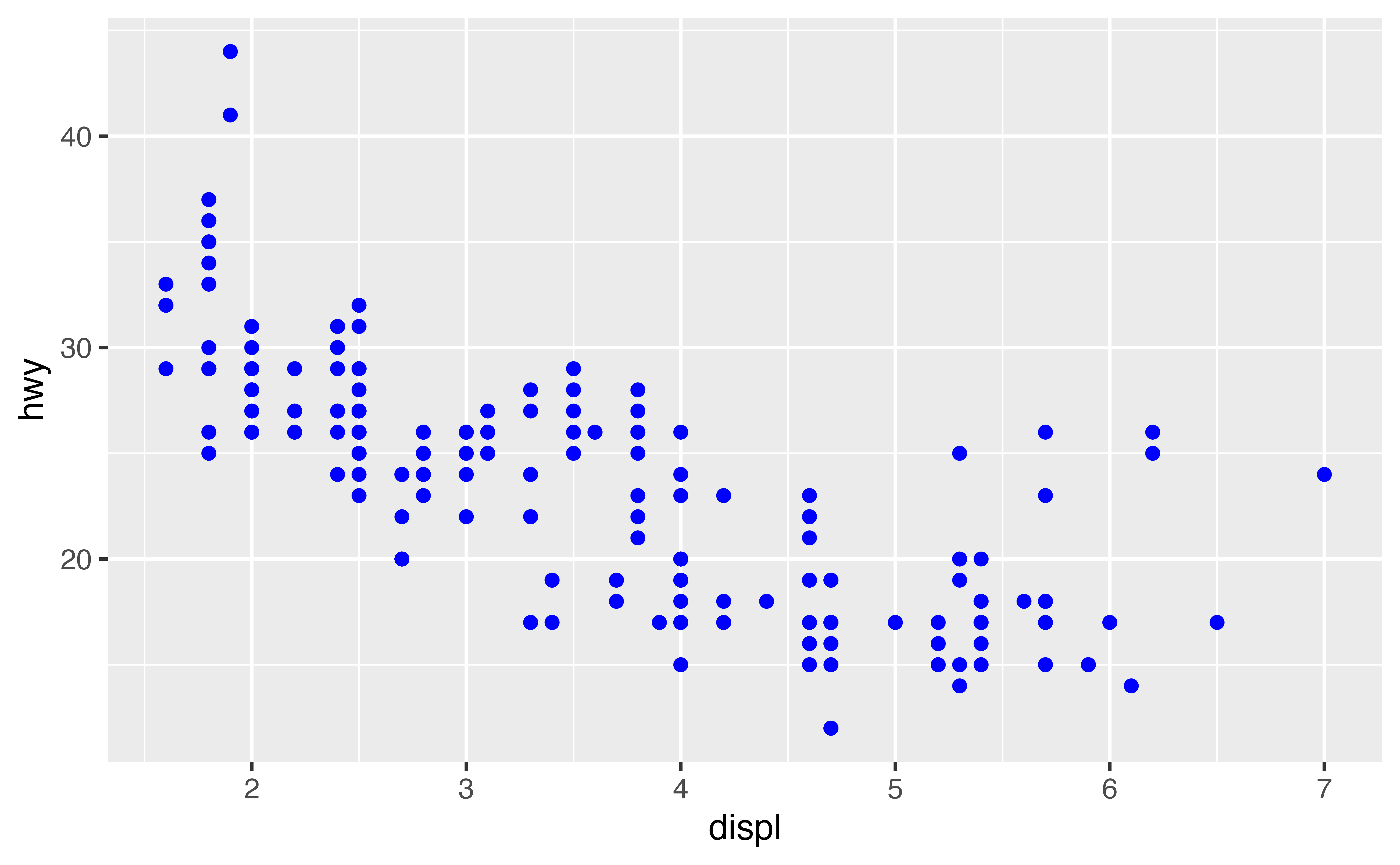
In the plot below, one group of points (highlighted in red) seems to fall outside of the linear trend between engine size and gas mileage. These cars have a higher mileage than you might expect. How can you explain these cars?
A hypothesis
Let’s hypothesize that the cars are hybrids. One way to test this hypothesis is to look at the class value for each car. The class variable of the mpg dataset classifies cars into groups such as compact, midsize, and SUV. If the outlying points are hybrids, they should be classified as compact cars or, perhaps, subcompact cars (keep in mind that this data was collected before hybrid trucks and SUVs became popular). To check this, we need to add the class variable to the plot.
Aesthetics
You can add a third variable, like class, to a two dimensional scatterplot by mapping it to a new aesthetic. An aesthetic is a visual property of the objects in your plot. Aesthetics include things like the size, the shape, or the color of your points.
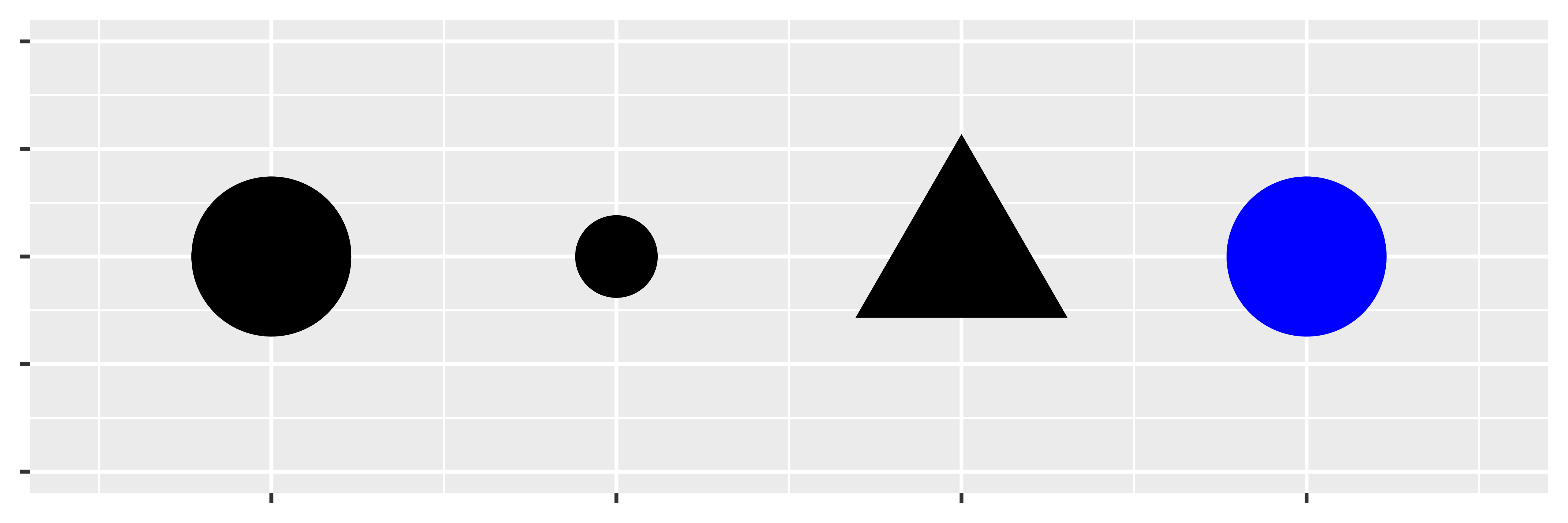
You can display a point (like the one below) in different ways by changing the values of its aesthetic properties. Since we already use the word “value” to describe data, let’s use the word “level” to describe aesthetic properties. Here we change the levels of a point’s size, shape, and color to make the point small, triangular, or blue:
A strategy
We can add the class variable to the plot by mapping the levels of an aesthetic (like color) to the values of class. For example, we can color a point green if it belongs to the compact class, blue if it belongs to the midsize class, and so on.
Let’s give this a try. Fill in the blank piece of code below with color = class. What happens? Delete the underline characters (_____) before running your code. (If you prefer British English, you can use colour instead of color.)
Hint: Be sure to remove all of the underlines and hashtags from the code.
ggplot(data = mpg) +
  geom_point(mapping = aes(x = displ, y = hwy, color = class))
Great Job! You can now tell which class of car each point represents by examining the color of the point.
And the answer is…
The colors reveal that many of the unusual points in mpg are two-seater cars. These cars don’t seem like hybrids, and are, in fact, sports cars! Sports cars have large engines like SUVs and pickup trucks, but small bodies like midsize and compact cars, which improves their gas mileage. In hindsight, these cars were unlikely to be hybrids since they have large engines.
This isn’t the only insight we’ve gleaned; you’ve also learned how to add new aesthetics to your graph. Let’s review the process.
Aesthetic mappings
To map an aesthetic to a variable, set the name of the aesthetic equal to the name of the variable, and do this inside mapping = aes(). ggplot2 will automatically assign a unique level of the aesthetic (here a unique color) to each unique value of the variable. ggplot2 will also add a legend that explains which levels correspond to which values.
This insight gives us a new way to think about the mapping argument. Mappings tell ggplot2 more than which variables to put on which axes, they tell ggplot2 which variables to map to which visual properties. The x and y locations of each point are just two of the many visual properties displayed by a point.
Other aesthetics
In the above example, we mapped color to class, but we could have mapped size to class in the same way.
Change the code below to map size to class. What happens?
Hint: If color controls the aesthetic, what word do you suppose controls the size aesthetic?
ggplot(data = mpg) +
  geom_point(mapping = aes(x = displ, y = hwy, size = class))
Great Job! Now the size of a point represents its class. Did you notice the warning message? ggplot2 gives us a warning here because mapping an unordered variable (class) to an ordered aesthetic (size) is not a good idea.
alpha
You can also map class to the alpha aesthetic, which controls the transparency of the points. Try it below.
Hint: If color controls the aesthetic, what word do you suppose controls the alpha aesthetic?
ggplot(data = mpg) +
  geom_point(mapping = aes(x = displ, y = hwy, alpha = class))
Great Job! If you look closely, you can spot something subtle: many locations contain multiple points stacked on top of each other (alpha is additive so multiple transparent points will appear opaque).
Shape
Let’s try one more aesthetic. This time map the class of the points to shape, then look for the SUVs. What happened?
Hint: If color controls the aesthetic, what word do you suppose controls the shape aesthetic?
ggplot(data = mpg) +
  geom_point(mapping = aes(x = displ, y = hwy, shape = class))
Good work! What happened to the SUVs? ggplot2 will only use six shapes at a time. By default, additional groups will go unplotted when you use the shape aesthetic. So only use it when you have fewer than seven groups.
Exercise 1
In the code below, map cty, which is a continuous variable, to color, size, and shape. How do these aesthetics behave differently for continuous variables, like cty, vs. categorical variables, like class?
# Map cty to color
ggplot(data = mpg) +
  geom_point(mapping = aes(x = displ, y = hwy, color = cty))

# Map cty to size
ggplot(data = mpg) +
  geom_point(mapping = aes(x = displ, y = hwy, size = cty))

# Map cty to shape
ggplot(data = mpg) +
  geom_point(mapping = aes(x = displ, y = hwy, shape = cty))
Very nice! ggplot2 treats continuous and categorical variables differently. Noteably, ggplot2 supplies a blue gradient when you map a continuous variable to color, and ggplot2 will not map continuous variables to shape.
Exercise 2
Map class to color, size, and shape all in the same plot. Does it work?
Hint: Be sure to set each mapping separately, e.g. color = class, size = class, etc.
ggplot(data = mpg) +
  geom_point(mapping = aes(x = displ, y = hwy, color = class, size = class, shape = class))
Very nice! ggplot2 can map the same variable to multiple aesthetics.
Exercise 3
What happens if you map an aesthetic to something other than a variable name, like aes(colour = displ < 5)? Try it.
ggplot(data = mpg) +
  geom_point(mapping = aes(x = displ, y = hwy, color = displ < 5))
Good job! ggplot2 will map the aesthetic to the results of the expression. Here, ggplot2 mapped the color of each point to TRUE or FALSE based on whther the point’s displ value was less than five.
Setting aesthetics
What if you just want to make all of the points in your plot blue, like in the plot below?

You can do this by setting the color aesthetic outside of the aes() function, like this
Setting vs. Mapping
Setting works for every aesthetic in ggplot2. If you want to manually set the aesthetic to a value in the visual space, set the aesthetic outside of aes().
If you want to map the aesthetic to a variable in the data space, map the aesthetic inside aes().
Exercise 4
What do you think went wrong in the code below? Fix the code so it does something sensible.
ggplot(data = mpg) +
  geom_point(mapping = aes(x = displ, y = hwy), color = "blue")
Good job! Putting an aesthetic in the wrong location is one of the most common graphing errors. Sometimes it helps to think of legends. If you will need a legend to understand what the color/shape/etc. means, then you should probably put the aesthetic inside aes() — ggplot2 will build a legend for every aesthetic mapped here. If the aesthetic has no meaning and is just… well, aesthetic, then set it outside of aes().”
Recap
For each aesthetic, you associate the name of the aesthetic with a variable to display, and you do this within aes().
Once you map a variable to an aesthetic, ggplot2 takes care of the rest. It selects a reasonable scale to use with the aesthetic, and it constructs a legend that explains the mapping between levels and values. For x and y aesthetics, ggplot2 does not create a legend, but it creates an axis line with tick marks and a label. The axis line acts as a legend; it explains the mapping between locations and values.
You’ve experimented with the most common aesthetics for points: x, y, color, size, alpha and shape. Each geom uses its own set of aesthetics (you wouldn’t expect a line to have a shape, for example). To find out which aesthetics a geom uses, open its help page, e.g. ?geom_line.
This raises a new question that we’ve only brushed over: what is a geom?