Line graphs
Line graph vs. scatterplot
Like scatterplots, line graphs display the relationship between two continuous variables. However, unlike scatterplots, line graphs expect the variables to have a functional relationship, where each value of \(x\) is associated with only one value of \(y\).
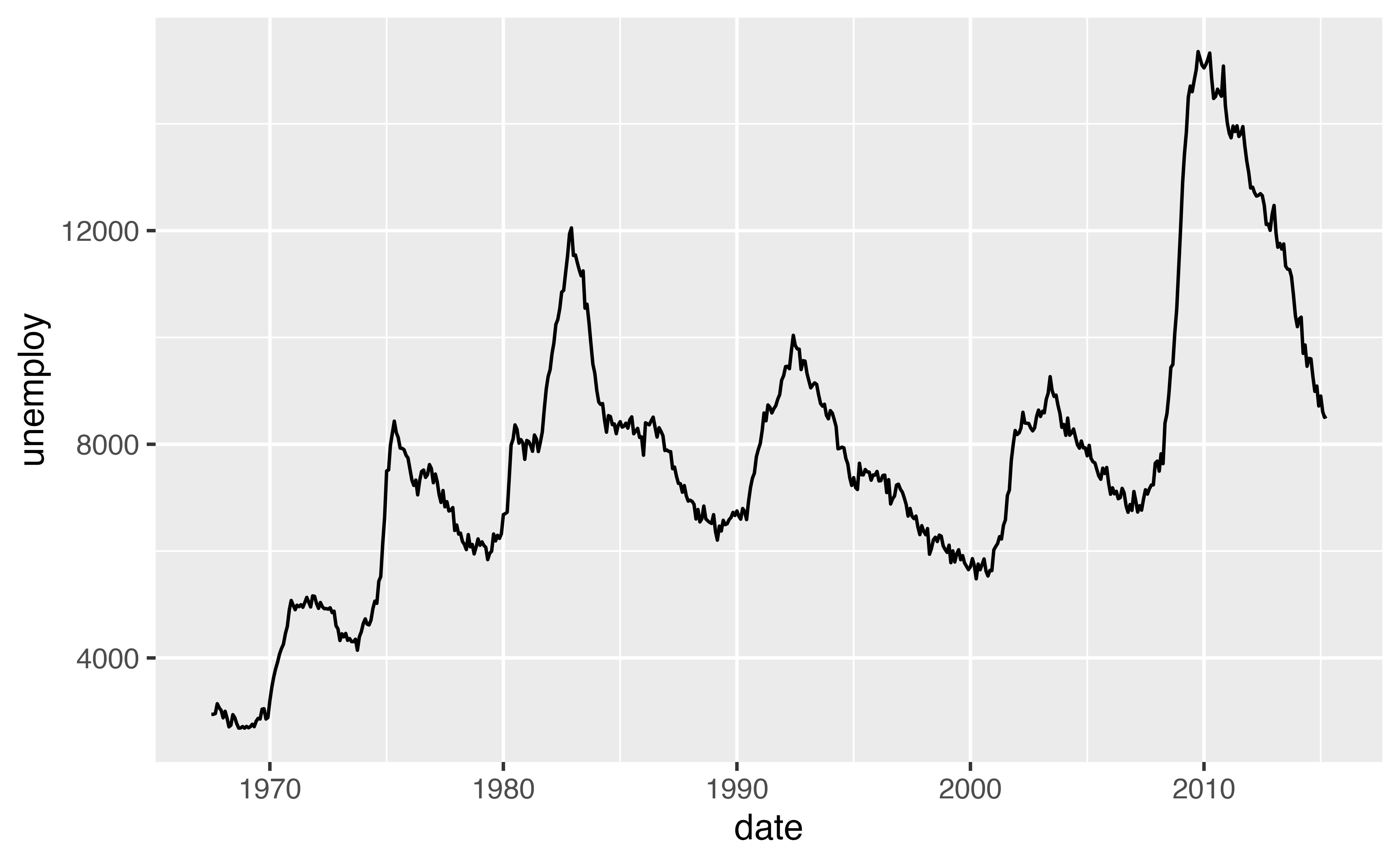
For example, in the plot below, there is only one value of unemploy for each value of date.
geom_line()
Use the geom_line() function to make line graphs. Like geom_point(), it requires x and y aesthetics.
Use geom_line() in the chunk below to recreate the graph above. The graph uses the economics dataset that comes with {ggplot2} and maps the date and unemploy variables to the \(x\) and \(y\) axes. See Visualization Basics if you are completely stuck.
ggplot(economics) +
  geom_line(mapping = aes(x = date, y = unemploy))
Good job! The graph shows the number of unemployed people in the US (in thousands) from 1967 to 2015. Now let’s look at a richer dataset.
asia
I’ve used the {gapminder} package to assemble a new data set named asia to plot. Among other things, asia contains the GDP per capita of four countries from 1952 to 2007.
asia# A tibble: 48 × 6
country continent year lifeExp pop gdpPercap
<fct> <fct> <int> <dbl> <int> <dbl>
1 China Asia 1952 44 556263527 400.
2 China Asia 1957 50.5 637408000 576.
3 China Asia 1962 44.5 665770000 488.
4 China Asia 1967 58.4 754550000 613.
5 China Asia 1972 63.1 862030000 677.
6 China Asia 1977 64.0 943455000 741.
7 China Asia 1982 65.5 1000281000 962.
8 China Asia 1987 67.3 1084035000 1379.
9 China Asia 1992 68.7 1164970000 1656.
10 China Asia 1997 70.4 1230075000 2289.
# ℹ 38 more rowsWhipsawing
However, when we plot the asia data we get an odd looking graph. The line seems to “whipsaw” up and down. Whipsawing is one of the most encountered challenges with line graphs.
ggplot(asia) +
  geom_line(mapping = aes(x = year, y = gdpPercap))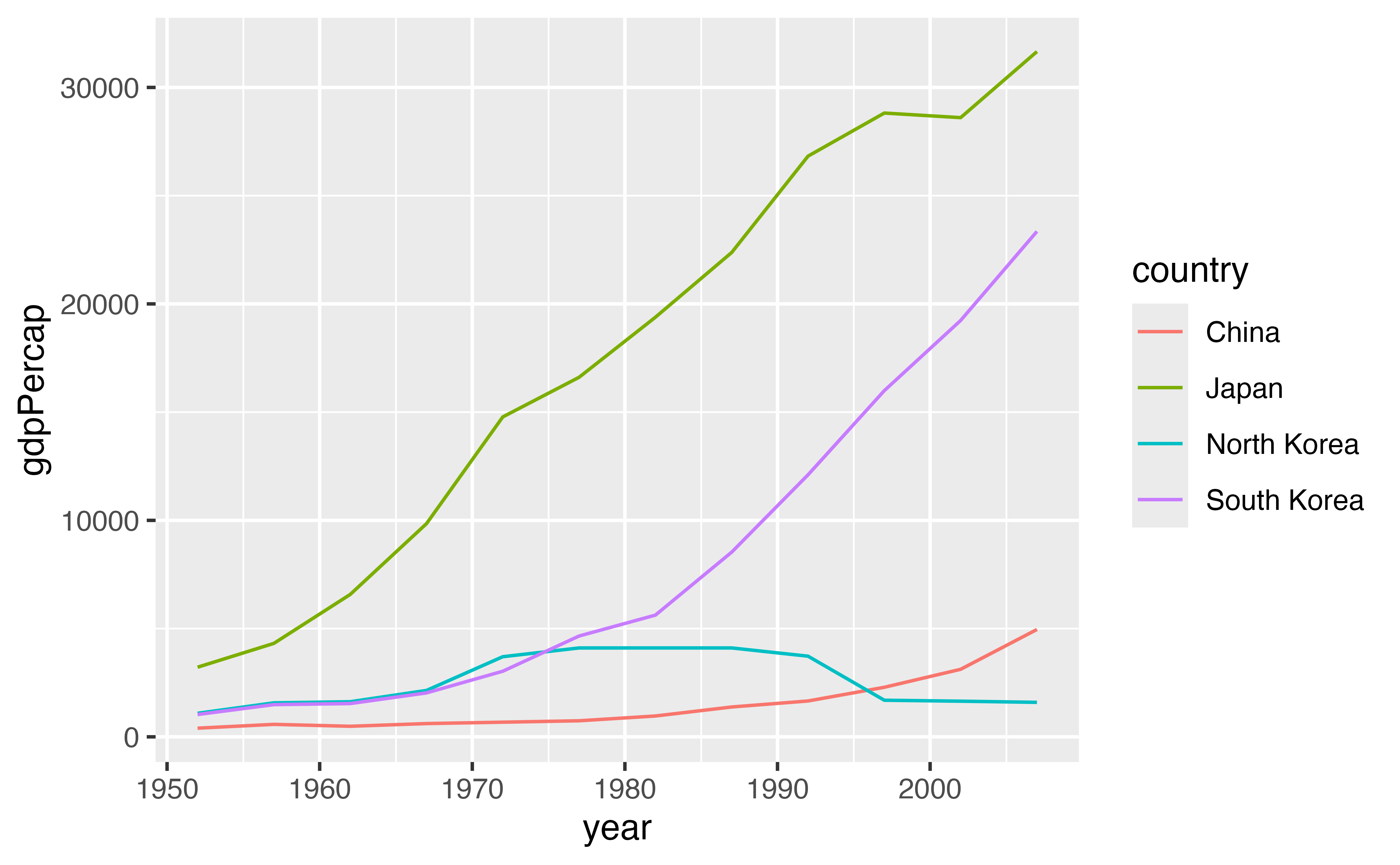
Review 1: Whipsawing
Multiple lines
Redraw our graph as a scatterplot. Can you spot more than one “line” in the data?
ggplot(asia) +
  geom_point(mapping = aes(x = year, y = gdpPercap))
Good job! There are actually four lines in the plot. One for each country: China, Japan, North Korea, and South Korea.
group
Many geoms, like lines, boxplots, and smooth lines, use a single object to display the entire dataset. You can use the group aesthetic to instruct these geoms to draw separate objects for different groups of observations.
For example, in the code below, you can map group to the grouping variable country to create a separate line for each country. Try it. Be sure to place the group mapping inside of aes().
ggplot(asia) +
  geom_line(mapping = aes(x = year, y = gdpPercap, group = country))
Good job! We now have a separate line for each country. Unfortunately, we cannot tell what the countries are: the group aesthetic does not supply a legend. Let’s look at how to fix that.
Aesthetics
You do not have to rely on the group aesthetic to perform a grouping. {ggplot2} will automatically group a monolithic geom whenever you map an aesthetic to a categorical variable.
So for example, the code below performs an implied grouping. And since we use the color aesthetic, the plot includes the color legend.
ggplot(asia) +
  geom_line(mapping = aes(x = year, y = gdpPercap, color = country))
linetype
Lines recognize a useful aesthetic that we haven’t encountered before, linetype. Change color to linetype below and inspect the results. What happens if you map both a color and a linetype to country?
ggplot(asia) +
  geom_line(mapping = aes(x = year, y = gdpPercap, linetype = country, color = country))
Good job! If you map two aesthetics to the same variable, {ggplot2} will combine their legends. Supplementing color with linetype is a good idea if you might print your line chart in black and white.
Exercise 1: Life Expectancy
Use what you’ve learned to plot the life expectancy of each country over time. Life expectancy is saved in the asia data set as lifeExp. Which country has the highest life expectancy? The lowest?
ggplot(asia) +
  geom_line(mapping = aes(x = year, y = lifeExp, color = country, linetype = country))
Good job! Japan has the highest life expectancy and North Korea the worst, but we can see that things haven’t always been this way. Now let’s look at some other ways to display the same information.