Scatterplots
Review 1: geom_point()
In Visualization Basics, you learned how to make a scatterplot with geom_point().
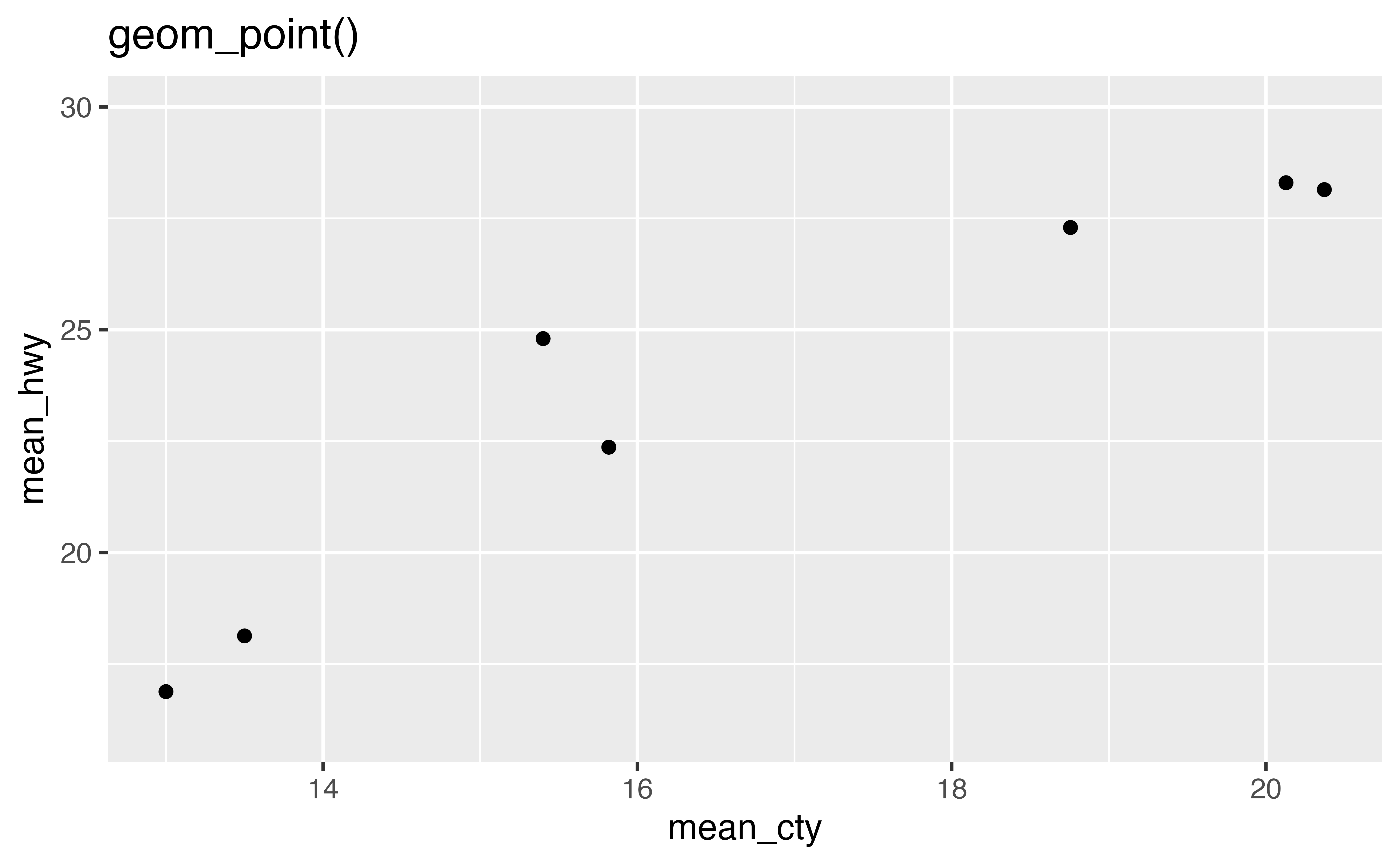
The code below summarizes the mpg data set and begins to plot the results. Finish the plot with geom_point(). Put mean_cty on the \(x\) axis and mean_hwy on the \(y\) axis.
mpg |>
  group_by(class) |>
  summarize(mean_cty = mean(cty), mean_hwy = mean(hwy)) |>
  ggplot() +
    geom_point(mapping = aes(x = mean_cty, y = mean_hwy))
Good job! It can be tricky to remember when to use |> and when to use +. Use |> to add one complete step to a pipe of code. Use + to add one more line to a {ggplot2} call.
geom_text() and geom_label()
geom_text() and geom_label() create scatterplots that use words instead of points to display data. Each requires the extra aesthetic label, which you should map to a variable that contains text to display for each observation.
Convert the plot below from geom_point() to geom_text() and map the label aesthetic to the class variable. When you are finished convert the code to geom_label() and rerun the plot. Can you spot the difference?
mpg |>
  group_by(class) |>
  summarize(mean_cty = mean(cty), mean_hwy = mean(hwy)) |>
  ggplot() +
    geom_text(mapping = aes(x = mean_cty, y = mean_hwy, label = class))

mpg |>
  group_by(class) |>
  summarize(mean_cty = mean(cty), mean_hwy = mean(hwy)) |>
  ggplot() +
    geom_label(mapping = aes(x = mean_cty, y = mean_hwy, label = class))
Good job! geom_text() replaces each point with a piece of text supplied by the label aesthetic. geom_label() replaces each point with a textbox. Notice that some pieces of text overlap each other, and others run off the page. We’ll soon look at a way to fix this.
geom_smooth()
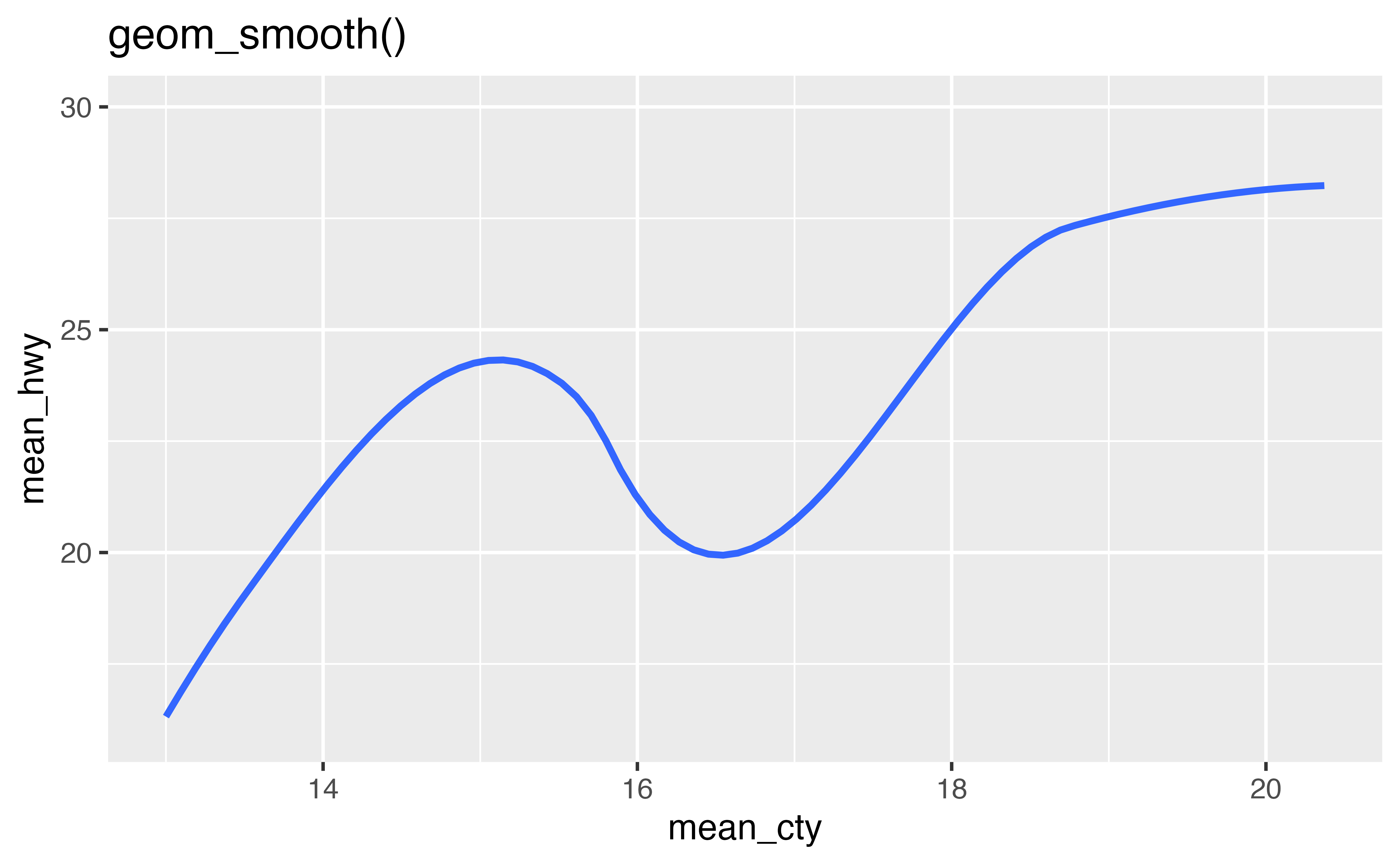
In Visualization Basics, you met geom_smooth(), which provides a summarized version of a scatterplot.
geom_smooth() uses a model to fit a smoothed line to the data and then visualizes the results. By default, geom_smooth() fits a loess smooth to data sets with less than 1,000 observations, and a generalized additive model to data sets with more than 1,000 observations.
method
You can use the method parameter of geom_smooth() to fit and display other types of model lines. To do this, pass method the name of an R modeling function for geom_smooth() to use, such as "lm" (for linear models) or "glm" (for generalized linear models).
In the code below, use geom_smooth() to draw the linear model line that fits the data.
mpg |>
  group_by(class) |>
  summarize(mean_cty = mean(cty), mean_hwy = mean(hwy)) |>
  ggplot() +
    geom_smooth(mapping = aes(x = mean_cty, y = mean_hwy), method = "lm")
Good job! Now let’s look at a way to make geom_smooth() much more useful.