Your name
The history of your name
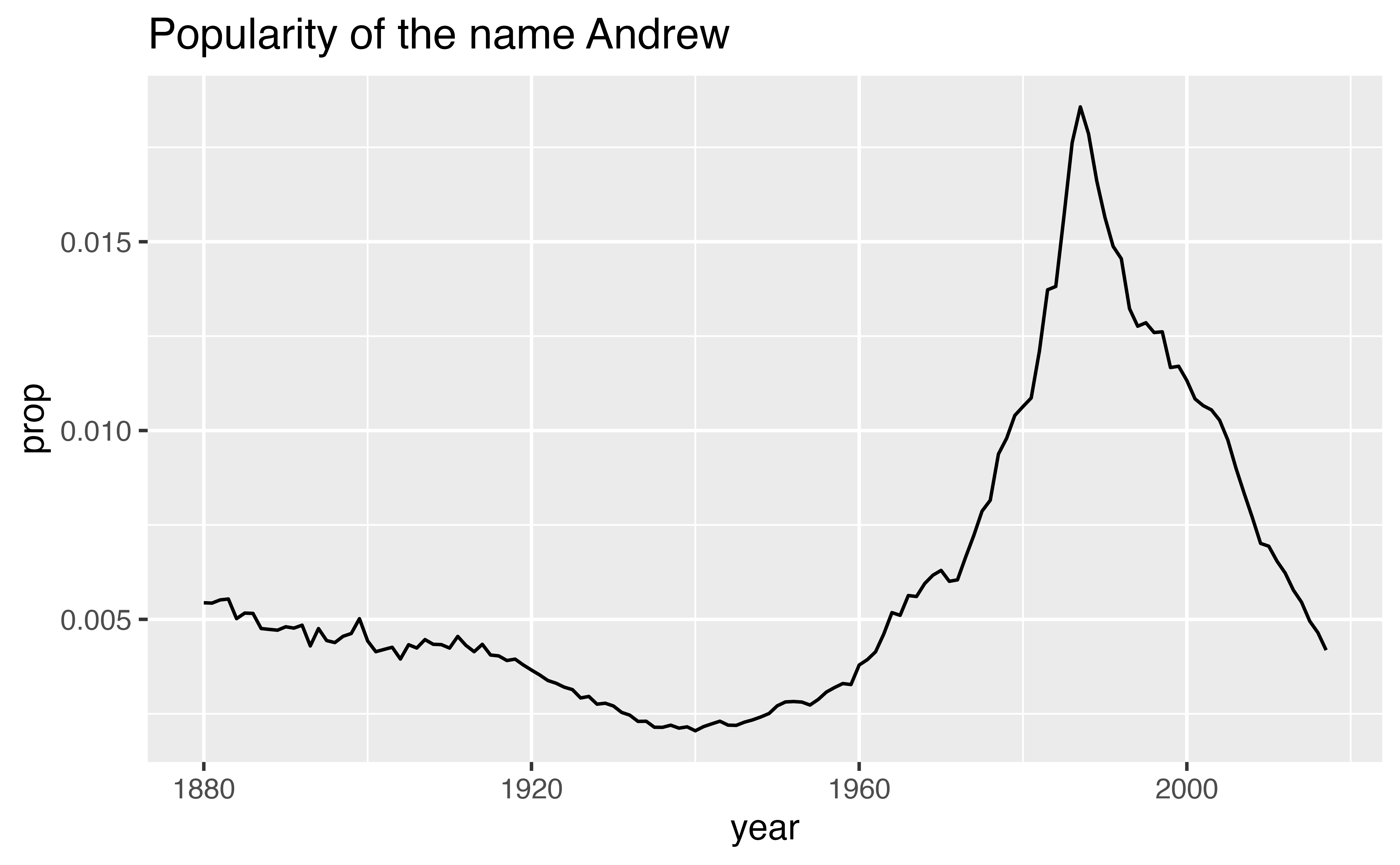
You can use the data in babynames to make graphs like this, which reveal the history of a name, perhaps your name.
But before you do, you will need to trim down babynames. At the moment, there are more rows in babynames than you need to build your plot.
An example
To see what I mean, consider how I made the plot above: I began with the entire dataset, which if plotted as a scatterplot would’ve looked like this.
ggplot(babynames) +
  geom_point(aes(x = year, y = prop)) +
  labs(title = "Popularity of every name in the dataset")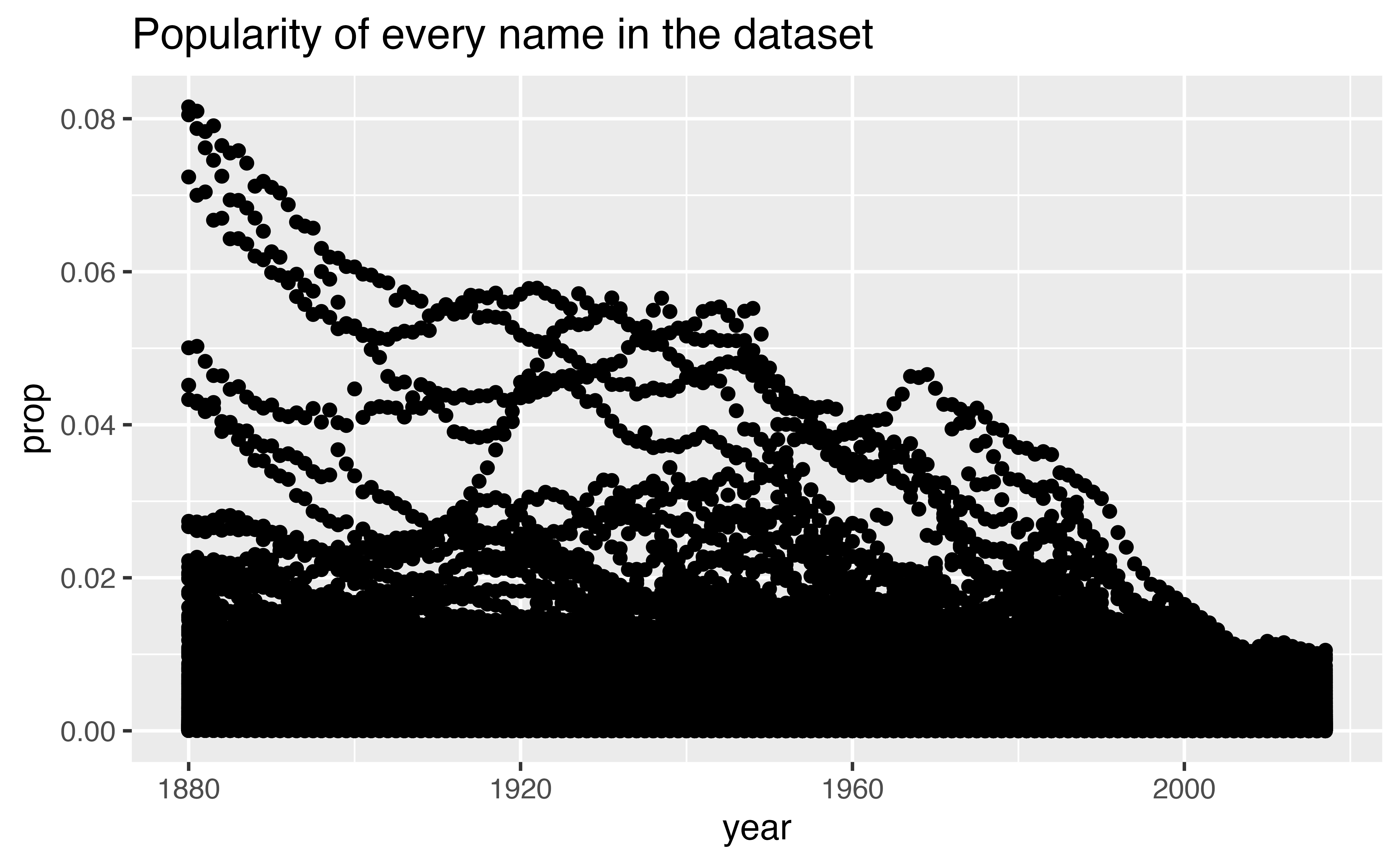
I then narrowed the data to just the rows that contain my name, before plotting the data with a line geom. Here’s how the rows with just my name look as a scatterplot.
babynames |>
  filter(name == "Andrew", sex == "M") |>
  ggplot() +
    geom_point(aes(x = year, y = prop)) +
    labs(title = "Popularity of the name Andrew")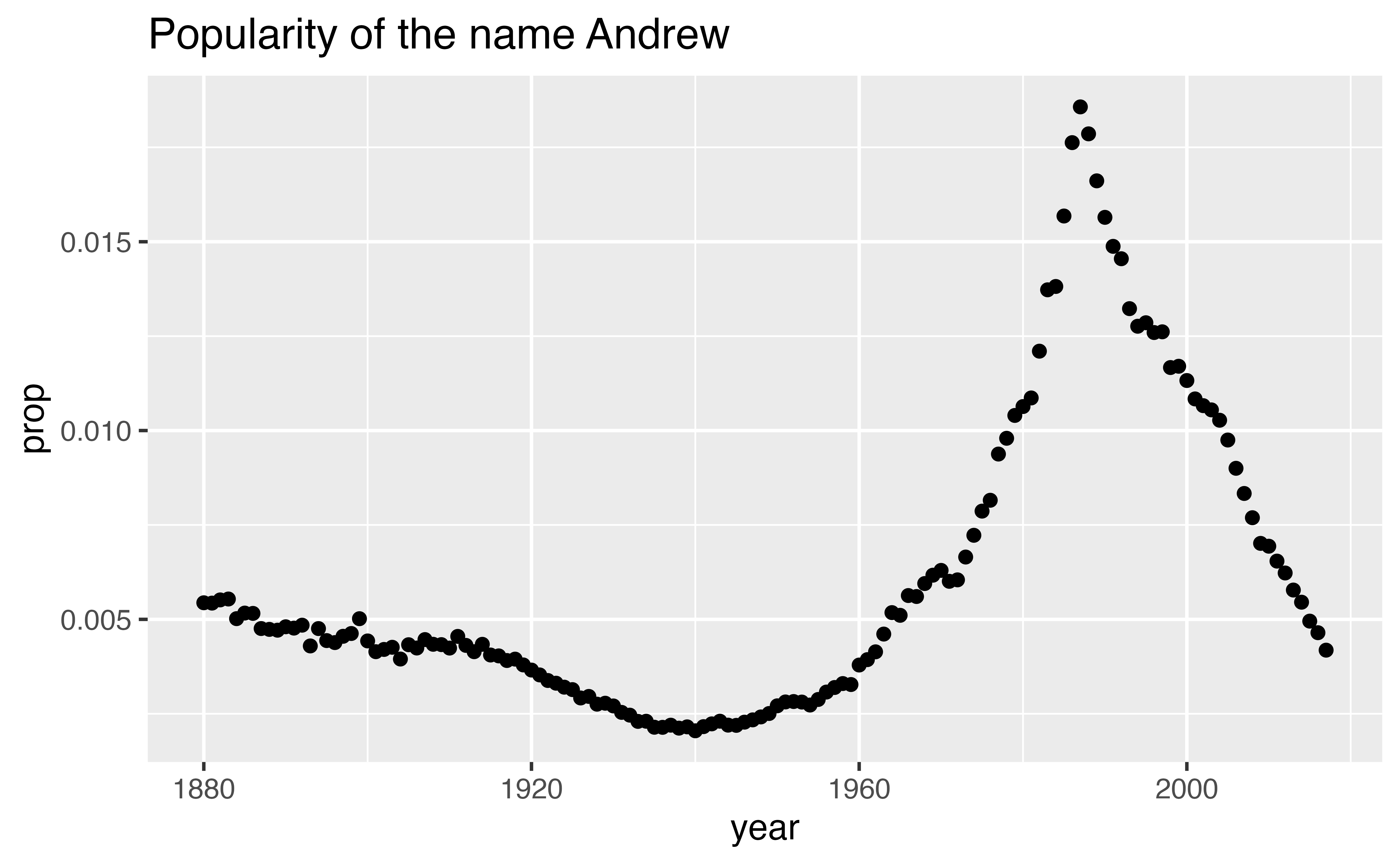
If I had skipped this step, my line graph would’ve connected all of the points in the large dataset, creating an uninformative graph.
ggplot(babynames) +
  geom_line(aes(x = year, y = prop)) +
  labs(title = "Popularity of every name in the dataset")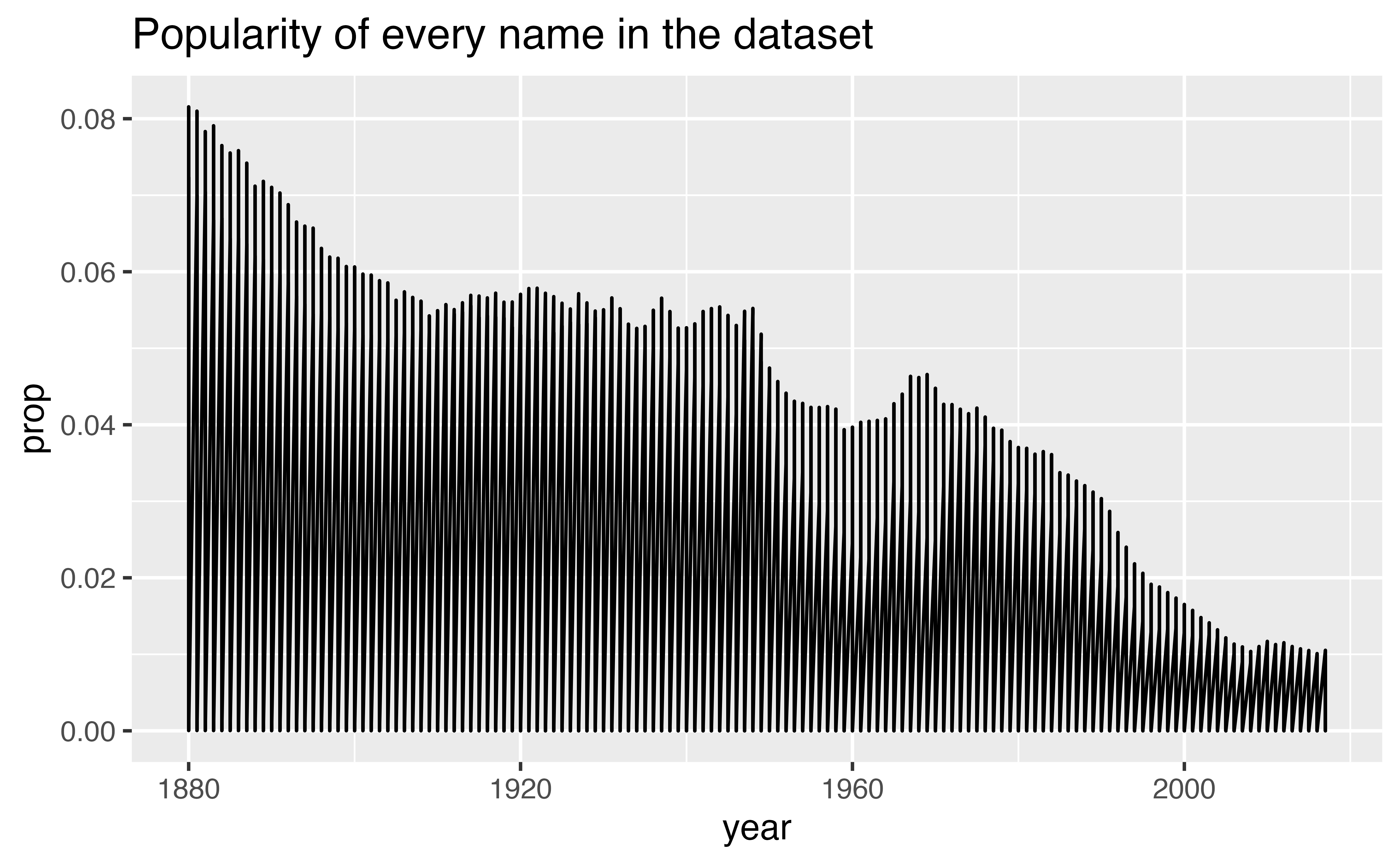
Your goal in this section is to repeat this process for your own name (or a name that you choose). Along the way, you will learn a set of functions that isolate information within a dataset.
Isolating data
This type of task occurs often in data science: you need to extract data from a table before you can use it. You can do this task quickly with three functions that come in the {dplyr} package:
select(), which extracts columns from a data framefilter(), which extracts rows from a data framearrange(), which moves important rows to the top of a data frame
Each function takes a data frame or tibble as its first argument and returns a new data frame or tibble as its output.