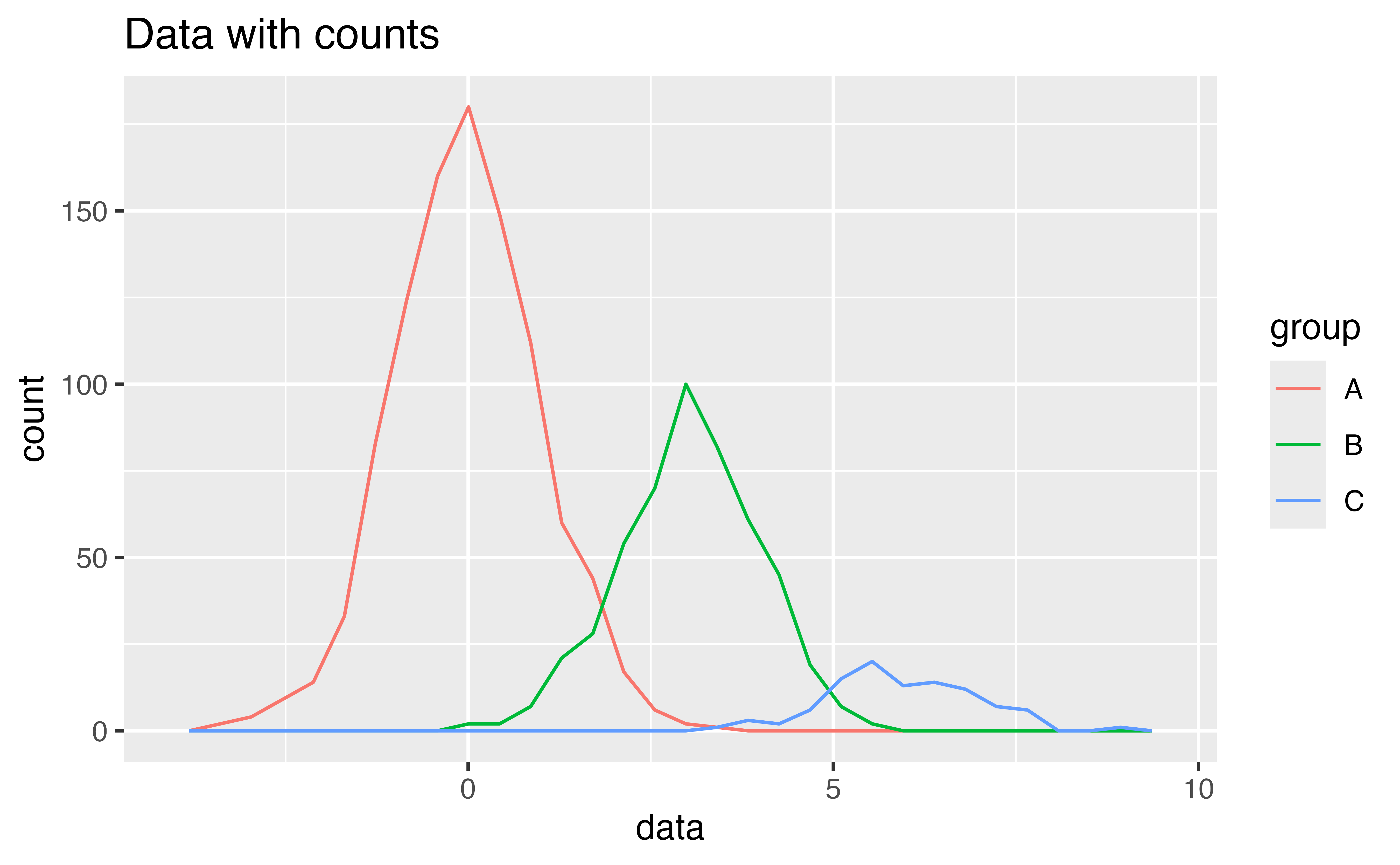
Similar geoms
A problem
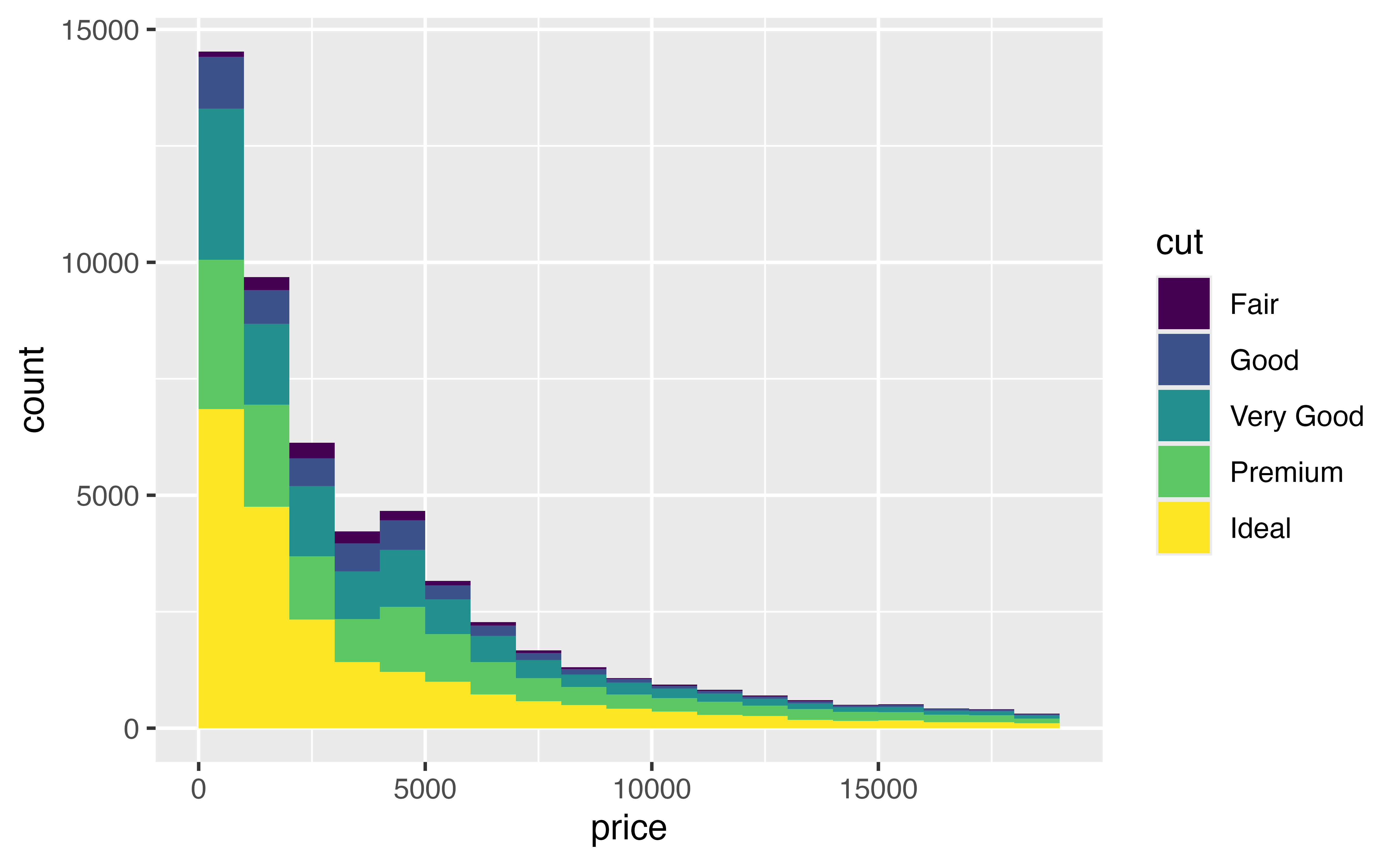
By adding a fill color to our histogram below, we’ve divided the data into five “sub-distributions”: the distribution of price for Fair cut diamonds, for Good cut diamonds, for Very Good cut diamonds, for Premium cut diamonds, and for Ideal cut diamonds.
But this display has some shortcomings:
- it is difficult to see the “shapes” of the individual distributions
- it is difficult to compare the individual distributions, because they do not share a common baseline value for \(y\).
A solution
We can improve the plot by using a different geom to display the distributions of price values. {ggplot2} includes three geoms that display the same information as a histogram, but in different ways:
geom_freqpoly()geom_density()geom_dotplot()
geom_freqpoly()
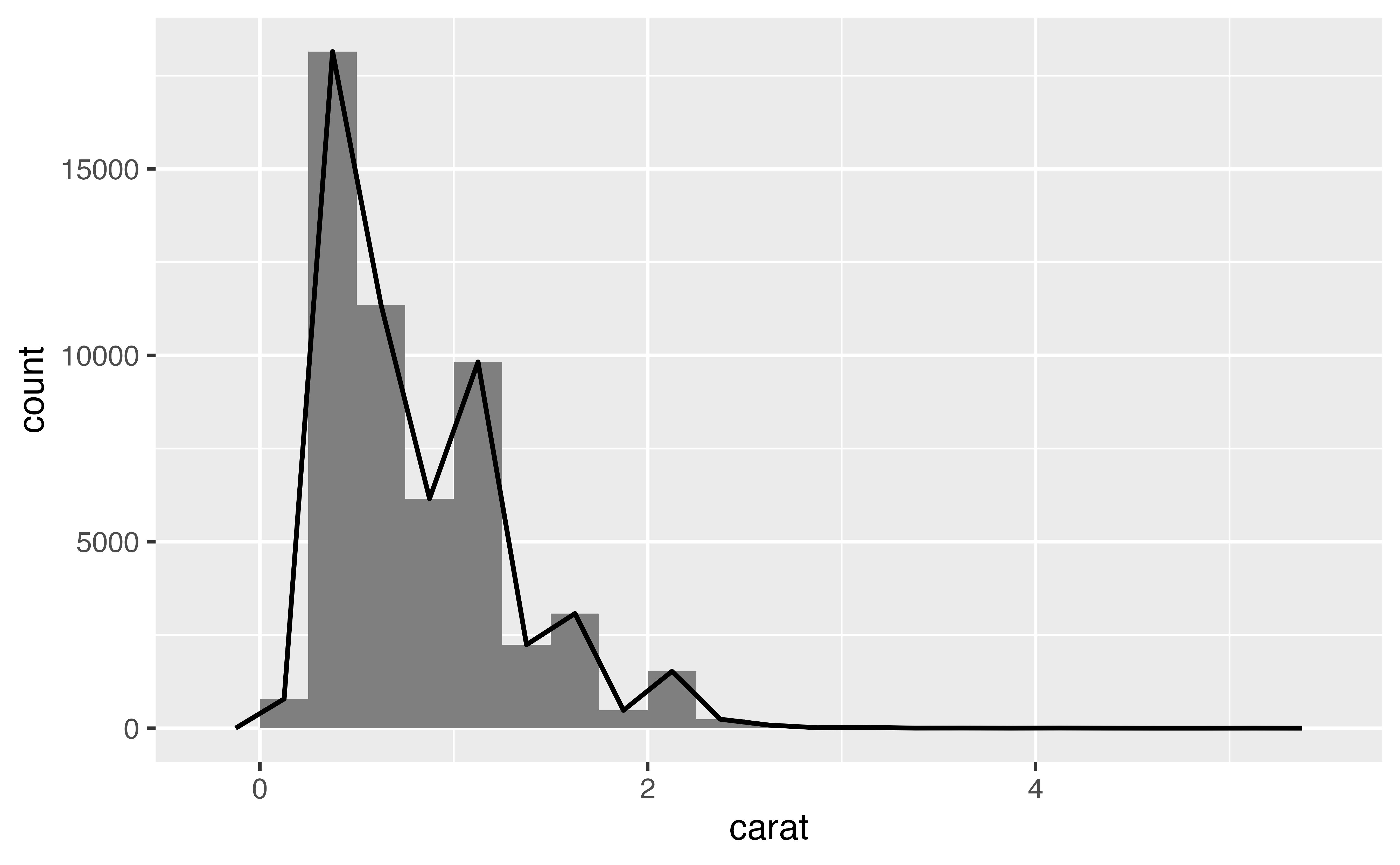
geom_freqpoly() plots a frequency polygon, which uses a line to display the same information as a histogram. You can think of a frequency polygon as a line that would connect the top of each bar that appears in a histogram, like this:
Note that the bars are not part of the frequency polygon; they are just there for reference. geom_freqpoly() recognizes the same parameters as geom_histogram(), such as bins, binwidth, and boundary.
Exercise 6: Frequency polygons
Create the frequency polygon depicted above. It has a binwidth of 0.25 and starts at the boundary zero.
ggplot(data = diamonds) +
  geom_freqpoly(mapping = aes(x = carat), binwidth = 0.25, boundary = 0)
Good job! By using a line instead of bars, frequency polygons can sometimes do things that histograms cannot.
Exercise 7: Multiple frequency polygons
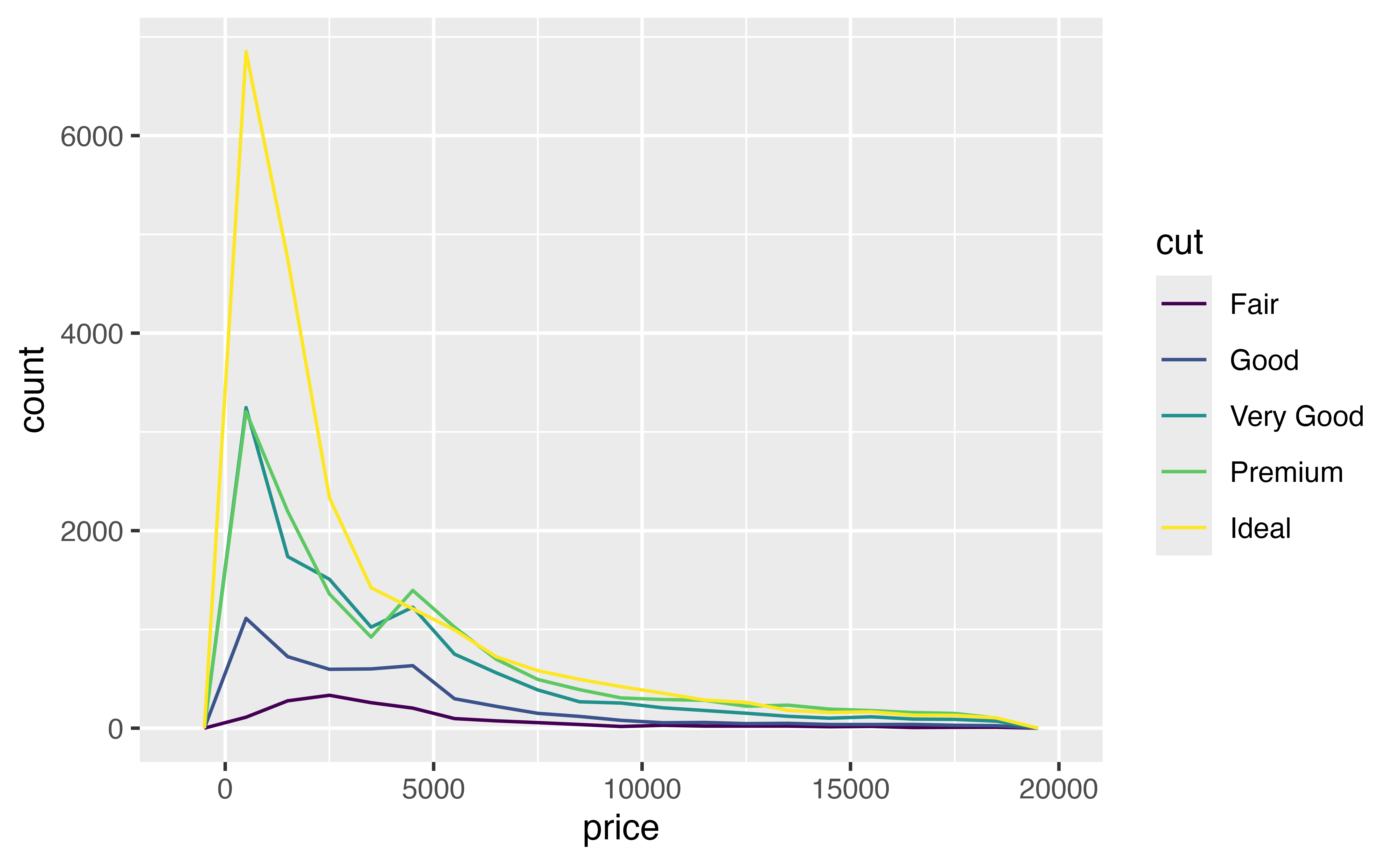
Use a frequency polygon to replace our chart of price and cut. Since lines do not have “substance” like bars, you will want to use the color aesthetic instead of the fill aesthetic.

ggplot(data = diamonds) +
  geom_freqpoly(mapping = aes(x = price, color = cut), binwidth = 1000, boundary = 0)
Good job! Since lines do not occlude each other, geom_freqpoly() plots each subgroup against the same baseline: y = 0 (i.e. it unstacks the subgroups). This makes it easier to compare the distributions. You can now see that for almost every price value, there are more Ideal cut diamonds than there are other types of diamonds.
geom_density()
Our frequency polygon highlights a second shortcoming with our graph: it is difficult to compare the shapes of the distributions because some subgroups contain more diamonds than others. This compresses smaller subgroups into the bottom of the graph.
You can avoid this with geom_density().
Density curves
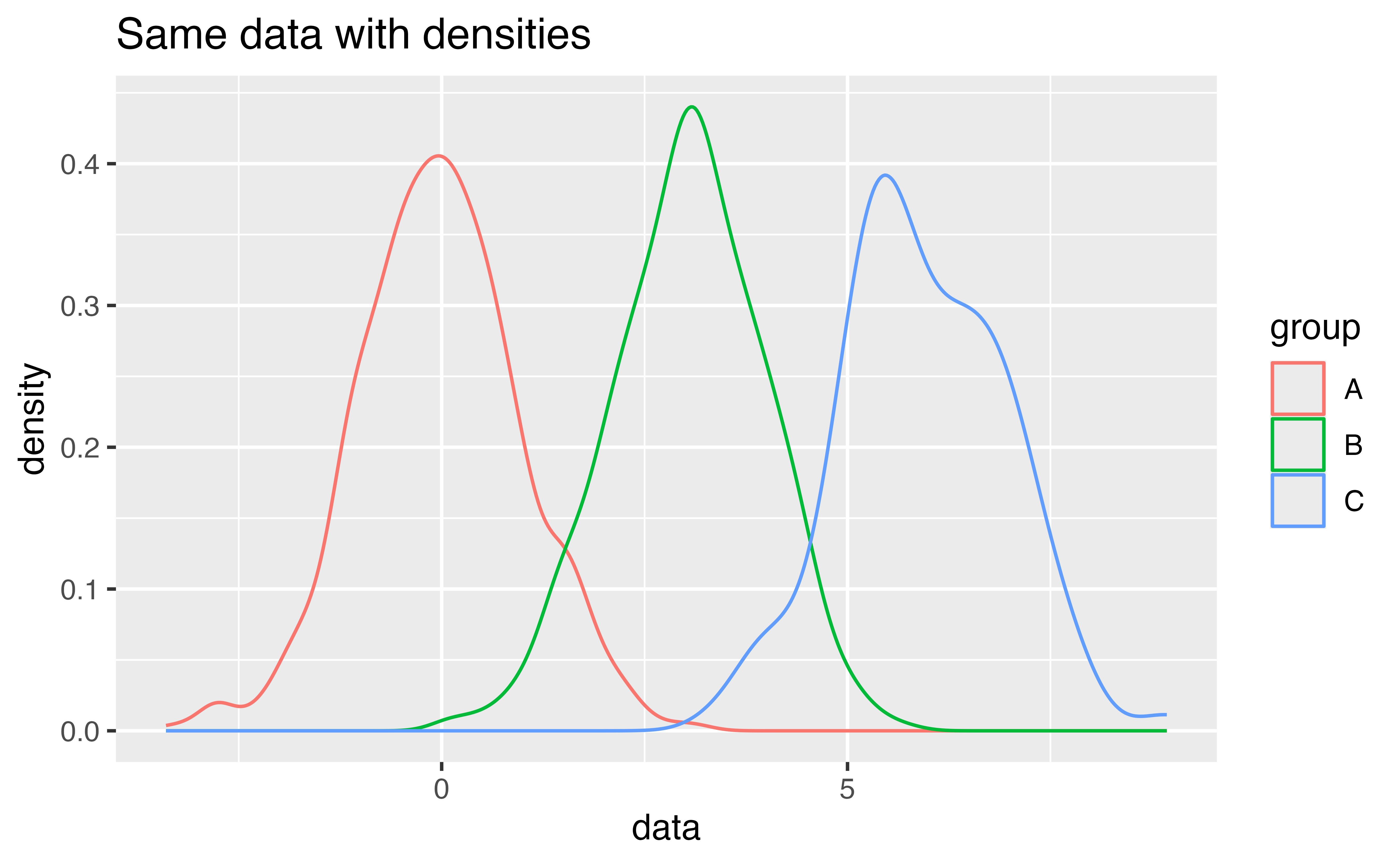
geom_density() plots a kernel density estimate (i.e. a density curve) for each distribution. This is a smoothed representation of the data, analogous to a smoothed histogram.
Density curves do not plot count on the \(y\) axis but density, which is analogous to the count divided by the total number of observations. Densities makes it easy to compare the distributions of subgroups. When you plot multiple subgroups, each density curve will contain the same area under its curve.
Exercise 8: Density curves
Re-draw this histogram with density curves. How do you interpret the results?

ggplot(data = diamonds) +
  geom_density(mapping = aes(x = price, color = cut))
Good job! You can now compare the most common prices for each subgroup. For example, the plot shows that the most common price for most diamonds is near $1000. However, the most common price for Fair cut diamonds is significantly higher, about $2500. We will come back to this oddity in a later tutorial.
Density parameters
Density plots do not take bin, binwidth, and boundary parameters. Instead they recognize kernel and smoothing parameters that are used in the density fitting algorithm, which is fairly sophisticated.
In practice, you can obtain useful results quickly with the default parameters of geom_density(). If you’d like to learn more about density estimates and their tuning parameters, begin with the help page at ?geom_density().
geom_dotplot()
ggplot2 provides a final geom for displaying one dimensional distributions: geom_dotplot(). geom_dotplot() represents each observation with a dot and then stacks dots within bins to create the semblance of a histogram.
Dotplots can provide an intuitive display of the data, but they have several shortcomings. Dotplots are not ideal for large data sets like diamonds, and provide meaningless \(y\) axis labels. I also find that the tuning parameters of geom_dotplot() make dotplots too slow to work with for EDA.
Exercise 9: Facets
Instead of changing geoms, you can make the subgroups in our original plot easier to compare by facetting the data. Extend the code below to facet by cut.
ggplot(data = diamonds) +
  geom_histogram(mapping = aes(x = price, fill = cut), binwidth = 1000, boundary = 0) +
  facet_wrap(vars(cut))
Good job! Facets make it easier to compare subgroups, but at the expense of separating the data. You may decide that frequency polygons and densities allow more direct comparisons.
Recap
In this tutorial, you learned how to visualize distributions with histograms, frequency polygons, and densities. But what should you look for in these visualizations?
Look for places with lots of data. Tall bars reveal the most common values in your data; you can expect these values to be the “typical values” for your variable.
Look for places with little data. Short bars reveal uncommon values. These values appear rarely and you might be able to figure out why.
Look for outliers. Bars that appear away from the bulk of the data are outliers, special cases that may reveal unexpected insights.
Sometimes outliers cannot be seen in a plot, but can be inferred from the range of the \(x\) axis. For example, many of the plots in this tutorial seemed to extend well past the end of the data. Why? Because the range was stretched to include outliers. When your data set is large, like
diamonds, the bar that describes an outlier may be invisible (i.e. less than one pixel high).Look for clusters.
Look for shape. The shape of a histogram can often indicate whether or not a variable behaves according to a known probability distribution.
The most important thing to remember about histograms, frequency polygons, and dotplots is to explore different binwidths. The binwidth of a histogram determines what information the histogram displays. You cannot predict ahead of time which binwidth will reveal unexpected information.