Counts
geom_count()
Boxplots provide an efficient way to explore the interaction of a continuous variable and a categorical variable. But what if you have two categorical variables?
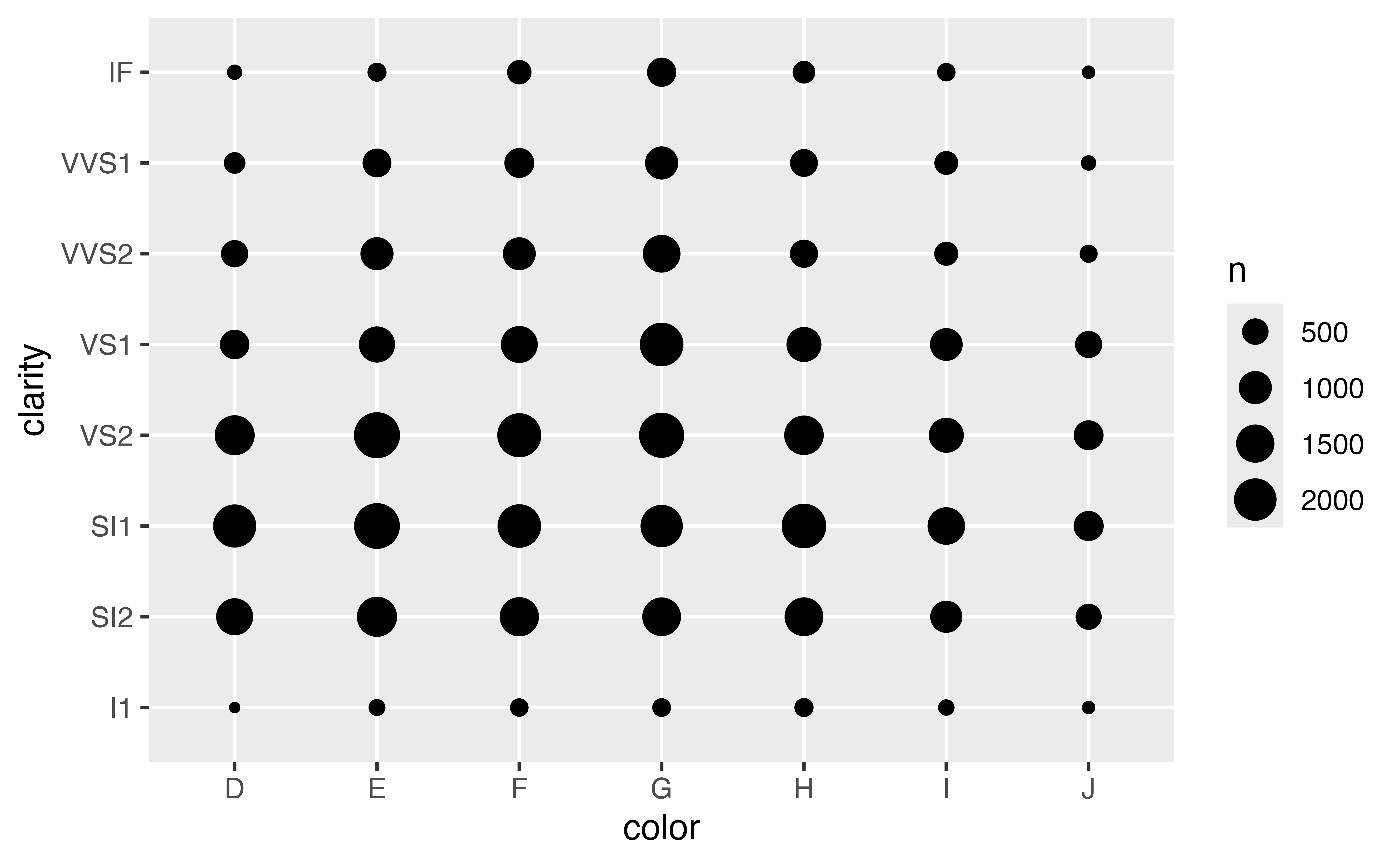
You can see how observations are distributed across two categorical variables with geom_count(). geom_count() draws a point at each combination of values from the two variables. The size of the point is mapped to the number of observations with this combination of values. Rare combinations will have small points, frequent combinations will have large points.
Exercise 8: Count plots
Use geom_count() to plot the interaction of the cut and clarity variables in the diamonds data set.
ggplot(data = diamonds) +
  geom_count(mapping = aes(x = cut, y = clarity))
count()
You can use the count() function in the {dplyr} package to compute the count values displayed by geom_count(). To use count(), pass it a data frame and then the names of zero or more variables in the data frame. count() will return a new table that lists how many observations occur with each possible combination of the listed variables.
So for example, the code below returns the counts that you visualized in Exercise 8.
diamonds |>
  count(cut, clarity)
# A tibble: 40 × 3
cut clarity n
<ord> <ord> <int>
1 Fair I1 210
2 Fair SI2 466
3 Fair SI1 408
4 Fair VS2 261
5 Fair VS1 170
6 Fair VVS2 69
7 Fair VVS1 17
8 Fair IF 9
9 Good I1 96
10 Good SI2 1081
# ℹ 30 more rowsHeat maps
Heat maps provide a second way to visualize the relationship between two categorical variables. They work like count plots, but use a fill color instead of a point size, to display the number of observations in each combination.
How to make a heat map
{ggplot2} does not provide a geom function for heat maps, but you can construct a heat map by plotting the results of count() with geom_tile().
To do this, set the x and y aesthetics of geom_tile() to the variables that you pass to count(). Then map the fill aesthetic to the n variable computed by count(). The plot below displays the same counts as the plot in Exercise 8.
diamonds |>
  count(cut, clarity) |>
  ggplot() +
    geom_tile(mapping = aes(x = cut, y = clarity, fill = n))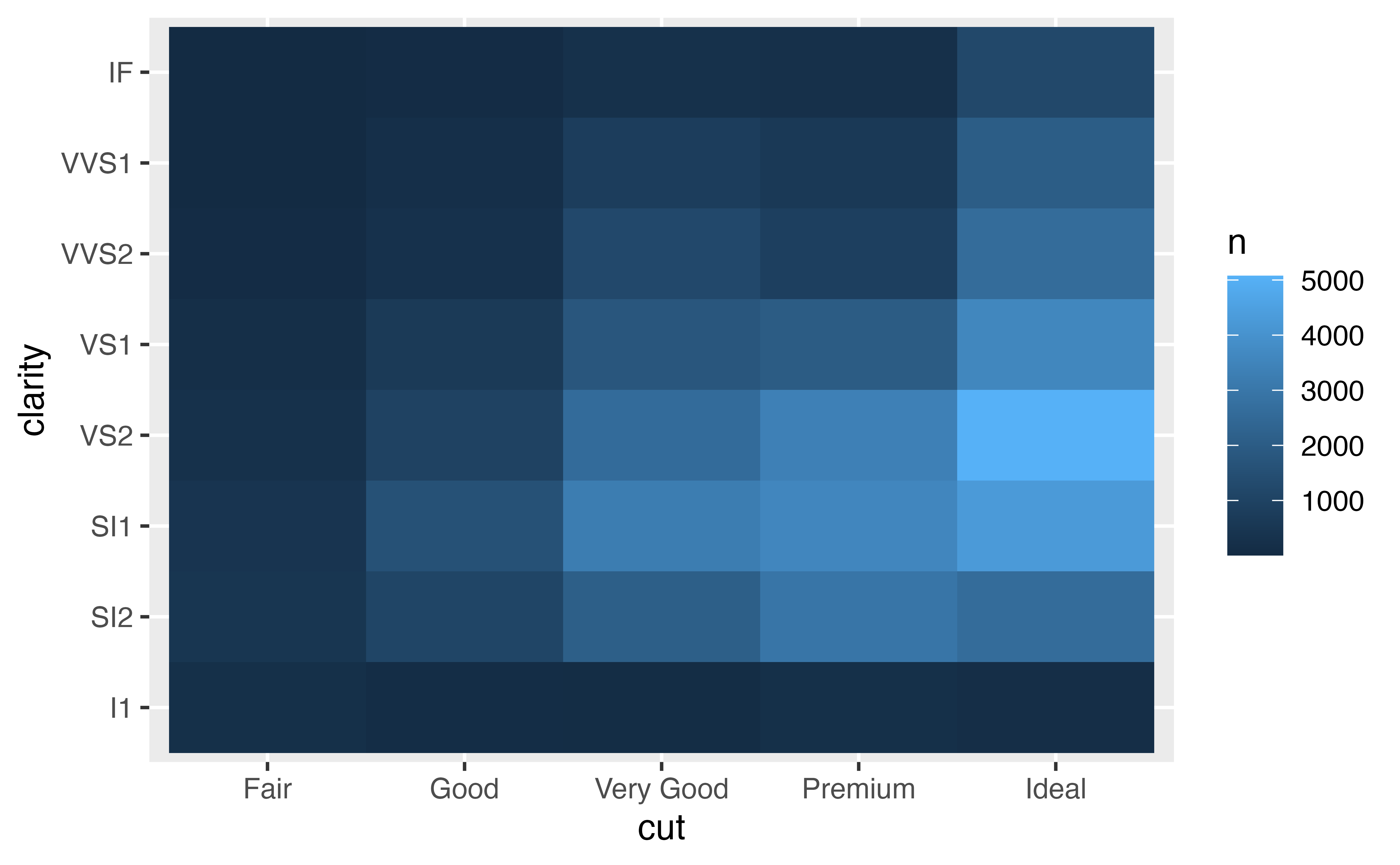
Exercise 9: Make a heat map
Practice the method above by re-creating the heat map below.
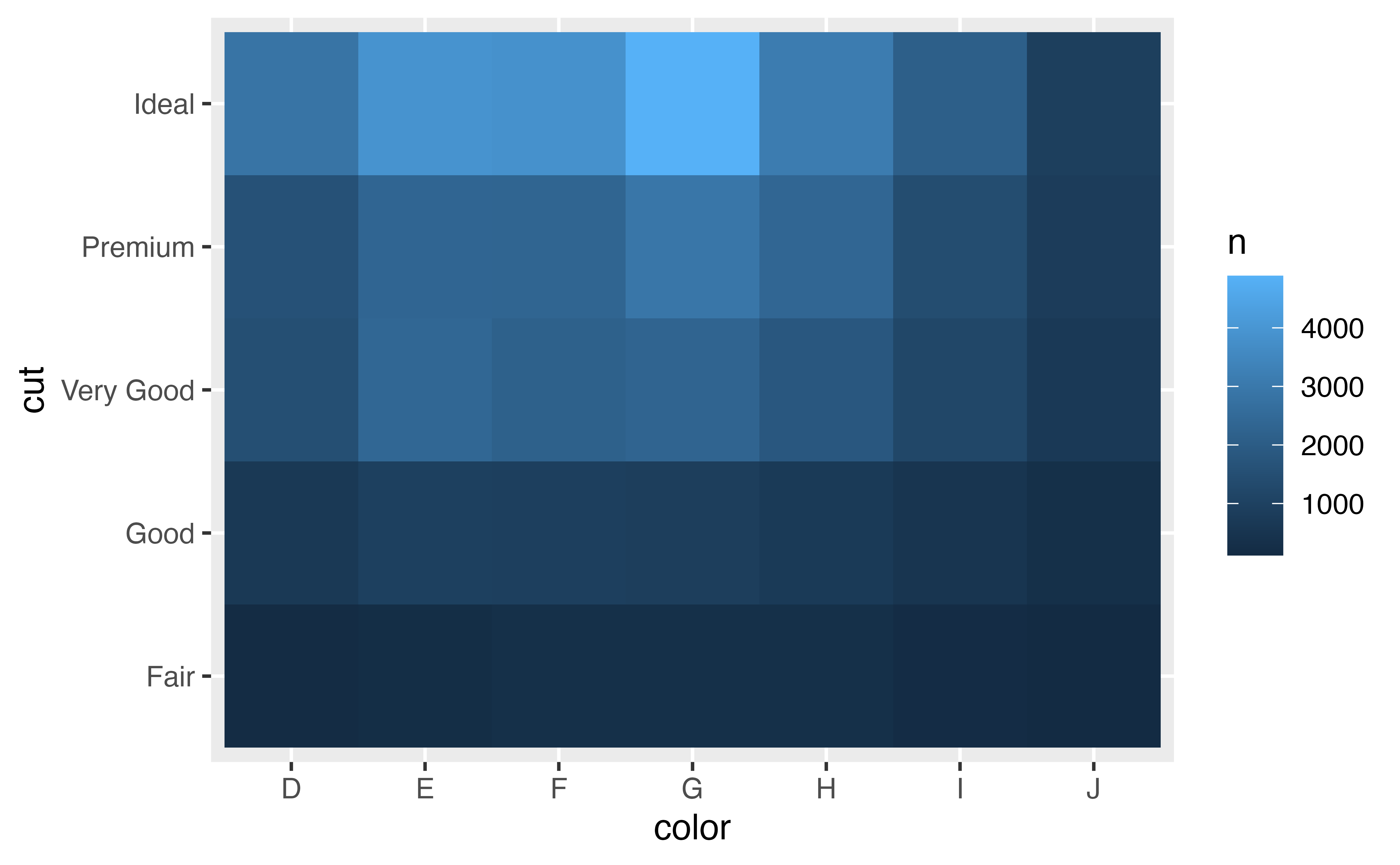
diamonds |>
  count(color, cut) |>
  ggplot(mapping = aes(x = color, y = cut)) +
    geom_tile(mapping = aes(fill = n))
Good job!
Recap
Boxplots, dotplots and violin plots provide an easy way to look for relationships between a continuous variable and a categorical variable. Violin plots convey a lot of information quickly, but boxplots have a head start in popularity—they were easy to use when statisticians had to draw graphs by hand.
In any of these graphs, look for distributions, ranges, medians, skewness or anything else that catches your eye to change in an unusual way from distribution to distribution. Often, you can make patterns even more revealing with the fct_reorder() function from the {forcats} package (we’ll wait to learn about {forcats} until after you study factors).
Count plots and heat maps help you see how observations are distributed across the interactions of two categorical variables.