Zooming
In the previous tutorials, you learned how to visualize data with graphs. Now let’s look at how to customize the look and feel of your graphs. To do that we will need to begin with a graph that we can customize.
Review 1: Make a plot
In the chunk below, make a plot that uses boxplots to display the relationship between the cut and price variables from the diamonds dataset.
ggplot(diamonds) +
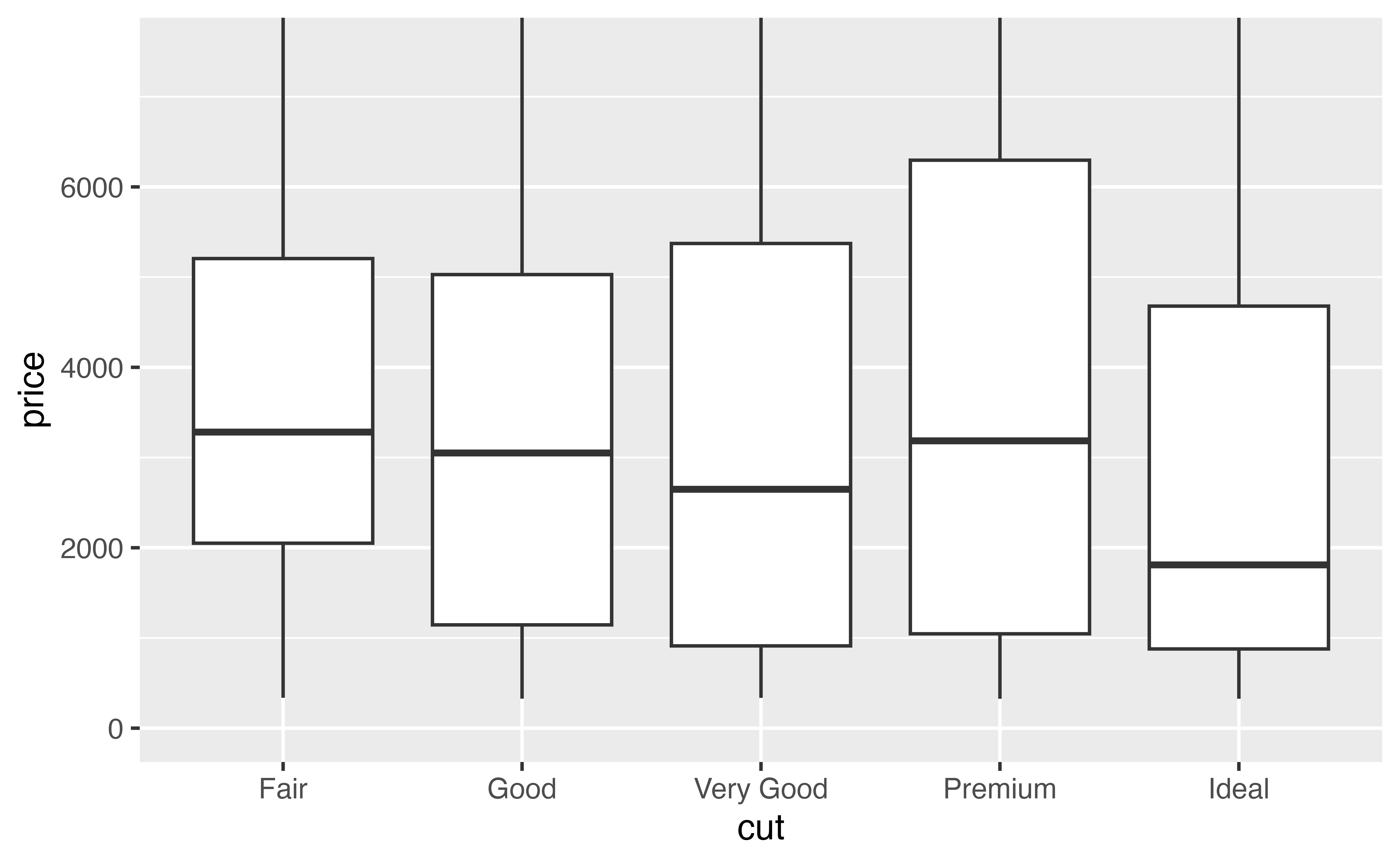
geom_boxplot(mapping = aes(x = cut, y = price))Good job! Let’s use this plot as a starting point to make a more pleasing plot that displays a clear message.
Storing plots
Since we want to use this plot again later, let’s go ahead and save it.
p <- ggplot(diamonds) +
  geom_boxplot(mapping = aes(x = cut, y = price))
Now whenever you call p, R will draw your plot. Try it and see.
pGood job! By the way, have you taken a moment to look at what the plot shows? Let’s do that now.
Surprise?
Our plot shows something surprising: when you group diamonds by cut, the worst cut diamonds have the highest median price. It’s a little hard to see in the plot, but you can verify it with some data manipulation.
diamonds |>
  group_by(cut) |>
  summarise(median = median(price))
# A tibble: 5 × 2
cut median
<ord> <dbl>
1 Fair 3282
2 Good 3050.
3 Very Good 2648
4 Premium 3185
5 Ideal 1810 Zoom

The difference between median prices is hard to see in our plot because each group contains distant outliers.
We can make the difference easier to see by zooming in on the low values of \(y\), where the medians are located. There are two ways to zoom with {ggplot2}: with and without clipping.
Clipping
Clipping refers to how R should treat the data that falls outside of the zoomed region. To see its effect, look at these plots. Each zooms in on the region where price is between $0 and $7,500.


- The plot on the left zooms by clipping. It removes all of the data points that fall outside of the desired region, and then plots the data points that remain.
- The plot on the right zooms without clipping. You can think of it as drawing the entire graph and then zooming into a certain region.
xlim() and ylim()
Of these, zooming by clipping is the easiest to do. To zoom your graph on the \(x\) axis, add the function xlim() to the plot call. To zoom on the \(y\) axis add the function ylim(). Each takes a minimum value and a maximum value to zoom to, like this
some_plot +
  xlim(0, 100)
Exercise 1: Clipping
Use ylim() to recreate our plot on the left from above. The plot zooms the \(y\) axis from 0 to 7,500 by clipping.
p + ylim(0, 7500)Good job! Zooming by clipping will sometimes make the graph you want, but in our case it is a very bad idea. Can you tell why?
A caution
Zooming by clipping is a bad idea for boxplots. ylim() fundamentally changes the information conveyed in the boxplots because it throws out some of the data before drawing the boxplots. Those aren’t the medians of the entire data set that we are looking at.
How then can we zoom without clipping?
xlim and ylim
To zoom without clipping, set the xlim and/or ylim arguments of your plot’s coord_ function. Each takes a numeric vector of length two (the minimum and maximum values to zoom to).
This is easy to do if your plot explicitly calls a coord_ function
p + coord_flip(ylim = c(0, 7500))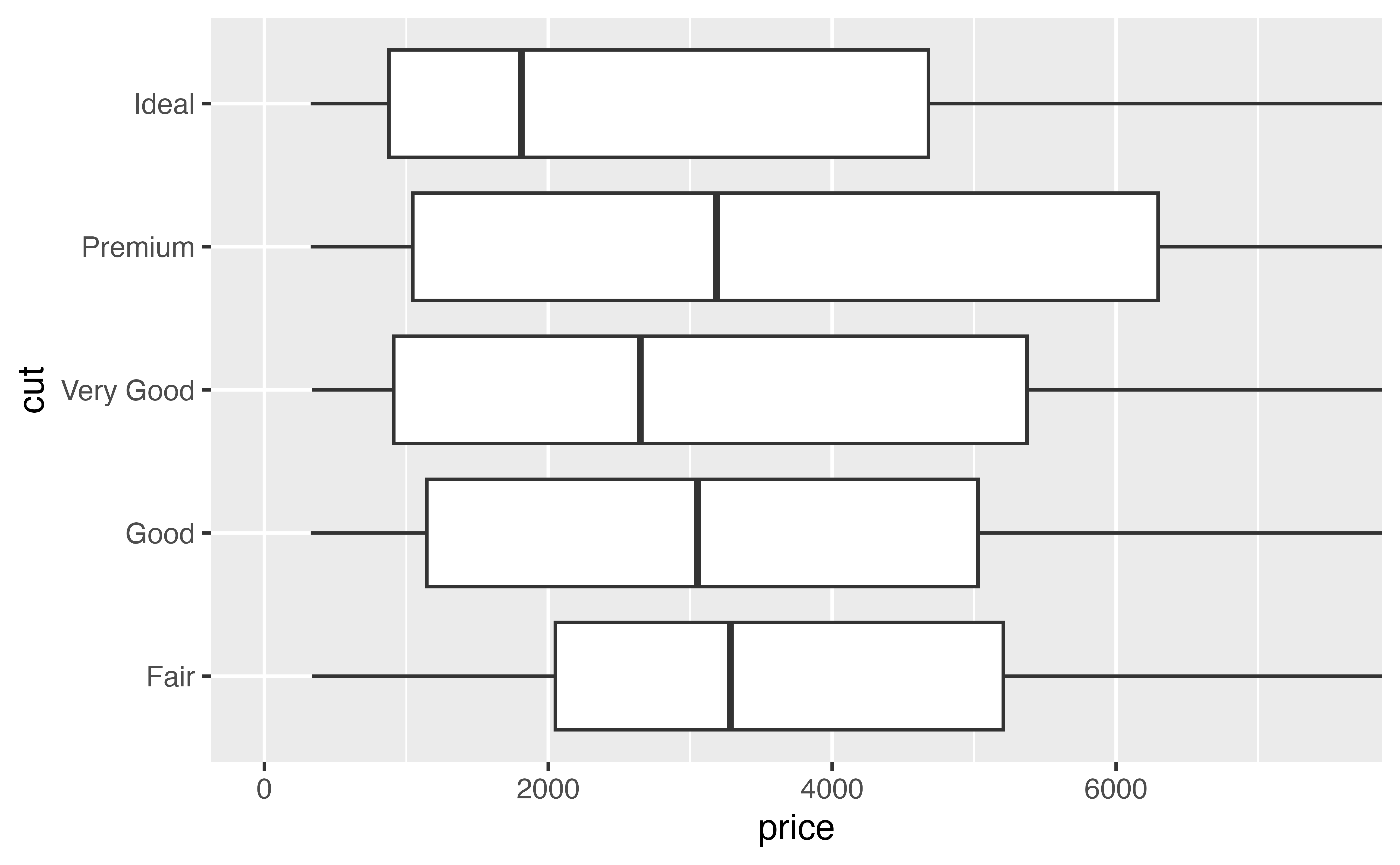
coord_cartesian()
But what if your plot doesn’t call a coord_ function? Then your plot is using Cartesian coordinates (the default). You can adjust the limits of your plot without changing the default coordinate system by adding coord_cartesian() to your plot.
Try it below. Use coord_cartesian() to zoom p to the region where price falls between 0 and 7500.
p + coord_cartesian(ylim = c(0, 7500))Good job! Now it is much easier to see the differences in the median.
p
Notice that our code so far has used p to make a plot, but it hasn’t changed the plot that is saved inside of p. You can run p by itself to get the unzoomed plot.
p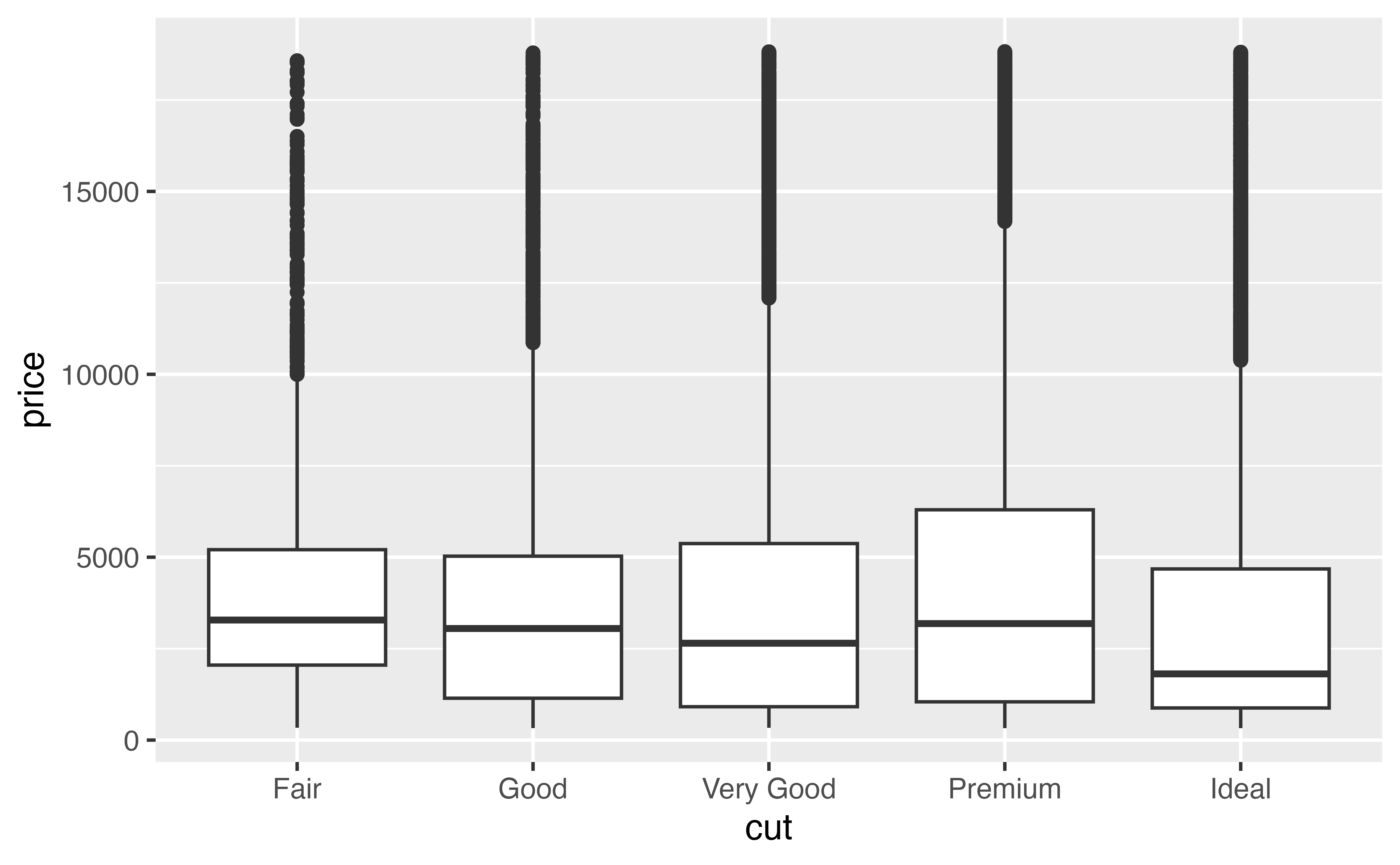
Updating p
I like the zooming, so I’m purposefully going to overwrite the plot stored in p so that it uses it.
p <- p + coord_cartesian(ylim = c(0, 7500))
p