Labels
labs()
The relationship in our plot is now easier to see, but that doesn’t mean that everyone who sees our plot will spot it. We can draw their attention to the relationship with a label, like a title or a caption.
To do this, we will use the labs() function. You can think of labs() as an all purpose function for adding labels to a {ggplot2} plot.
Titles
Give labs() a title argument to add a title.
p + labs(title = "The title appears here")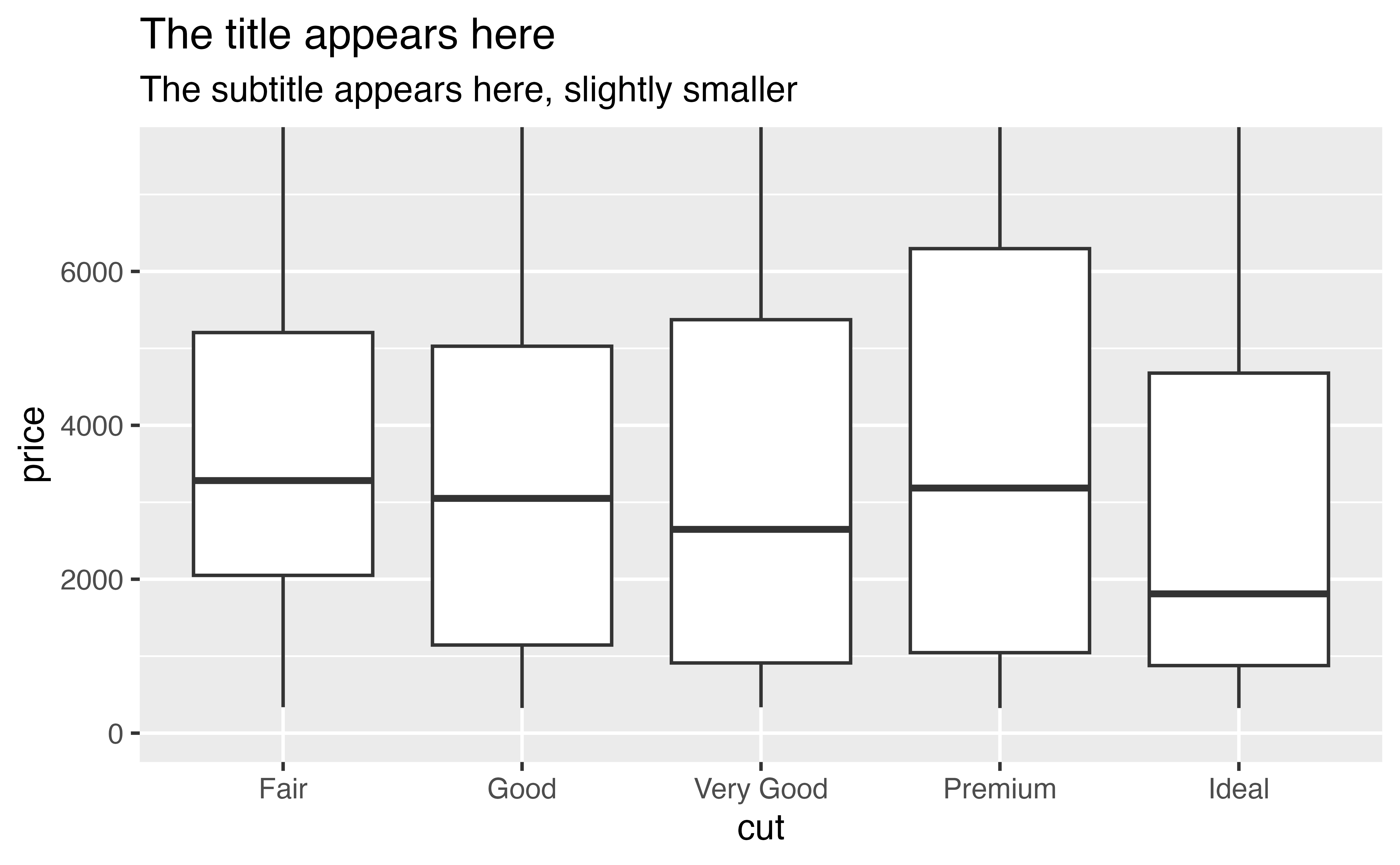
Subtitles
Give labs() a subtitle argument to add a subtitle. If you use multiple arguments, remember to separate them with a comma.
p + labs(title = "The title appears here",
         subtitle = "The subtitle appears here, slightly smaller")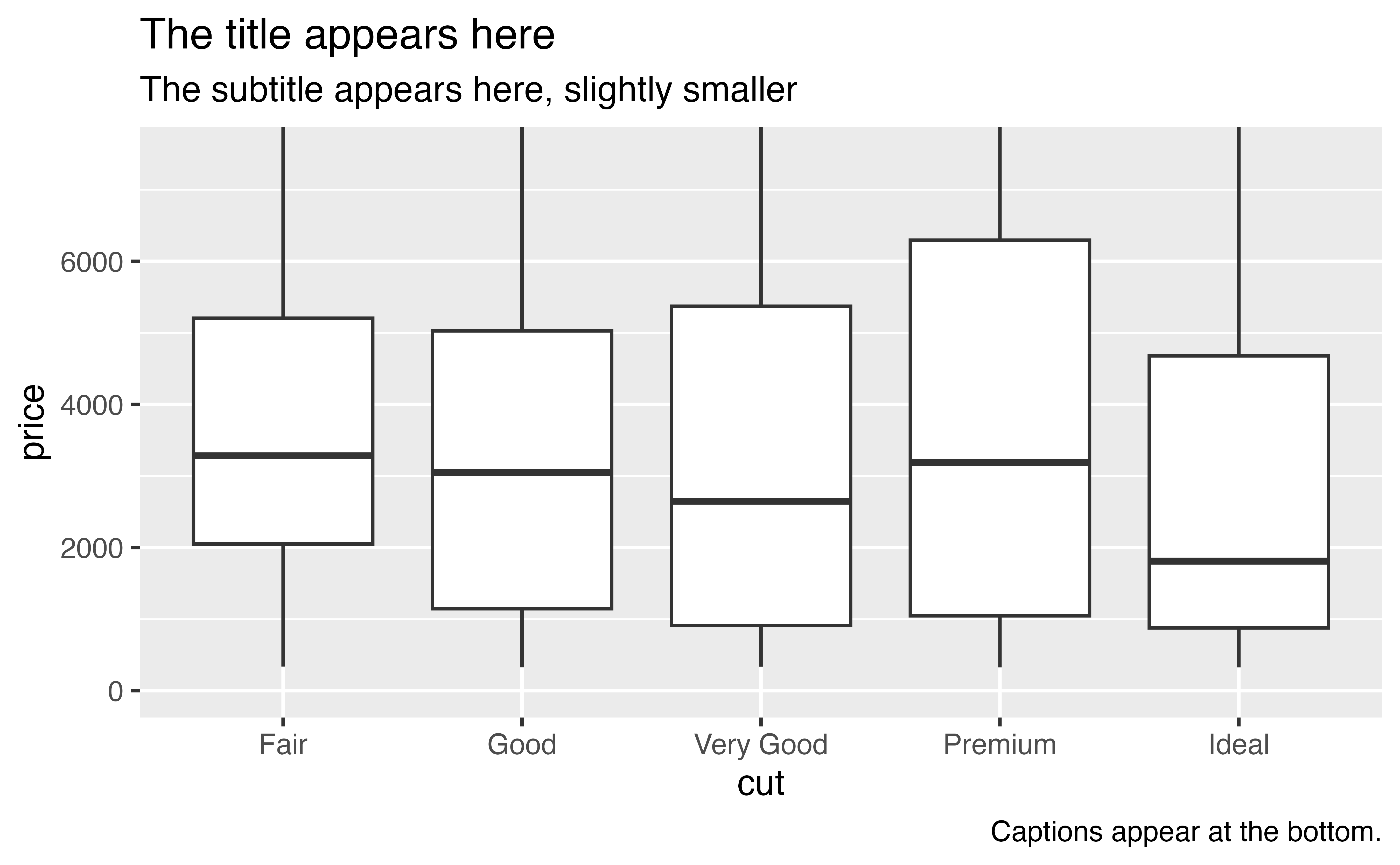
Captions
Give labs() a caption argument to add a caption. I like to use captions to cite my data source.
p + labs(title = "The title appears here",
         subtitle = "The subtitle appears here, slightly smaller",
         caption = "Captions appear at the bottom.")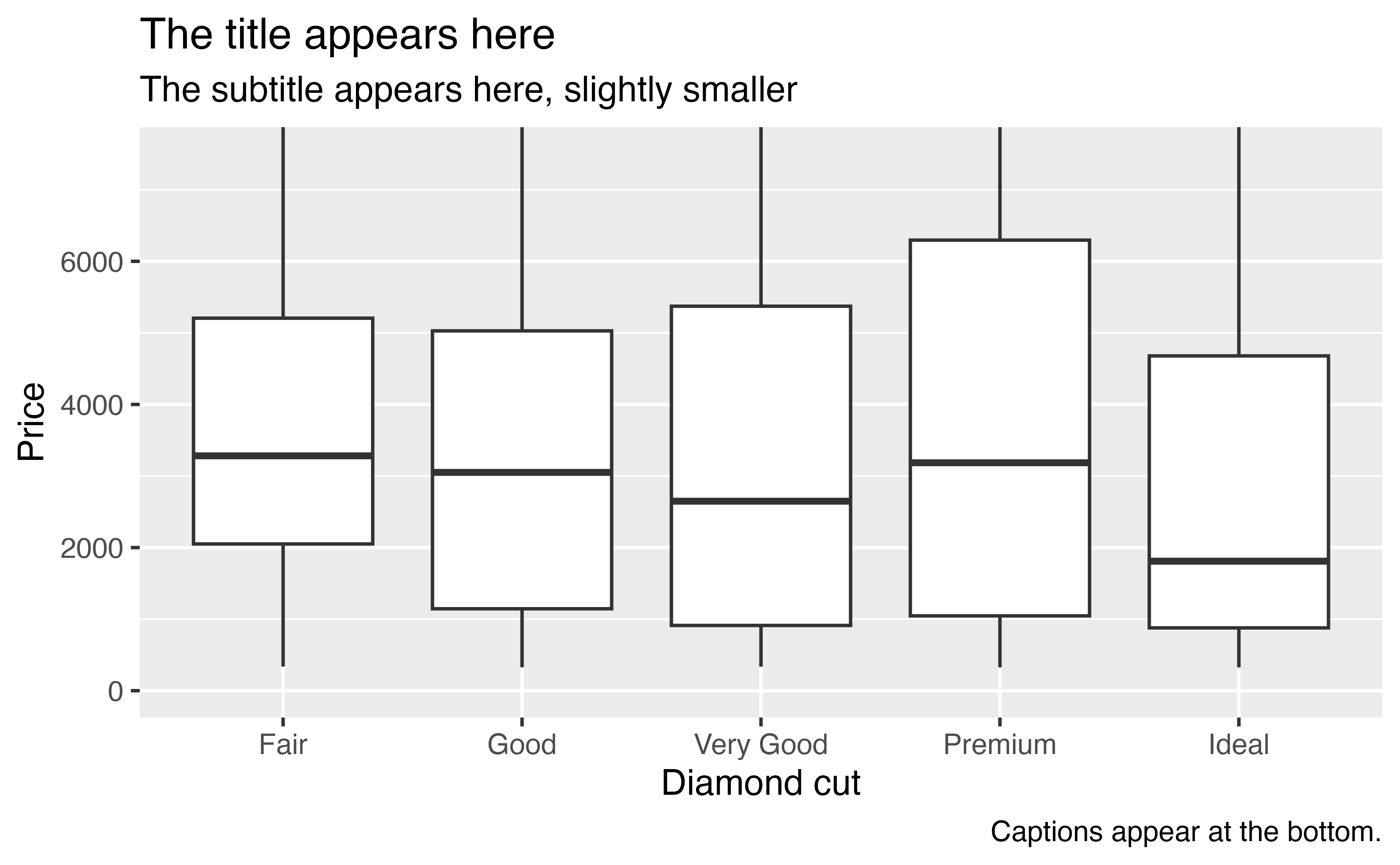
Axis labels
Give labs() x and y arguments to change the axis labels.
p + labs(title = "The title appears here",
         subtitle = "The subtitle appears here, slightly smaller",
         caption = "Captions appear at the bottom.",
         x = "Diamond cut",
         y = "Price")
Legend titles
If you’ve mapped a column to an aesthetic like color, fill, linetype, etc., you can change its label with labs() too:
ggplot(diamonds) +
  geom_boxplot(mapping = aes(x = cut, y = price, fill = cut)) +
  labs(title = "The title appears here",
         subtitle = "The subtitle appears here, slightly smaller",
         caption = "Captions appear at the bottom.",
         x = "Diamond cut",
         y = "Price",
         fill = "Diamond cut")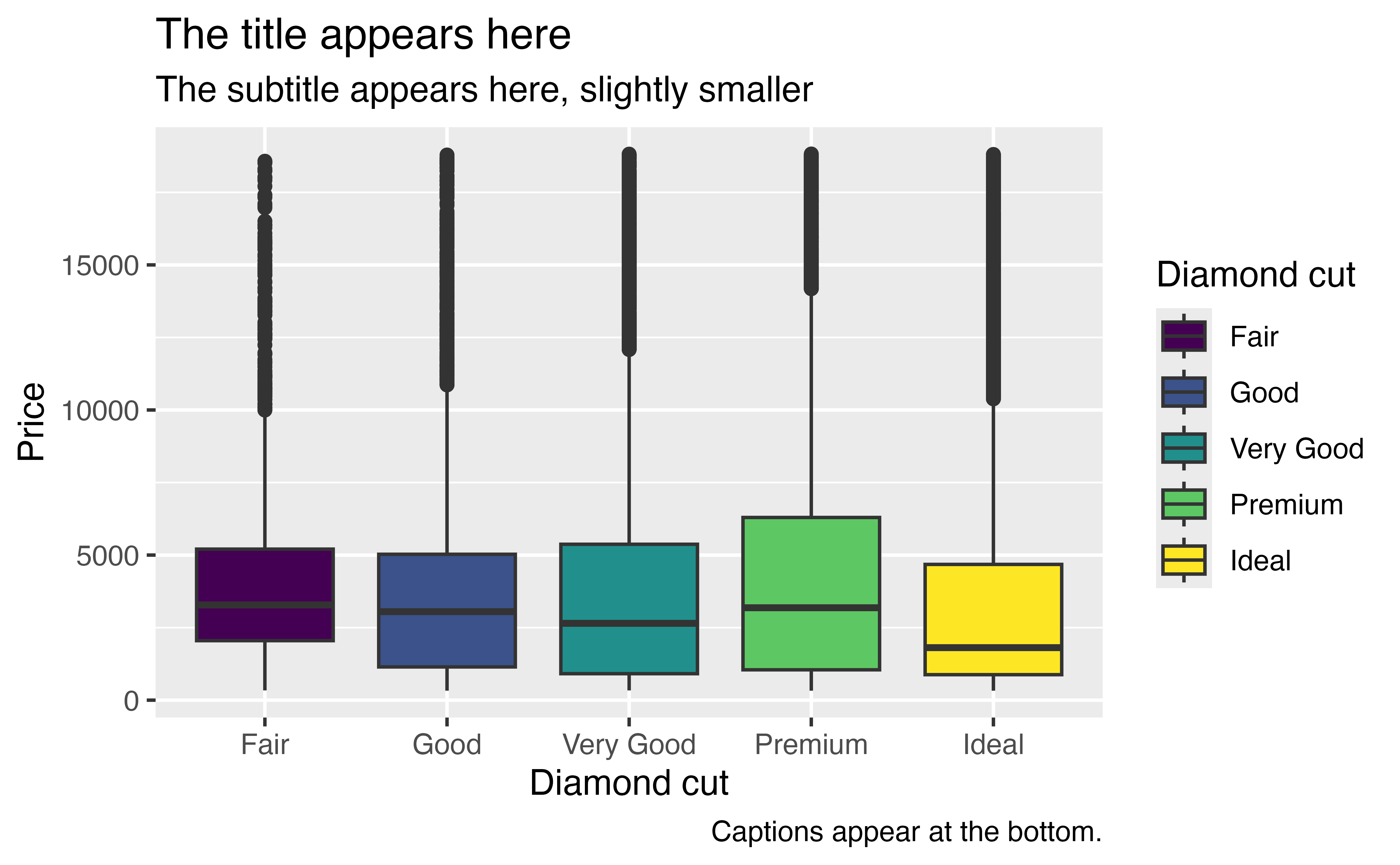
Exercise 2: Labels
Plot p with a set of informative labels. For learning purposes, be sure to use a title, subtitle, caption, and axis labels.
p + labs(title = "Diamond prices by cut",
         subtitle = "Fair cut diamonds fetch the highest median price. Why?",
         caption = "Data collected by Hadley Wickham")
Good job! By the way, why do fair cut diamonds fetch the highest price?
Exercise 3: Carat size?
Perhaps a diamond’s cut is conflated with its carat size. If fair cut diamonds tend to be larger diamonds that would explain their larger prices. Let’s test this.
Make a plot that displays the relationship between carat size, price, and cut for all diamonds. How do you interpret the results? Give your plot a title, subtitle, and caption that explain the plot and convey your conclusions.
If you are looking for a way to start, I recommend using a smooth line with color mapped to cut, perhaps overlaid on the background data.
ggplot(data = diamonds, mapping = aes(x = carat, y = price)) +
  geom_smooth(mapping = aes(color = cut), se = FALSE) +
  labs(title = "Carat size vs. Price",
       subtitle = "Fair cut diamonds tend to be large, but they fetch the lowest prices for most carat sizes.",
       caption = "Data by Hadley Wickham")
Good job! The plot corroborates our hypothesis.
p1
Unlike p, our new plot uses color and has a legend. Let’s save it to use later when we learn to customize colors and legends.
p1 <- ggplot(data = diamonds, mapping = aes(x = carat, y = price)) +
  geom_smooth(mapping = aes(color = cut), se = FALSE) +
  labs(title = "Carat size vs. Price",
       subtitle = "Fair cut diamonds tend to be large, but they fetch the lowest prices for most carat sizes.",
       caption = "Data by Hadley Wickham")
annotate()
annotate() provides a final way to label your graph: it adds a single geom to your plot. When you use annotate(), you must first choose which type of geom to add. Next, you must manually supply a value for each aesthetic required by the geom.
So for example, we could use annotate() to add text to our plot.
p1 + annotate("text", x = 4, y = 7500, label = "There are no cheap,\nlarge diamonds")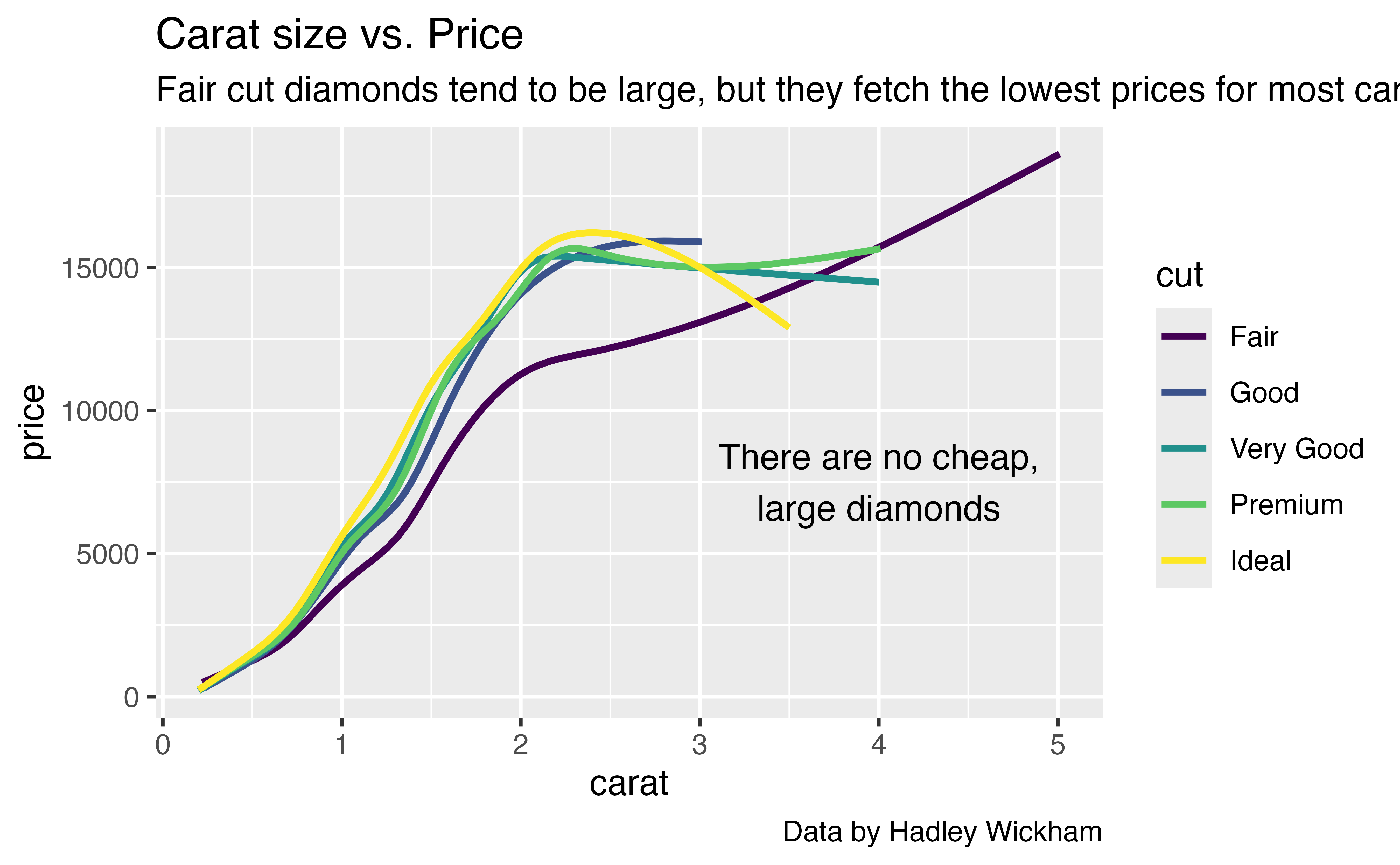
Notice that I select geom_text() with "text", the suffix of the function name in quotation marks.