Similar geoms
geom_step()
geom_step() draws a line chart in a stepwise fashion. To see what I mean, change the geom in the plot below and rerun the code.
ggplot(asia) +
  geom_step(mapping = aes(x = year, y = lifeExp, color = country, linetype = country))
Good job! You can control whether the steps move horizontally first and then vertically or vertically first and then horizontally with the parameters direction = "hv" (the default) or direction = "vh".
geom_area()
geom_area() is similar to a line graph, but it fills in the area under the line. To see geom_area() in action, change the geom in the plot below and rerun the code.
ggplot(economics) +
  geom_area(mapping = aes(x = date, y = unemploy))
Good job! Filling the space under the line gives you a new way to customize your plot.
Review 2 - Set vs. map
Do you recall from Visualization Basics how you would set the fill of our plot to blue (instead of, say, map the fill to a variable)? Give it a try.
ggplot(economics) +
  geom_area(mapping = aes(x = date, y = unemploy), fill = "blue")
Good job! Remember that you map aesthetics to variables inside of aes(). You set aesthetics to values outside of aes().
Accumulation
geom_area() is a great choice if your measurements represent the accumulation of objects (like unemployed people). Notice that the \(y\) axis geom_area() always begins or ends at zero.
Perhaps because of this, geom_area() can be quirky when you have multiple groups. Run the code below. Can you tell what happens here?
Review 3: Position adjustments
If you answered that people in China were living to be 300 years old, you guessed wrong.
geom_area() is stacking each group above the group below. As a result, the line that should display the life expectancy for China displays the combined life expectancy for all countries.
You can fix this by changing the position adjustment for geom_area(). Give it a try below. Change the position parameter from “stack” (the implied default) to "identity". See Bar Charts if you’d like to learn more about position adjustments.
ggplot(asia) +
  geom_area(mapping = aes(x = year, y = lifeExp, fill = country), position = "identity", alpha = 0.3)
Good job! You can further customize your graph by switching from geom_area() to geom_ribbon(). geom_ribbon() lets you map the bottom of the filled area to a variable, as well as the top. See ?geom_ribbon if you’d like to learn more.
geom_path()
geom_line() comes with a strange bedfellow, geom_path(). geom_path() draws a line between points like geom_line(), but instead of connecting points in the order that they appear along the \(x\) axis, geom_path() connects the points in the order that they appear in the data set.
It starts with the observation in row one of the data and connects it to the observation in row two, which it then connects to the observation in row three, and so on.
geom_path() example
To see how geom_path() does this, let’s rearrange the rows in the economics dataset. We can reorder them by unemploy value. Now the data set will begin with the observation that had the lowest value of unemploy.
economics2 <- economics |>
  arrange(unemploy)
economics2
# A tibble: 574 × 6
date pce pop psavert uempmed unemploy
<date> <dbl> <dbl> <dbl> <dbl> <dbl>
1 1968-12-01 576. 201621 11.1 4.4 2685
2 1968-09-01 568. 201095 10.6 4.6 2686
3 1968-10-01 572. 201290 10.8 4.8 2689
4 1969-02-01 589. 201881 9.7 4.9 2692
5 1968-04-01 544 200208 12.3 4.6 2709
6 1969-03-01 589. 202023 10.2 4 2712
7 1969-05-01 600. 202331 10.1 4.2 2713
8 1968-11-01 577. 201466 10.6 4.4 2715
9 1969-01-01 584. 201760 10.3 4.4 2718
10 1968-05-01 550. 200361 12 4.4 2740
# ℹ 564 more rowsgeom_path() example continued
If we plot the reordered data with both geom_line() and geom_path() we get two very different graphs.
ggplot(economics2) +
  geom_line(mapping = aes(x = date, y = unemploy))

ggplot(economics2) +
  geom_path(mapping = aes(x = date, y = unemploy))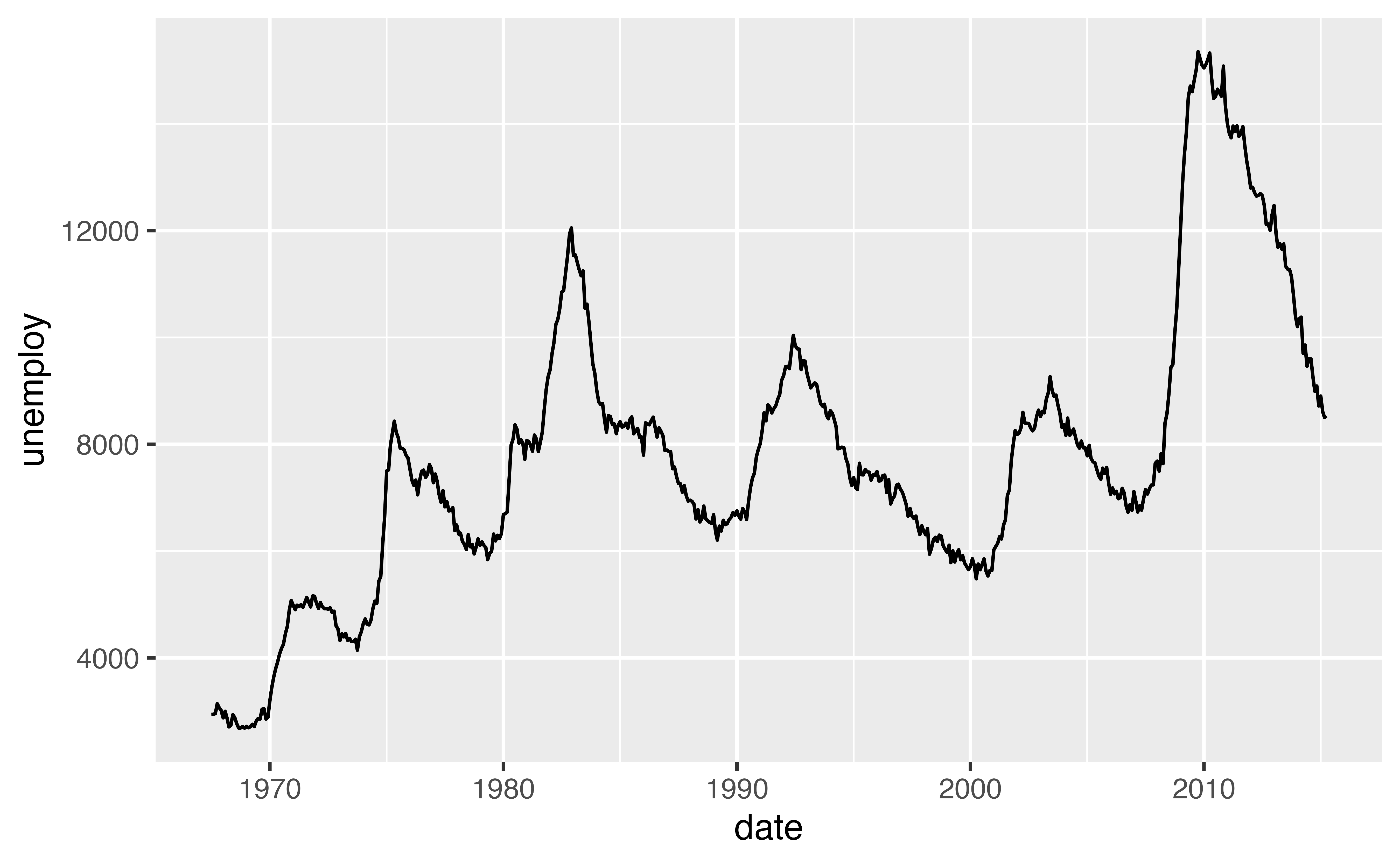
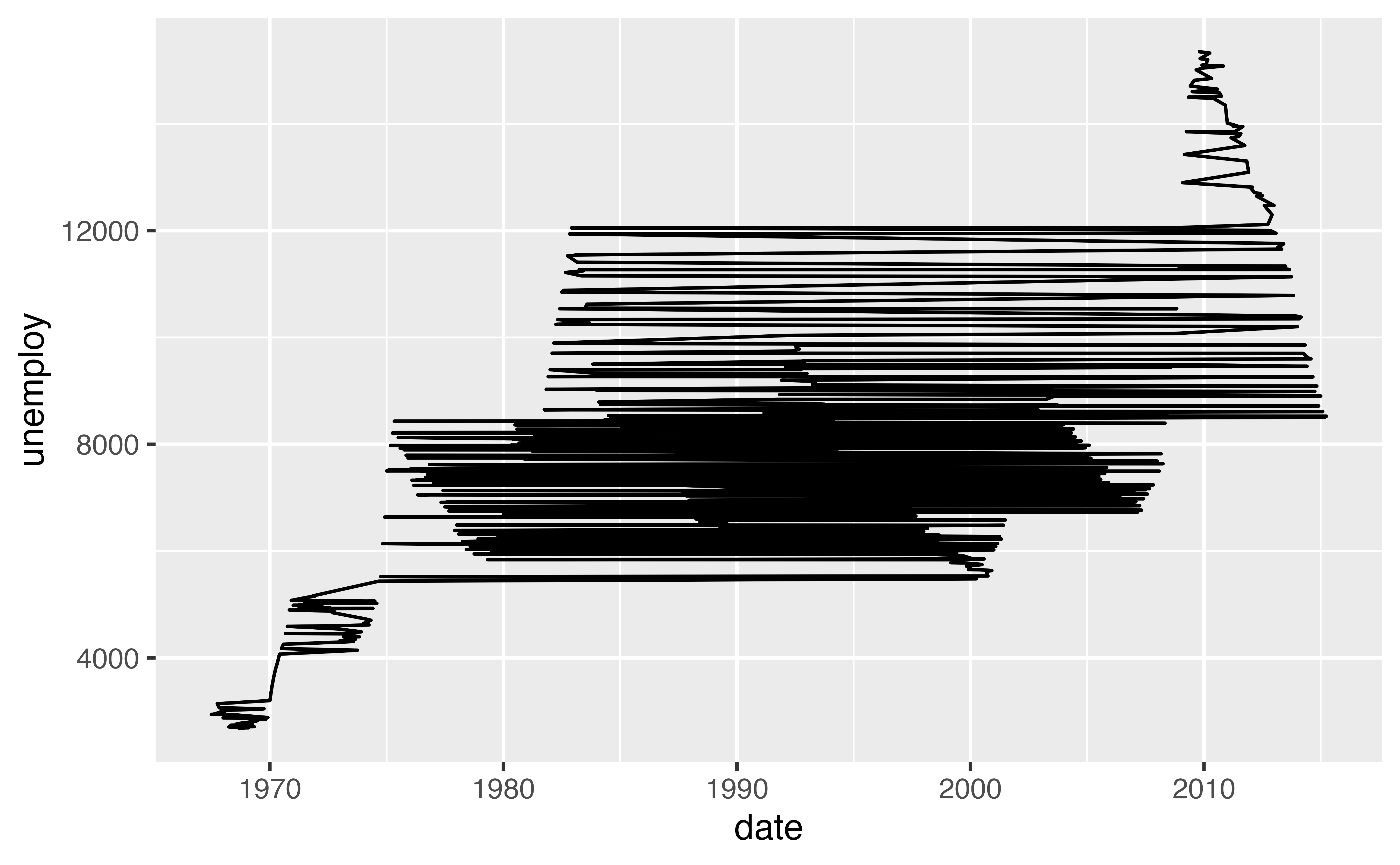
The plot on the left uses geom_line(), hence the points are connected in order along the \(x\) axis. The plot on the right uses geom_path(). These points are connected in the order that they appear in the dataset, which happens to put them in order along the \(y\) axis.
A use case
Why would you want to use geom_path()? The code below illustrates one particularly useful case. The tx dataset contains latitude and longitude coordinates saved in a specific order.
tx# A tibble: 1,088 × 6
long lat group order region subregion
<dbl> <dbl> <dbl> <int> <chr> <chr>
1 -94.5 33.7 1 1 texas <NA>
2 -94.5 33.7 1 2 texas <NA>
3 -94.5 33.6 1 3 texas <NA>
4 -94.5 33.6 1 4 texas <NA>
5 -94.5 33.6 1 5 texas <NA>
6 -94.4 33.6 1 6 texas <NA>
7 -94.4 33.6 1 7 texas <NA>
8 -94.4 33.6 1 8 texas <NA>
9 -94.4 33.6 1 9 texas <NA>
10 -94.3 33.6 1 10 texas <NA>
# ℹ 1,078 more rowstx
What do you think happens when you plot the data in tx? Run the code to find out.
Good job! geom_path() reveals how you can use what is essentially a line plot to make a map (this is a map of the state of Texas). There are other better ways to make maps in R, but this low tech method is surprisingly versatile.
geom_polygon()
geom_polygon() extends geom_path() one step further: it connects the last point to the first and then colors the interior region with a fill. The result is a polygon.
ggplot(tx) +
  geom_polygon(mapping = aes(x = long, y = lat))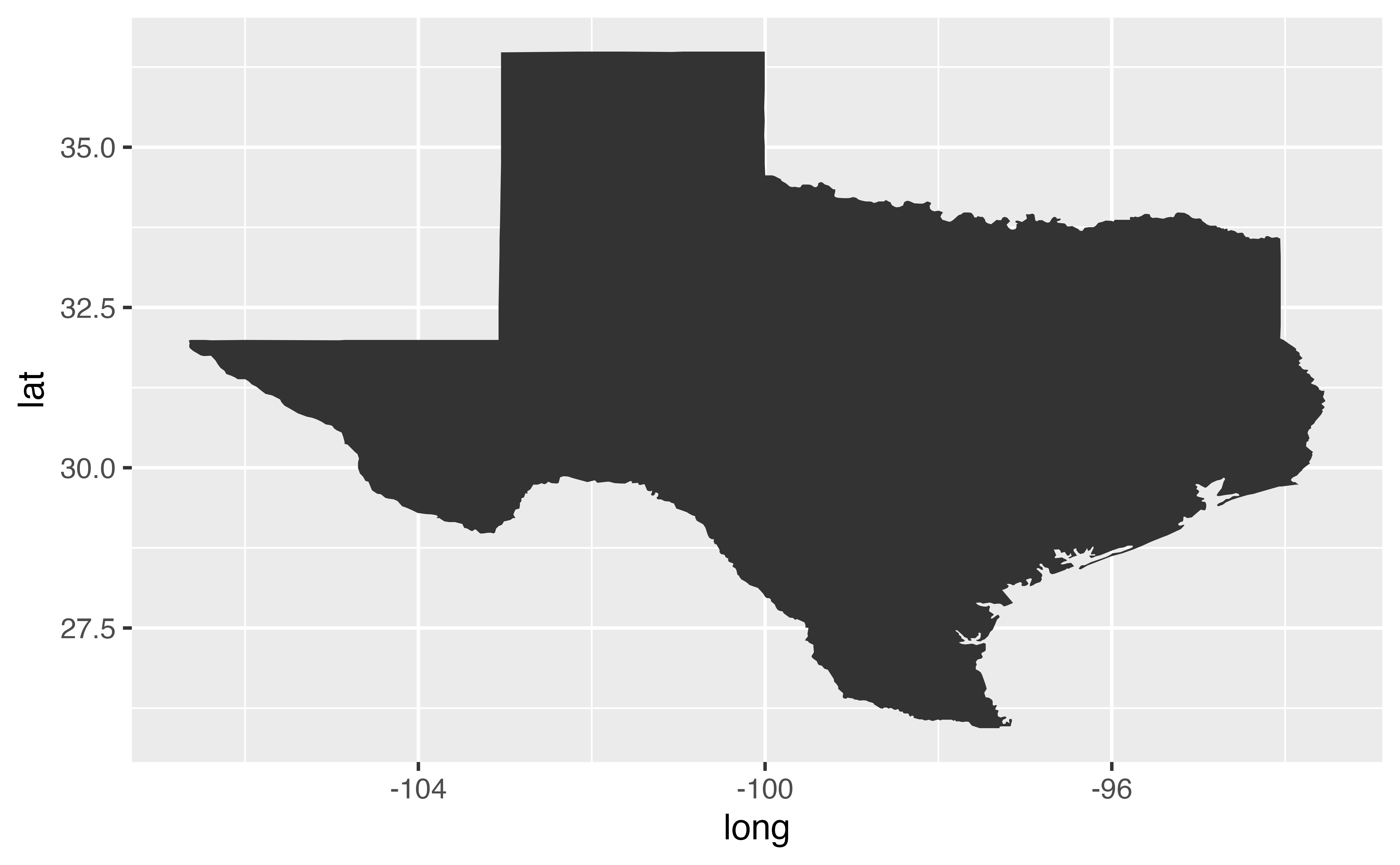
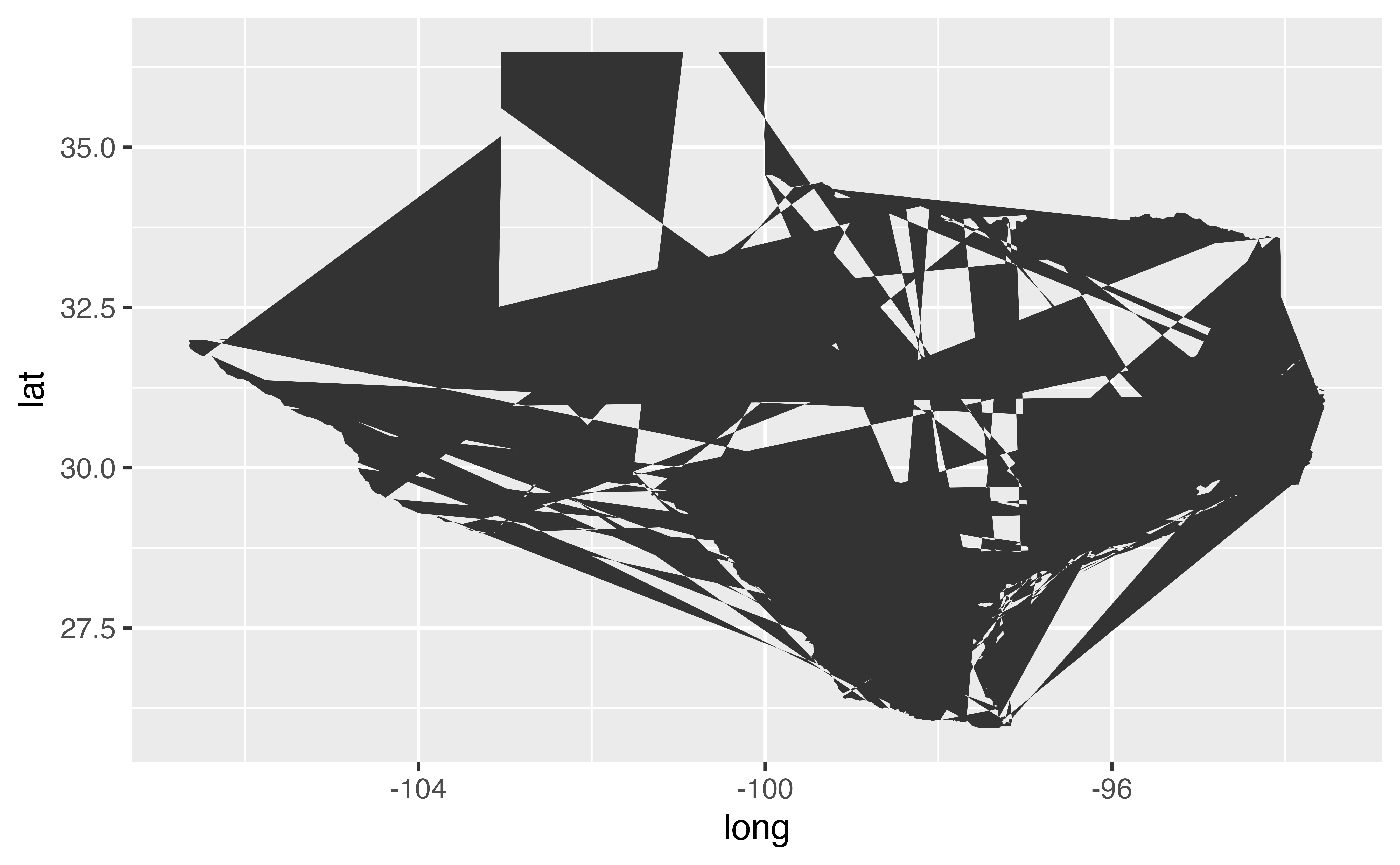
Exercise 2: Shattered glass
What do you think went wrong in the plot of Texas below?