Quiz
In this tutorial, you learned how to customize the graphs that you make with ggplot2 in several ways. You learned how to:
- Zoom in on regions of the graph
- Add titles, subtitles, and annotations
- Add themes
- Add color scales
- Adjust legends
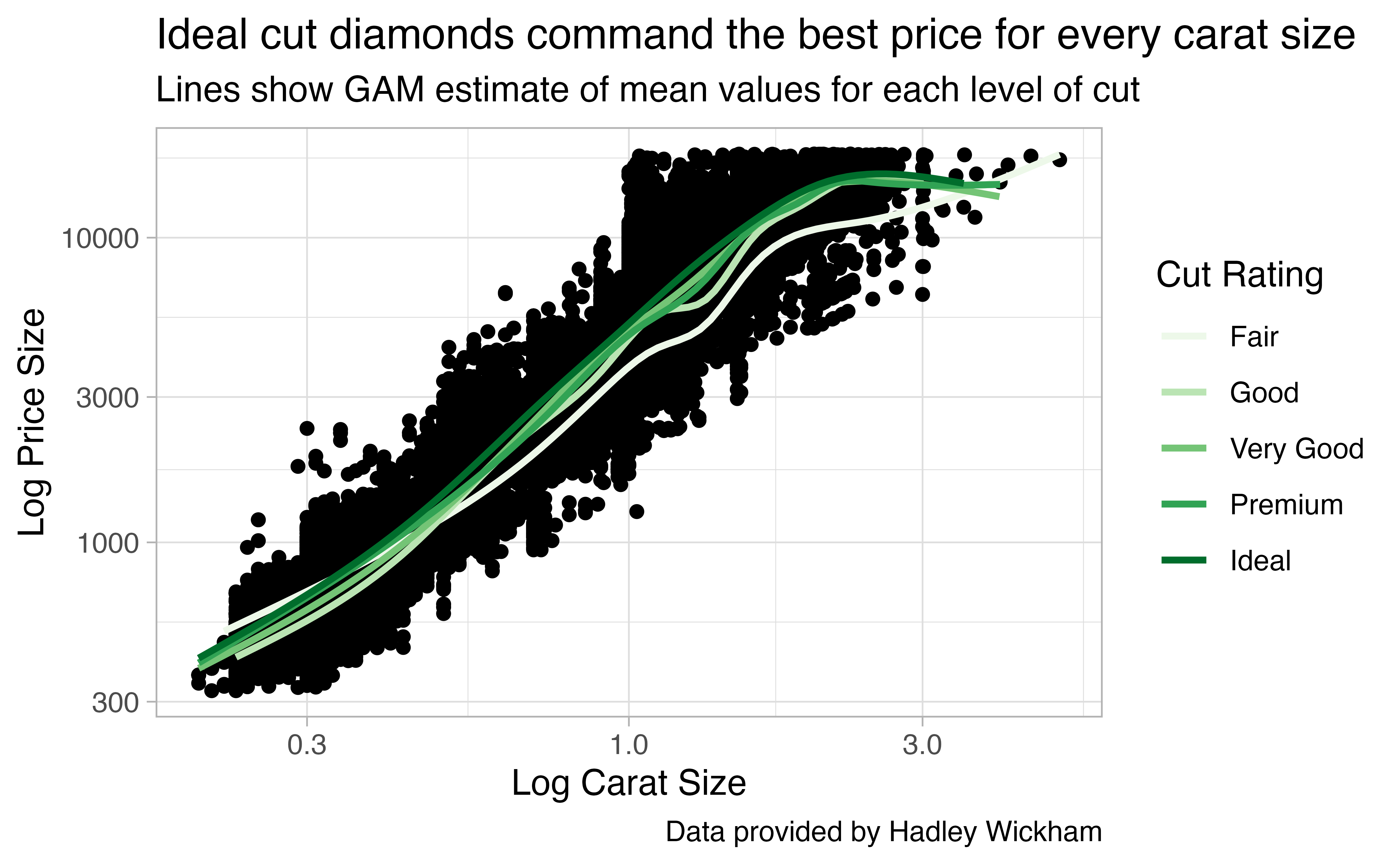
To cement your skills, combine what you’ve learned to recreate the plot below.
ggplot(data = diamonds, mapping = aes(x = carat, y = price)) +
  geom_point() +
  geom_smooth(mapping = aes(color = cut), se = FALSE) +
  labs(title = "Ideal cut diamonds command the best price for every carat size",
       subtitle = "Lines show GAM estimate of mean values for each level of cut",
       caption = "Data provided by Hadley Wickham",
       x = "Log Carat Size",
       y = "Log Price Size",
       color = "Cut Rating") +
  scale_x_log10() +
  scale_y_log10() +
  scale_color_brewer(palette = "Greens") +
  theme_light()