ggplot(data = diamonds) +
  geom_point(mapping = aes(x = carat, y = price))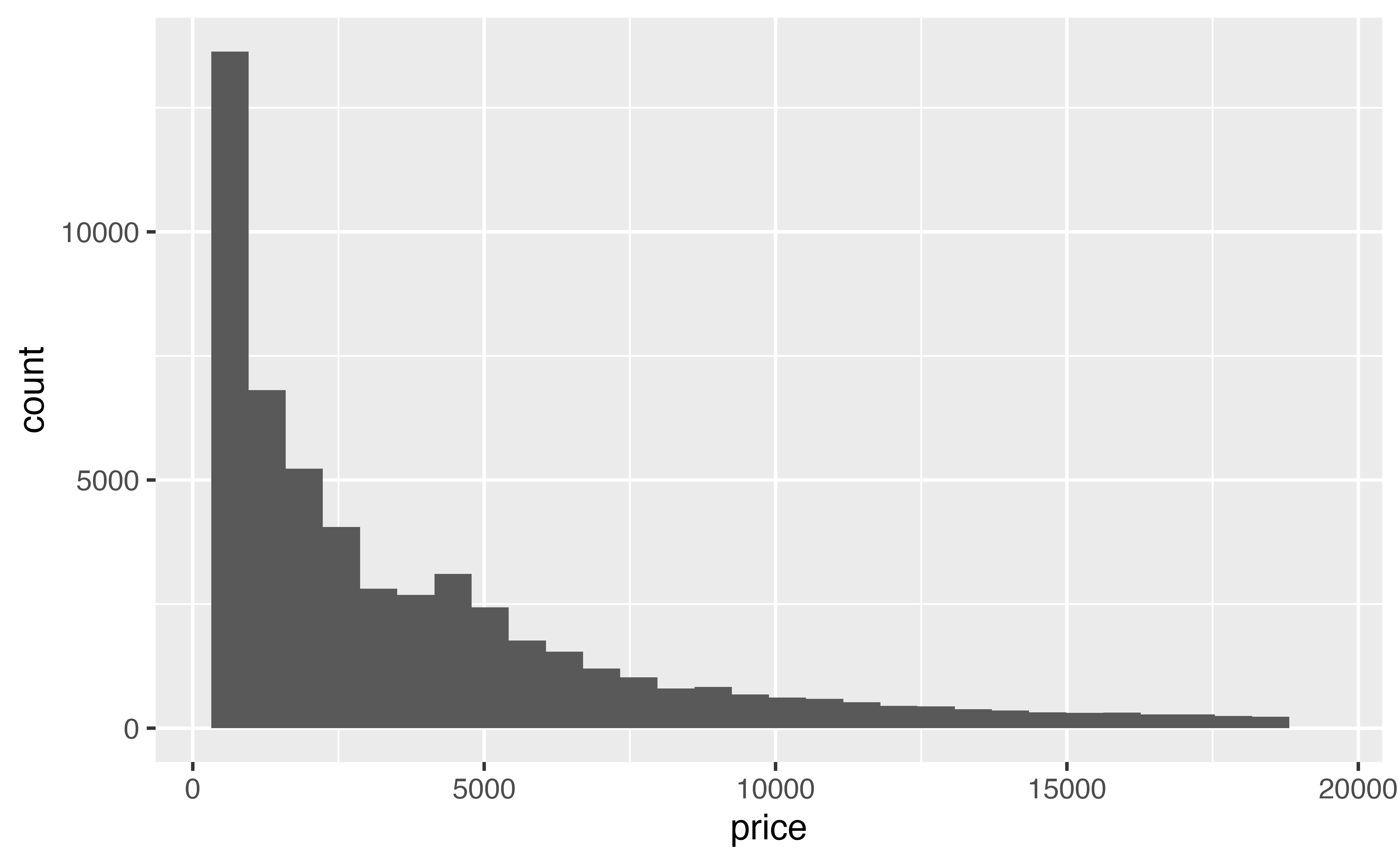
A dataset does not need to be truly “Big Data” to be hard to visualize. The diamonds data set contains fewer than 54,000 points, but it still suffers from overplotting when you try to plot carat vs. price. Here the bulk of the points fall on top of each other in an impenetrable cloud of blackness.
ggplot(data = diamonds) +
geom_point(mapping = aes(x = carat, y = price))
Alpha and jittering are less useful for large data. Jittering will not separate the points, and a mass of transparent points can still look black.
A better way to deal with overplotting due to large data is to visualize a summary of the data. In fact, we’ve already worked with this dataset by using geoms that naturally summarize the data, like geom_histogram() and geom_smooth().
Let’s look at several other geoms that you can use to summarize relationships in large data.
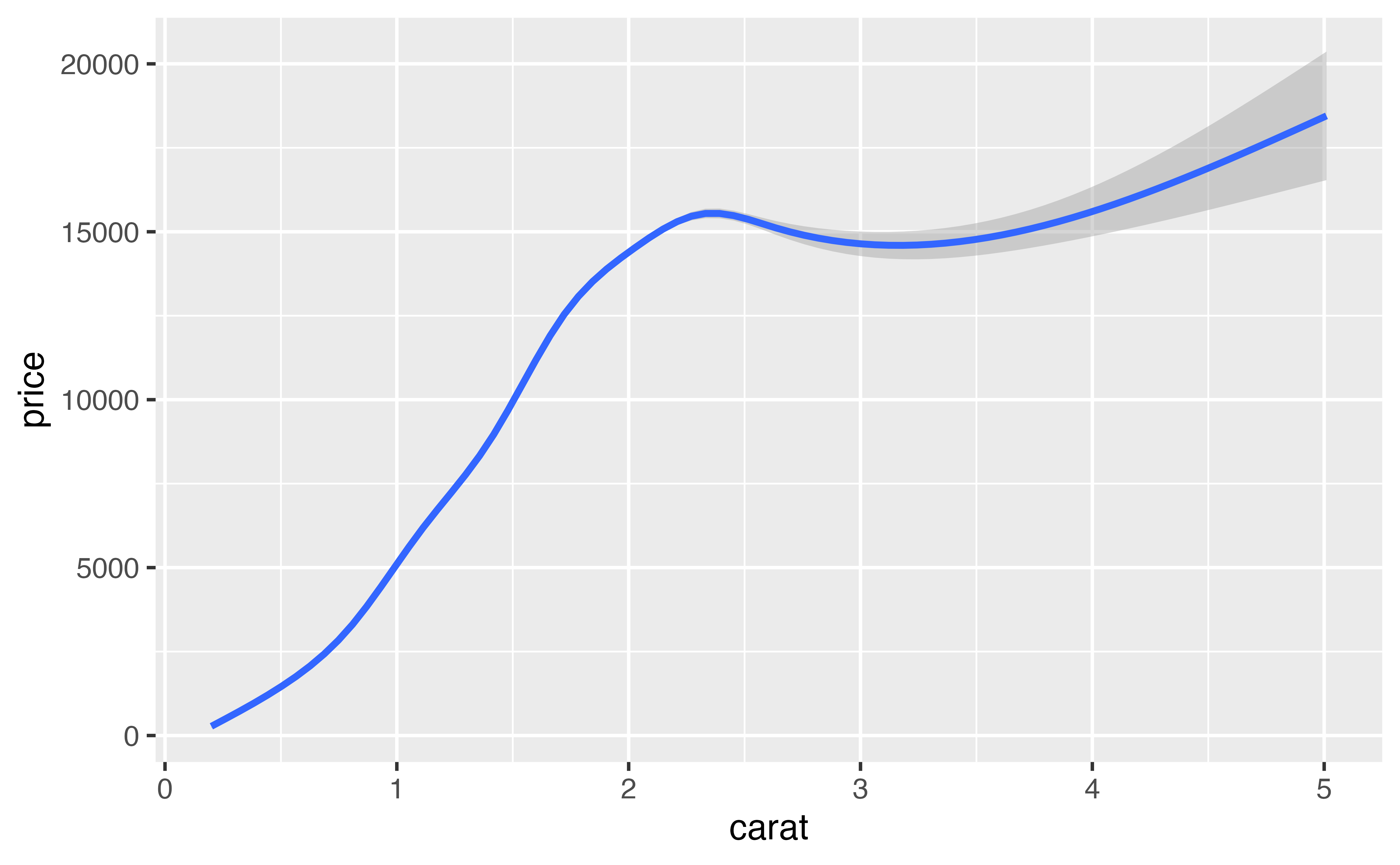
Boxplots efficiently summarize data, which make them a useful tool for large data sets. In the boxplots tutorial, you learned how to use cut_width() and the group aesthetic to plot multiple boxplots for a continuous variable.
Modify the code below to cut the carat axis into intervals with width 0.2. Then set the group aesthetic of geom_boxplot() to the result.
ggplot(data = diamonds) +
  geom_boxplot(mapping = aes(x = carat, y = price, group = cut_width(carat, width = 0.2)))
Good job! The medians of the boxplots give a somewhat more precise description of the relationship between carat and price than does the fan of individual points.
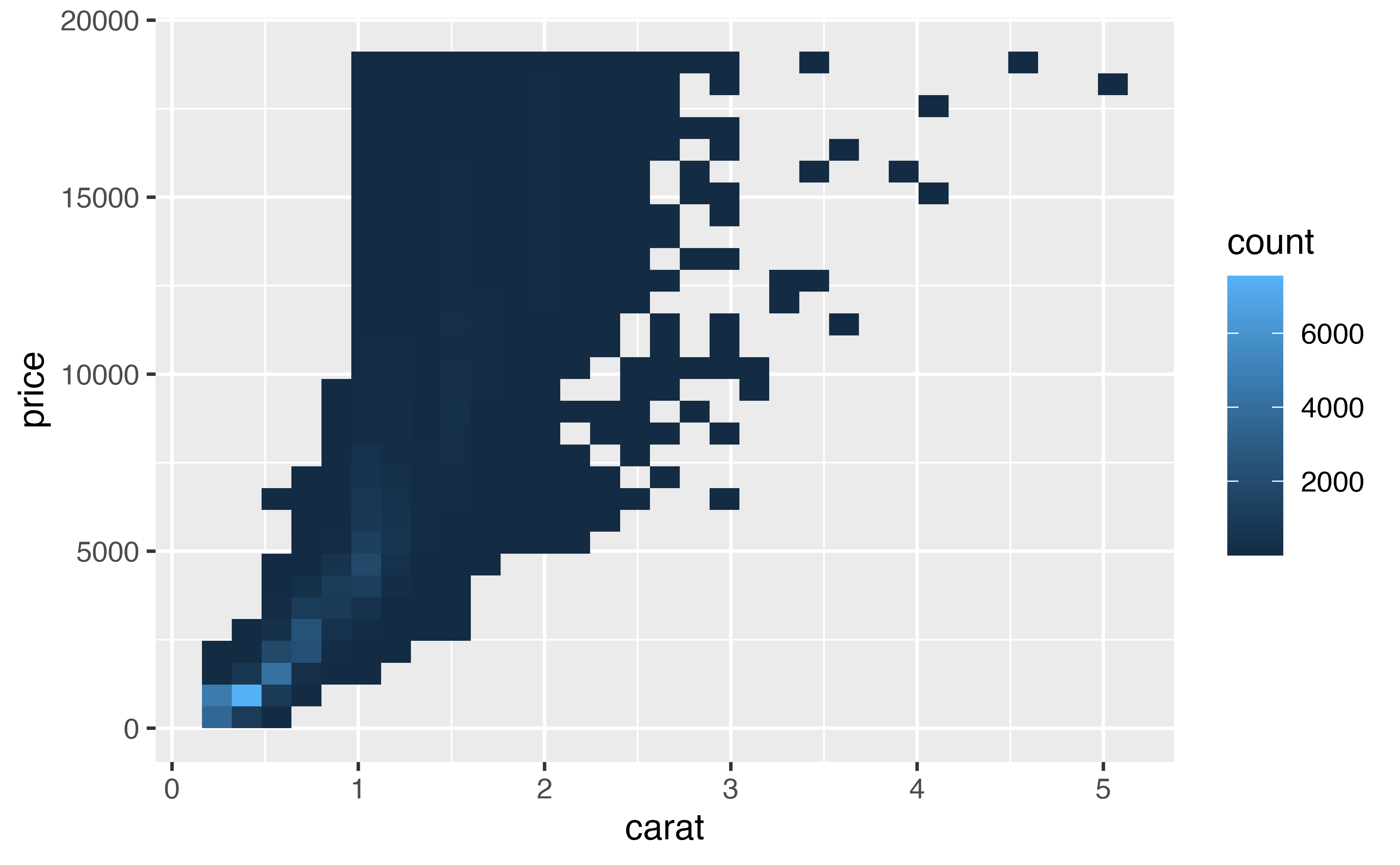
geom_bin2d()geom_bin2d() provides a new way to summarize two dimensional continuous relationships. You can think of bin2d as working like a three dimensional histogram. It divides the Cartesian field into small rectangular bins, like a checkerboard. It then counts how many points fall into each bin, and maps the count to color. Bins that contain no points are left blank.
ggplot(data = diamonds) +
  geom_bin2d(mapping = aes(x = carat, y = price))
`stat_bin2d()` using `bins = 30`. Pick better value `binwidth`.
By studying the results, we can see that the mass of points falls in the bottom left of the graph.
Like histograms, bin2d use bins and binwidth arguments. Each should be set to a vector of two numbers: one for the number of bins (or binwidths) to use on the x axis, and one for the number of bins (or binwidths) to use on the y axis.
Use one of these parameters to modify the graph below to use 40 bins on the x axis and 50 on the y axis.
ggplot(data = diamonds) +
  geom_bin2d(mapping = aes(x = carat, y = price), bins = c(40, 50))
Good job! As with histograms, bin2ds can reveal different information at different binwidths.
geom_hex()Our eyes are drawn to straight vertical and horizontal lines, which makes it easy to perceive “edges” in a bin2d that are not necessarily there (the rectangular bins naturally form edges that span the breadth of the graph).
One way to avoid this, if you like, is to use geom_hex(). geom_hex() functions like geom_bin2d() but uses hexagonal bins. Adjust the graph below to use geom_hex().
ggplot(data = diamonds) +
  geom_hex(mapping = aes(x = carat, y = price))
Good job! You need to have the {hexbin} package installed on your computer, but not necessarily loaded, to use geom_hex().
geom_density2d()geom_density2d() provides one last way to summarize a two dimensional continuous relationship. Think of density2d as the two dimensional analog of density. Instead of drawing a line that rises and falls on the y dimension, it draws a field over the coordinate axes that rises and falls on the z dimension, that’s the dimension that points straight out of the graph towards you.
The result is similar to a mountain that you are looking straight down upon. The high places on the mountain show where the most points fall and the low places show where the fewest points fall. To visualize this mountain, density2d draws contour lines that connect areas with the same “height”, just like a contour map draws elevation.
Here we see the “ridge” of points that occur at low values of carat and price.
ggplot(data = diamonds) +
  geom_density2d(mapping = aes(x = carat, y = price))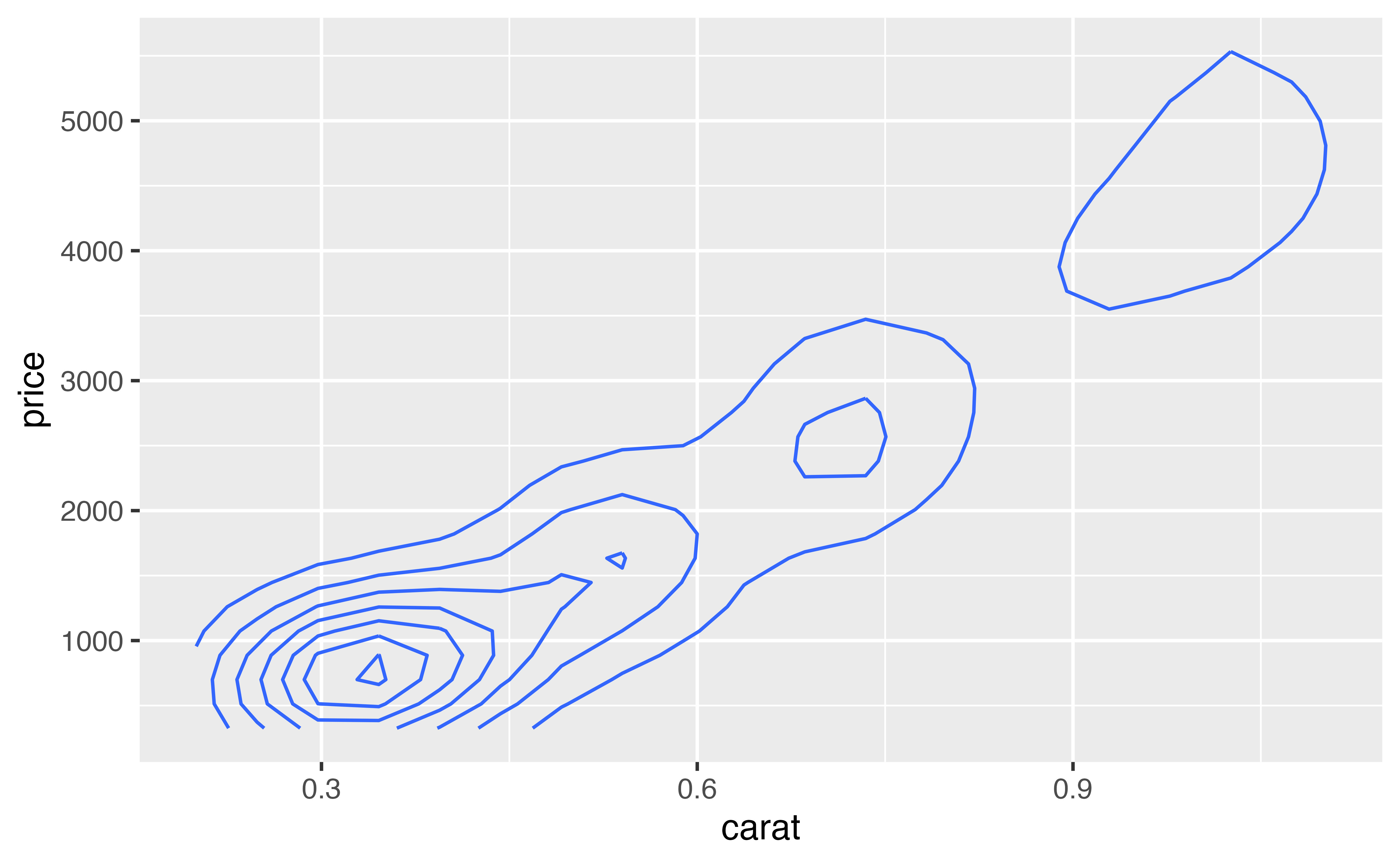
By default, density2d zooms in on the region that contains density lines. This may not be the same region spanned by the data points. If you like, you can re-expand the graph to the region spanned by the price and carat variables with expand_limits().
expand_limits() zooms the x and y axes to the fit the range of any two variables (they need not be the original x and y variables).
ggplot(data = diamonds) +
  geom_density2d(mapping = aes(x = carat, y = price)) +
  expand_limits(x = diamonds$carat, y = diamonds$price)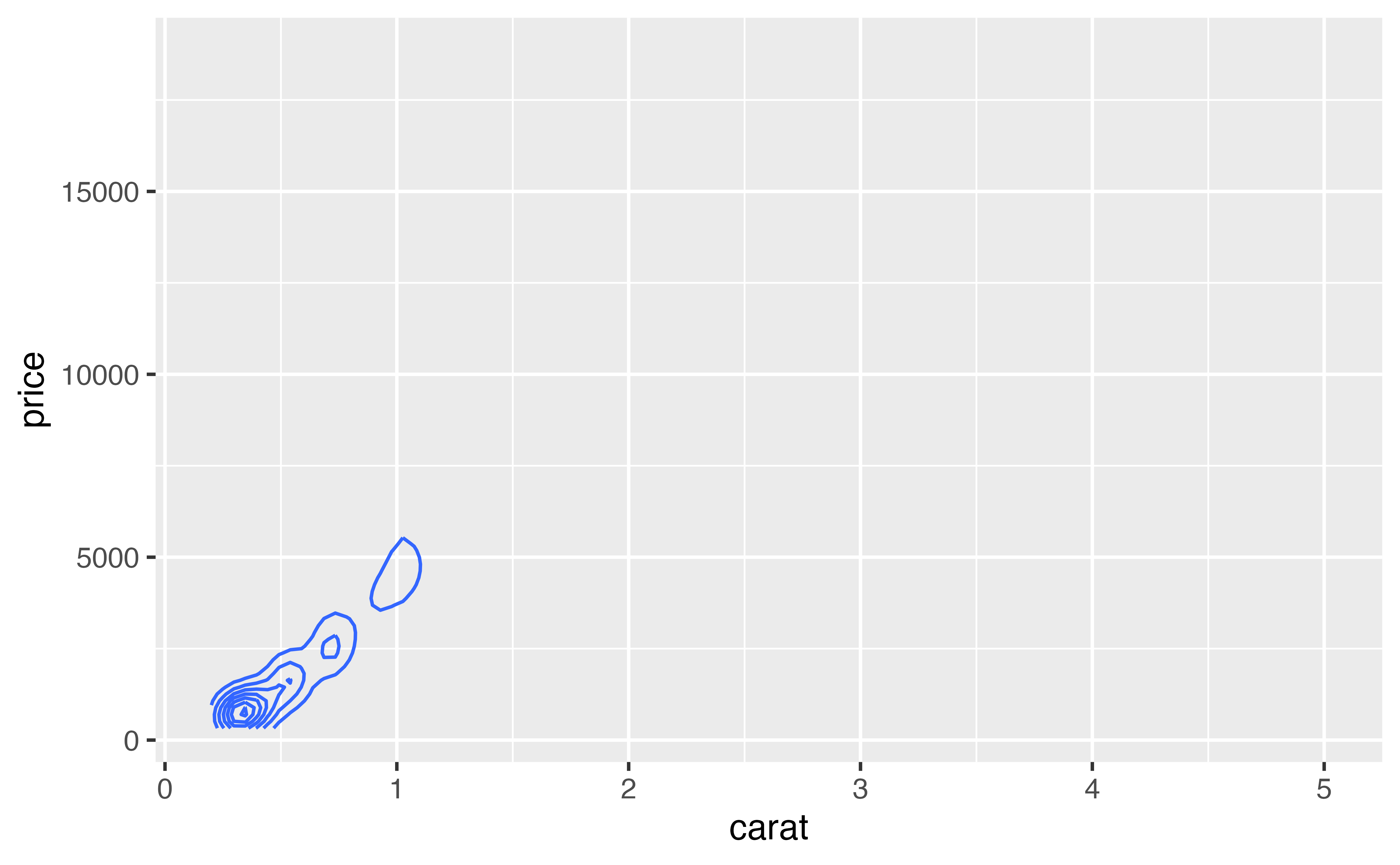
Often density2d plots are easiest to read when you plot them on top of the original data. In the chunk below create a plot of diamond carat size vs. price. The plot should contain density2d lines superimposed on top of the raw points. Make the raw points transparent with an alpha of 0.1.
ggplot(data = diamonds, mapping = aes(x = carat, y = price)) +
  geom_point(alpha = 0.1) +
  geom_density2d()
Good job! Plotting a summary on top of raw values is a common pattern in data science.
Overplotting is a common phenomenon in plots because the causes of overplotting area common phenomenon in data sets. Data sets often
When overplotting results from rounding errors, you can work around it by manipulating the transparency or location of the points.
For larger datasets you can use geoms that summarize the data to display relationships without overplotting. This is an effective tactic for truly big data as well, and it also works for the first case of overplotting due to rounding.
One final tactic is to sample your data to create a sample data set that is small enough to visualize without overplotting.
You’ve now learned a complete toolkit for exploring data visually. The final tutorial in this primer will show you how to polish the plots you make for publication. Instead of learning how to visualize data, you will learn how to add titles and captions, customize color schemes and more.