Long to wide
Narrow data
The pollution dataset below displays the amount of small and large particulate in the air of three cities. It illustrates another common type of untidy data. Narrow data has a column whose values could be variable names in a tidy data frame and another column whose values would be values under these new columns. Can you tell here which is which?
pollution# A tibble: 6 × 3
city size amount
<chr> <chr> <dbl>
1 New York large 23
2 New York small 14
3 London large 22
4 London small 16
5 Beijing large 121
6 Beijing small 121Quiz 4: Which is the column containing variable names?
pollution# A tibble: 6 × 3
city size amount
<chr> <chr> <dbl>
1 New York large 23
2 New York small 14
3 London large 22
4 London small 16
5 Beijing large 121
6 Beijing small 121Quiz 5 - Which is the column containing values?
pollution# A tibble: 6 × 3
city size amount
<chr> <chr> <dbl>
1 New York large 23
2 New York small 14
3 London large 22
4 London small 16
5 Beijing large 121
6 Beijing small 121A tidy version of pollution
TipOlder names
This video uses older function names:
- Old
gather()is nowpivot_longer() - Old
spread()is nowpivot_wider()
Watch this video:
pivot_wider()
You can reshape this dataset into a wider dataset with the pivot_wider() function in the {tidyr} package. To use pivot_wider() pass it the name of a dataset to pivot (provided here by the pipe |>). Then tell it which column contains names and which contains values.
pollution |>
  pivot_wider(
    names_from = size,
    values_from = amount
  )
# A tibble: 3 × 3
city large small
<chr> <dbl> <dbl>
1 New York 23 14
2 London 22 16
3 Beijing 121 121pivot_wider() will give each unique value in the names_from column its own column. The unique values from this column will become the new column names. pivot_wider() will then redistribute the values in the values_from column across the new columns in a way that preserves every relationship in the original dataset.
Exercise 3: Tidy table2
Use pivot_wider() to tidy table2 into a dataset with four columns: country, year, cases, and population. In short, convert table2 to look like table1.
table2# A tibble: 12 × 4
country year type count
<chr> <dbl> <chr> <dbl>
1 Afghanistan 1999 cases 745
2 Afghanistan 1999 population 19987071
3 Afghanistan 2000 cases 2666
4 Afghanistan 2000 population 20595360
5 Brazil 1999 cases 37737
6 Brazil 1999 population 172006362
7 Brazil 2000 cases 80488
8 Brazil 2000 population 174504898
9 China 1999 cases 212258
10 China 1999 population 1272915272
11 China 2000 cases 213766
12 China 2000 population 1280428583table1# A tibble: 6 × 4
country year cases population
<chr> <dbl> <dbl> <dbl>
1 Afghanistan 1999 745 19987071
2 Afghanistan 2000 2666 20595360
3 Brazil 1999 37737 172006362
4 Brazil 2000 80488 174504898
5 China 1999 212258 1272915272
6 China 2000 213766 1280428583table2 |>
pivot_wider(
names_from = type,
values_from = count
)Good job! You now possess two complementary tools for reshaping the layout of data. By iterating between pivot_longer() and pivot_wider() you can rearrange the values of any data set into many different configurations.
To quote or not to quote
You may notice that both pivot_longer() and pivot_wider() arguments that start with names and values. And, in each case the arguments are set to column names. But in pivot_longer() you must surround the names with quotes and in pivot_wider() case you do not. Why is this?
table4b |>
  pivot_longer(
    cols = -country,
    names_to = "year", values_to = "population"
  )

pollution |>
  pivot_wider(names_from = size, values_from = amount)
Don’t let the difference trip you up. Instead think about what the quotes mean.
- In R, any sequence of characters surrounded by quotes is a character string, which is a piece of data in and of itself.
- Likewise, any sequence of characters not surrounded by quotes is the name of an object, which is a symbol that contains or points to a piece of data. Whenever R evaluates an object name, it searches for the object to find the data that it contains. If the object does not exist somewhere, R will return an error.
In our pivot_longer() code above, “year” and “population” refer to two columns that do not yet exist. If R tried to look for objects named year and population it wouldn’t find them (at least not in the table4b dataset). When we use pivot_longer() we are passing R two values (character strings) to use as the name of future columns that will appear in the result.
In our pivot_wider() code, names_from and values_from point to two columns that do exist in the pollution dataset: size and amount. When we use pivot_wider(), we are telling R to find these objects (columns) in the dataset and to use their contents to create the result. Since they exist, we do not need to surround them in quotation marks.
In practice, whether or not you need to use quotation marks will depend on how the author of your function wrote the function. For example, pivot_wider() will still work if you do include quotation marks. However, you can use the intuition above as a guide for how to use functions in the tidyverse.
Boys and girls in {babynames}
Let’s apply pivot_wider() to a real world inquiry. The plot below visualizes an aspect of the babynames data set from the babynames package. (See Work with Data for an introduction to the babynames dataset.)
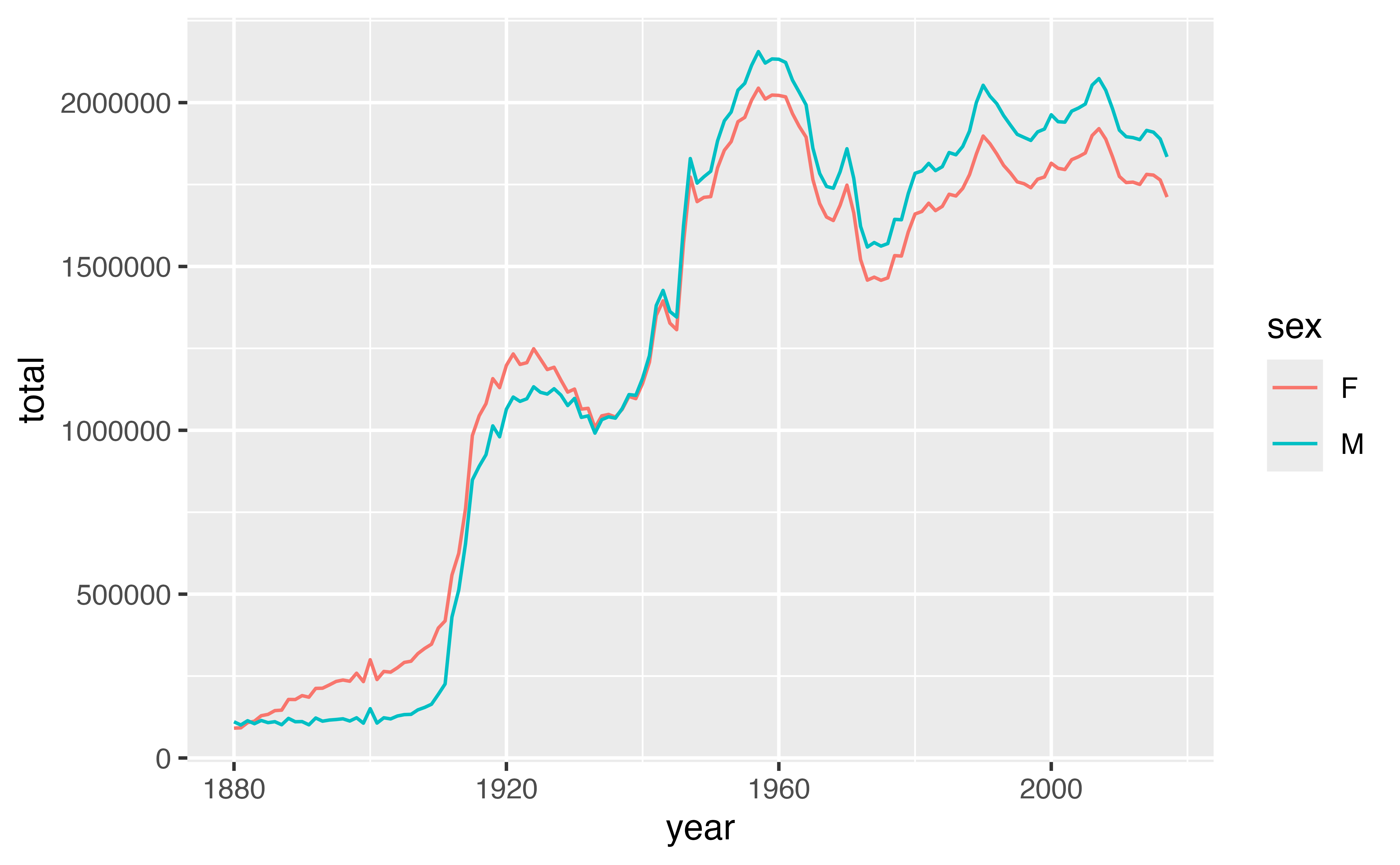
The ratio of girls to boys in babynames is not constant across time. We can explore this phenomenon further by recreating the data in the plot.
Review: Make the data

To make the data displayed in the plot above, I first grouped babynames by year and sex. Then I computed a summary for each group: total, which is equal to the sum of n for each group.
Use {dplyr} functions to recreate this process in the chunk below.
babynames |>
  group_by(year, sex) |>
  summarise(total = sum(n))
Good job! Now that we have the data, let’s recreate the plot.
Review: Make the plot
`summarise()` has grouped output by 'year'. You can override using the
`.groups` argument.
Use the data below to make the plot above, which was built with {ggplot2} functions.
babynames |>
  group_by(year, sex) |>
  summarise(total = sum(n)) |>
  ggplot() +
  geom_line(aes(year, total, color = sex))
Good job! You can see that the data shows that fewer boys than girls were born for the years prior to 1936, and fewer girls than boys for the years after 1936.
A better way to look at the data
A better way to explore this phenomena would be to directly plot a ratio of boys to girls over time. To make such a plot, you would need to compute the ratio of boys to girls for each year from 1880 to 2015:
\[ \text{ratio male} = \frac{\text{total male}}{\text{total female}} \]
But how can we plot this data? Our current iteration of babynames places the total number of boys and girls for each year in the same column, which makes it hard to use both totals in the same calculation.
babynames |>
  group_by(year, sex) |>
  summarise(total = sum(n))
# A tibble: 276 × 3
# Groups: year [138]
year sex total
<dbl> <chr> <int>
1 1880 F 90993
2 1880 M 110491
3 1881 F 91953
4 1881 M 100743
5 1882 F 107847
6 1882 M 113686
7 1883 F 112319
8 1883 M 104627
9 1884 F 129020
10 1884 M 114442
# ℹ 266 more rowsA goal
It would be easier to calculate the ratio of boys to girls if we could reshape our data to place the total number of boys born per year in one column and the total number of girls born per year in another:
# A tibble: 138 × 3
# Groups:   year [138]
    year      F      M
   <dbl>  <int>  <int>
 1  1880  90993 110491
 2  1881  91953 100743
 3  1882 107847 113686
 4  1883 112319 104627
 5  1884 129020 114442
 6  1885 133055 107799
 7  1886 144533 110784
 8  1887 145981 101413
 9  1888 178622 120851
10  1889 178366 110580
# ℹ 128 more rows
Then we could compute the ratio by piping our data into a call like mutate(ratio = M / F).
Exercise 4: Make the plot
Add to the code below to:
- Reshape the layout to place the total number of boys per year in one column and the total number of girls born per year in a second column.
- Compute the ratio of boys to girls.
- Plot the ratio of boys to girls over time.
babynames |>
  group_by(year, sex) |>
  summarise(total = sum(n)) |>
  pivot_wider(
    names_from = sex,
    values_from = total
  ) |>
  mutate(ratio = M / F) |>
  ggplot(aes(year, ratio)) +
  geom_line()
Good job!
Interesting
Our results reveal a conspicuous oddity, that is easier to interpret if we turn the ratio into a percentage.
babynames |>
  group_by(year, sex) |>
  summarise(total = sum(n)) |>
  pivot_wider(
    names_from = sex,
    values_from = total
  ) |>
  mutate(percent_male = M / (M + F) * 100, ratio = M / F) |>
  ggplot(aes(year, percent_male)) +
  geom_line()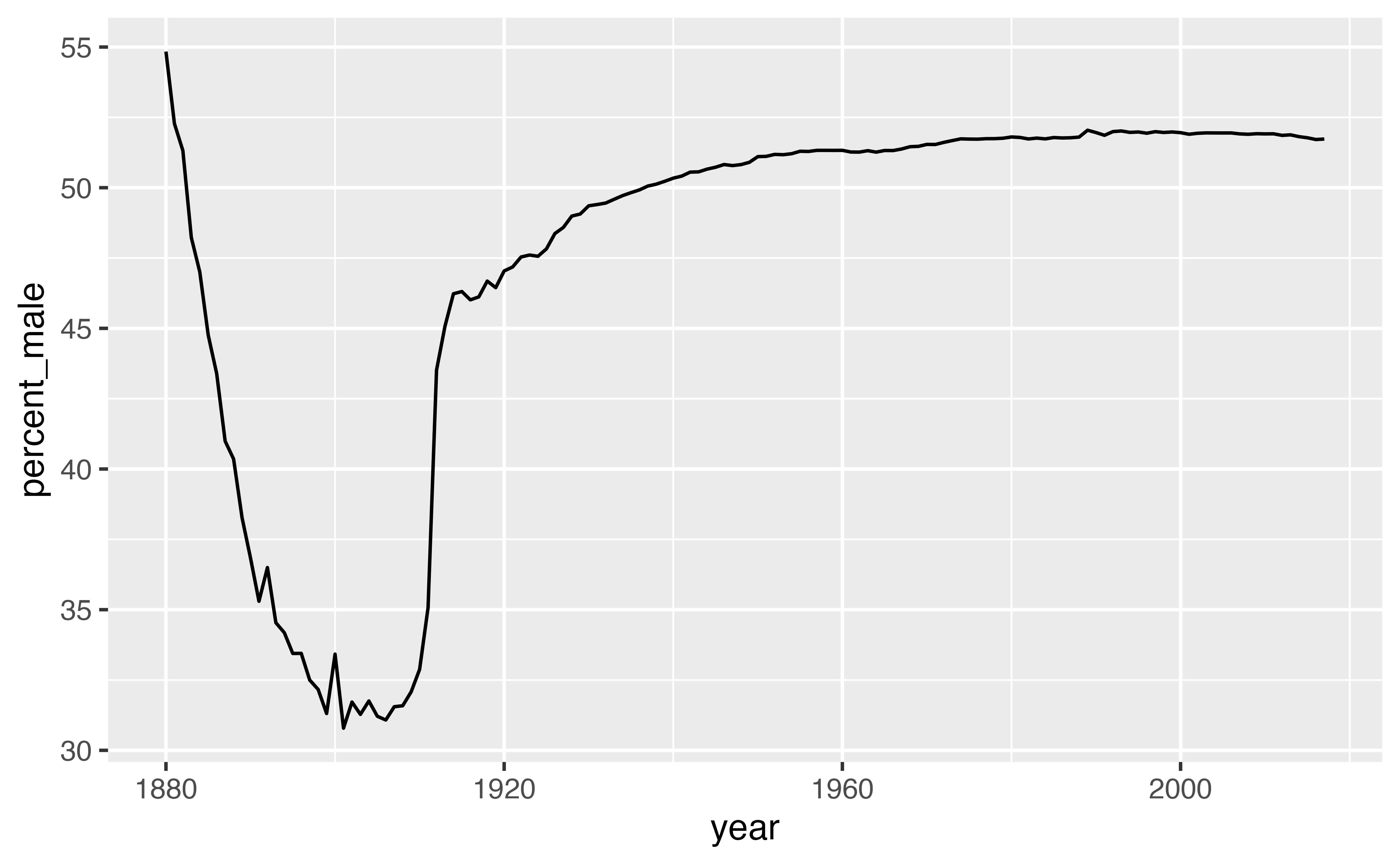
The percent of recorded male births is unusually low between 1880 and 1936. What is happening? One insight is that the data comes from the United States Social Security office, which was only created in 1936. As a result, we can expect the data prior to 1936 to display a survivorship bias.
Recap
Your data will be easier to work with in R if you reshape it into a tidy layout at the start of your analysis. Data is tidy if:
- Each variable is in its own column
- Each observation is in its own row
- Each value is in its own cell
You can use pivot_longer() and pivot_wider(), or some iterative sequence of the two, to reshape your data into any possible configuration that:
- Retains all of the values in your original data set, and
- Retains all of the relationships between values in your original data set.
In particular, you can use these functions to recast your data into a tidy layout.
Food for thought
It is not always clear whether or not a data set is tidy. For example, the version of babynames that was tidy when we wanted to plot total children by year, was no longer tidy when we wanted to compute the ratio of male to female children.
The ambiguity comes from the definition of tidy data. Tidiness depends on the variables in your data set. But what is a variable depends on what you are trying to do.
To identify the variables that you need to work with, describe what you want to do with an equation. Each variable in the equation should correspond to a variable in your data.
So in our first case, we wanted to make a plot with the following mappings (e.g. equations)
\[ \begin{aligned} \text{x} &= \text{year} \\ \text{y} &= \text{total} \\ \text{color} &= \text{sex} \end{aligned} \]
To do this, we needed a dataset that placed \(\text{year}\), \(\text{total}\), and \(\text{sex}\) each in their own columns.
In our second case we wanted to compute \(\text{ratio male}\), where
\[ \text{ratio male} = \frac{\text{total male}}{\text{total female}} \]
This formula has three variables: \(\text{ratio male}\), \(\text{total male}\), and \(\text{total female}\). To create the first variable, we required a dataset that isolated the second and third variables (\(\text{total male}\) and \(\text{total female}\)) in their own columns.