Layers
Add a layer
geom_smooth() becomes much more useful when you combine it with geom_point() to create a scatterplot that contains both:
- raw data
- a trend line
In {ggplot2}, you can add multiple geoms to a plot by adding multiple geom functions to the plot call. For example, the code below creates a plot that contains both points and a smooth line. Imagine what the results will look like in your head, and then run the code to see if you are right.
Good job! You can add as many geom functions as you like to a plot; but, in practice, a plot will become hard to interpret if it contains more than two or three geoms.
geom_label_repel()
Do you remember how the labels that we made early overlapped each other and ran off our graph? The geom_label_repel() geom from the {ggrepel} package mitigates these problems by using an algorithm to arrange labels within a plot. It works best in conjunction with a layer of points that displays the true location of each observation.
Use geom_label_repel() to add a new layer to our plot below. geom_label_repel() requires the same aesthetics as geom_label(): x, y, and label (here set to class).
mpg |>
  group_by(class) |>
  summarise(mean_cty = mean(cty), mean_hwy = mean(hwy)) |>
  ggplot() +
    geom_point(mapping = aes(x = mean_cty, y = mean_hwy)) +
    geom_smooth(mapping = aes(x = mean_cty, y = mean_hwy), method = "lm") +
    geom_label_repel(mapping = aes(x = mean_cty, y = mean_hwy, label = class))
Good job! The {ggrepel} package also provides geom_text_repel(), which is an analogue for geom_text().
Code duplication
If you study the solution for the previous exercise, you’ll notice a fair amount of duplication. We set the same aesthetic mappings in three different places.
mpg |>
  group_by(class) |>
  summarise(mean_cty = mean(cty), mean_hwy = mean(hwy)) |>
  ggplot() +
    geom_point(mapping = aes(x = mean_cty, y = mean_hwy)) +
    geom_smooth(mapping = aes(x = mean_cty, y = mean_hwy), method = "lm") +
    geom_label_repel(mapping = aes(x = mean_cty, y = mean_hwy, label = class))
You should try to avoid duplication whenever you can in code because duplicated code invites typos, is hard to update, and takes longer than needed to write. Thankfully, {ggplot2} provides a way to avoid duplication across multiple layers.
ggplot() mappings
You can set aesthetic mappings in two places within any {ggplot2} call. You can set the mappings inside of a geom function, as we’ve been doing. Or you can set the mappings inside of the ggplot() function like below:
ggplot(data = mpg, mapping = aes(x = displ, y = hwy)) +
  geom_point()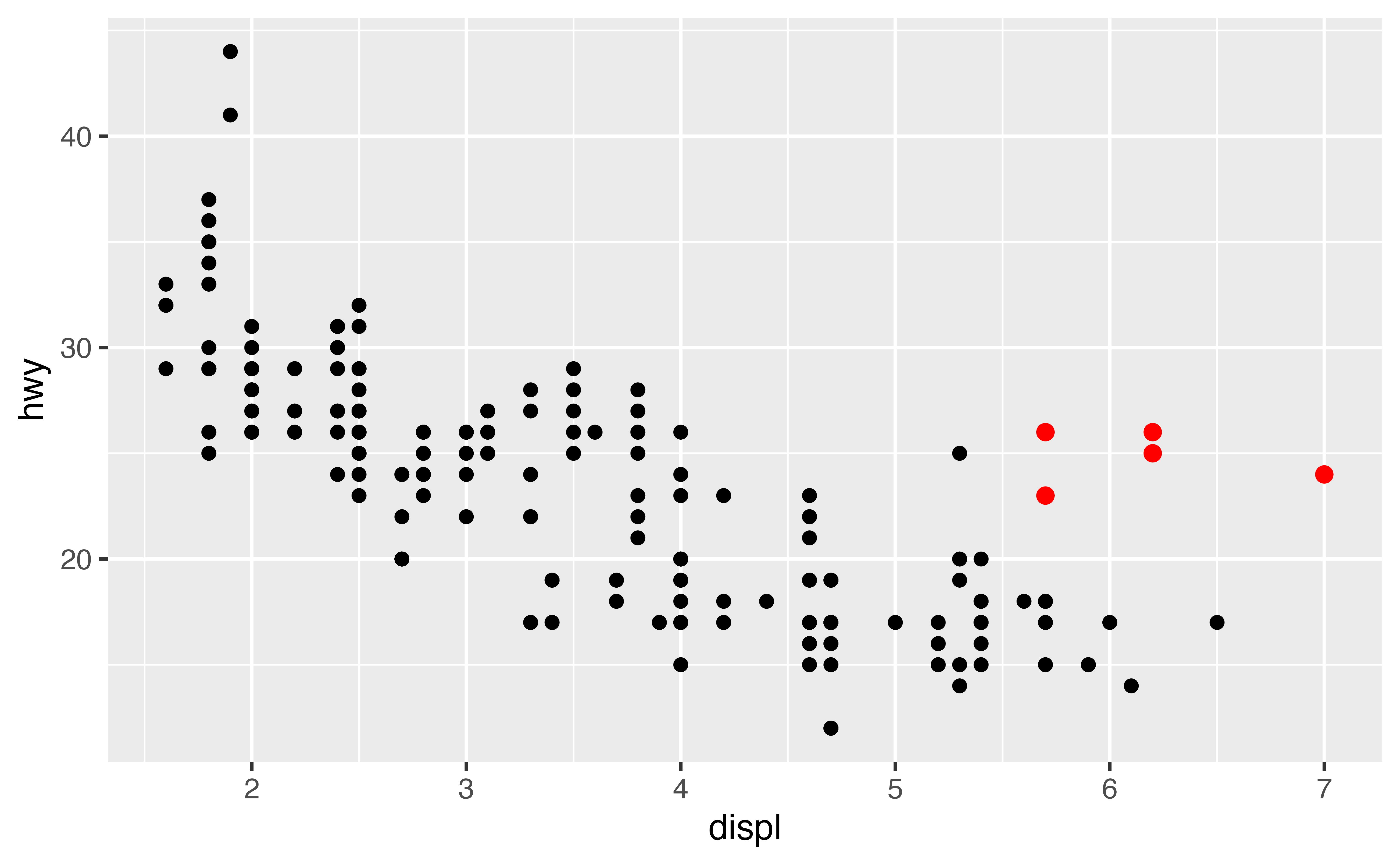
Global vs. local mappings
{ggplot2} will treat any mappings set in the ggplot() function as global mappings. Each layer in the plot will inherit and use these mappings.
{ggplot2} will treat any mappings set in a geom function as local mappings. Only the local layer will use these mappings. The mappings will override the global mappings if the two conflict, or add to them if they do not.
This system creates an efficient way to write plot calls:
ggplot(data = mpg, mapping = aes(x = displ, y = hwy)) +
  geom_point() +
  geom_smooth(mapping = aes(color = class), se = FALSE)
Exercise 2
Reduce duplication in the code below by moving as many local mappings into the global mappings as possible. Rerun the new code to ensure that it creates the same plot.
mpg |>
  group_by(class) |>
  summarise(mean_cty = mean(cty), mean_hwy = mean(hwy)) |>
  ggplot(mapping = aes(x = mean_cty, y = mean_hwy)) +
    geom_point() +
    geom_smooth(method = "lm") +
    geom_label_repel(mapping = aes(label = class))
Good job! Remember that not every mapping should be a global mapping. Here, only geom_label_repel() uses the label aesthetic. Hence, it should remain a local aesthetic to avoid unintended side effects, warnings, or errors.
Exercise 3: Global vs. Local
Recreate the plot below in the most efficient way possible.
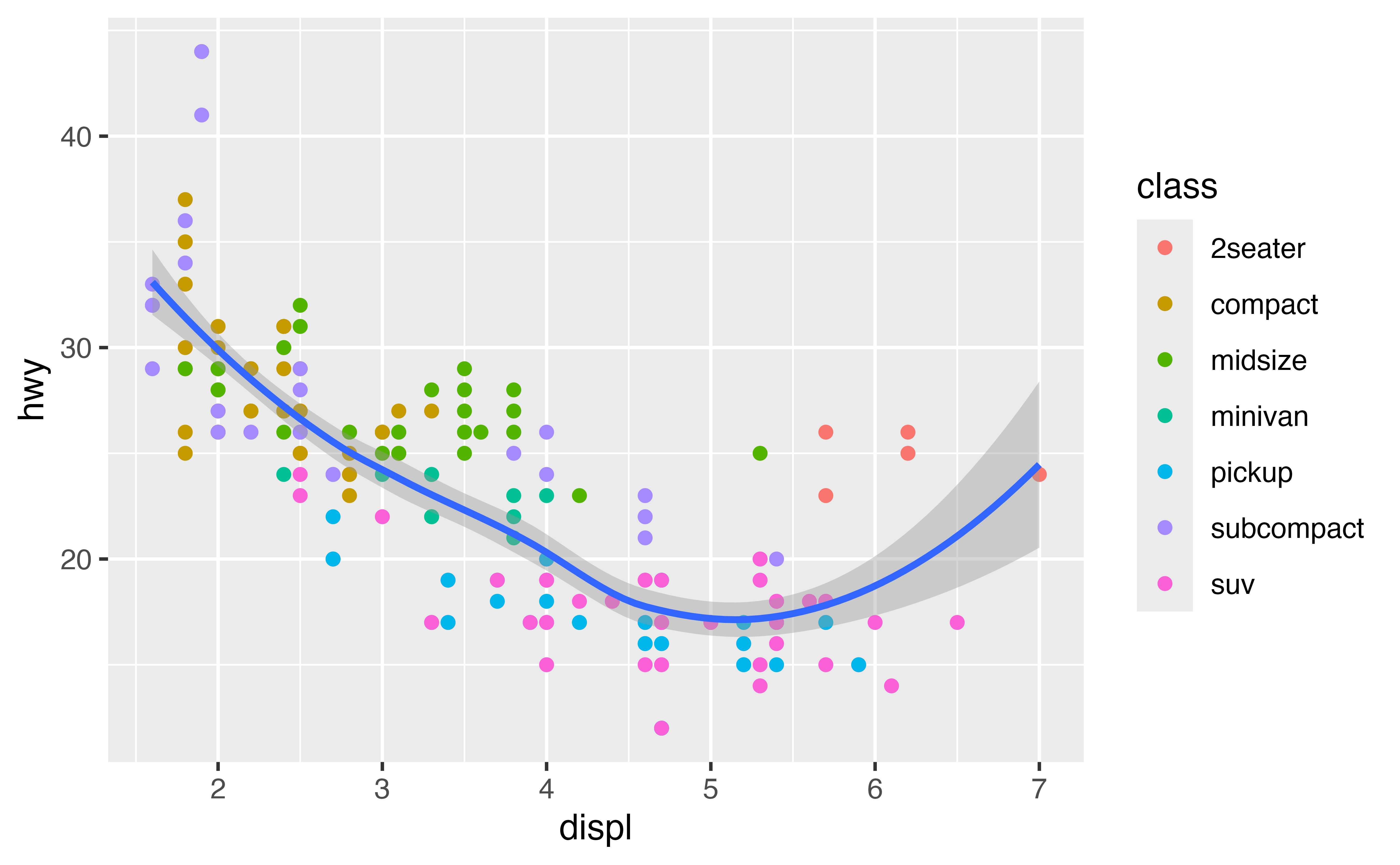
ggplot(data = mpg, mapping = aes(x = displ, y = hwy)) +
  geom_point(mapping = aes(color = class)) +
  geom_smooth()
Good job!
Global vs. local data
The data argument also follows a global vs. local system. If you set the data argument of a geom function, the geom will use the data you supply instead of the data contained in ggplot(). This is a convenient way to highlight groups of points.
Use data arguments to recreate the plot below. I’ve started the code for you.

mpg2 <- filter(mpg, class == "2seater")

ggplot(data = mpg, mapping = aes(x = displ, y = hwy)) +
  geom_point() +
  geom_point(data = mpg2, color = "red", size = 2)
Good job!
Exercise 4: Global vs. local data
Use data arguments to recreate the plot below.
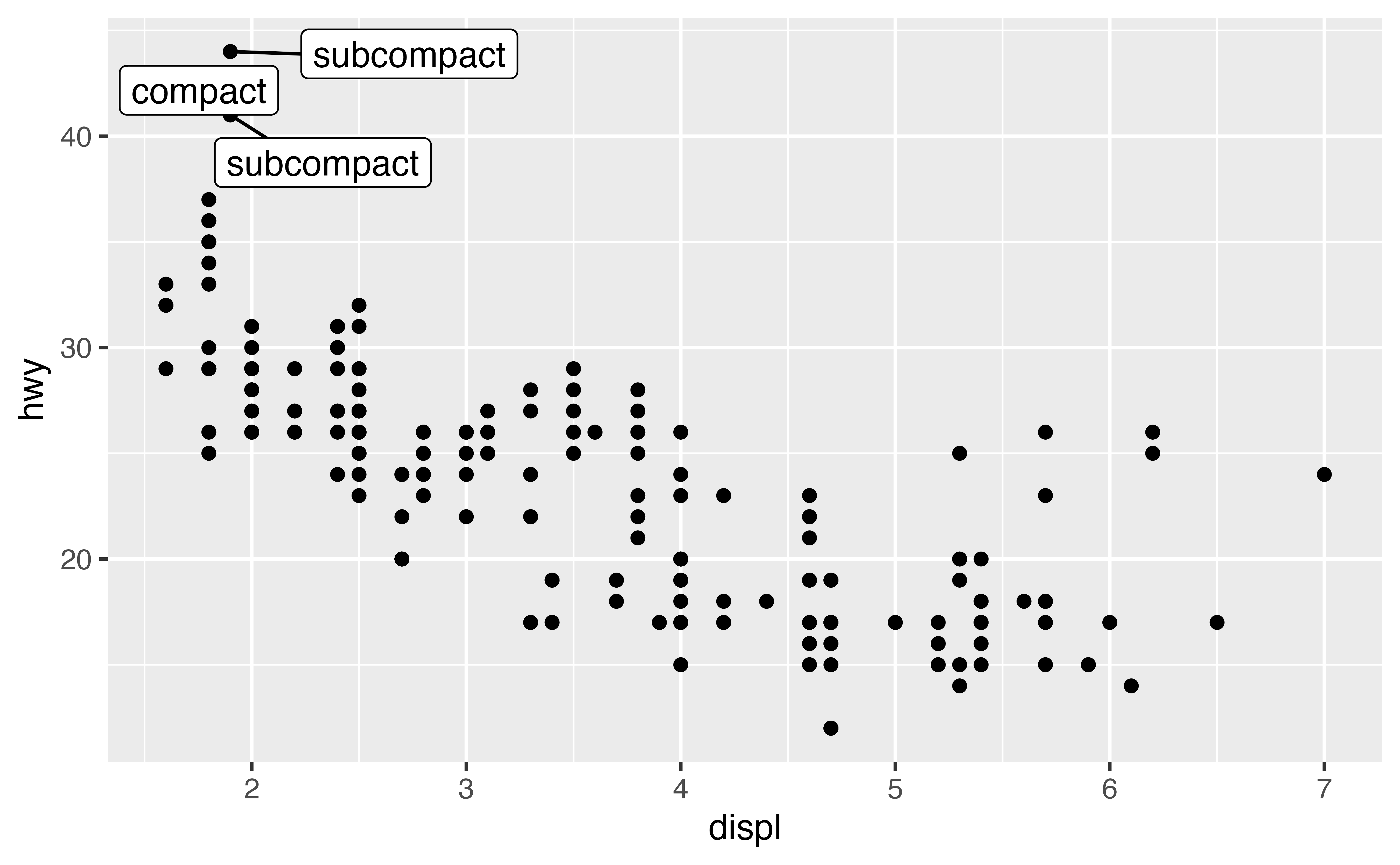
mpg3 <- filter(mpg, hwy > 40)

ggplot(data = mpg, mapping = aes(x = displ, y = hwy)) +
  geom_point() +
  geom_label_repel(data = mpg3, mapping = aes(label = class))
Good job!
last_plot()
When exploring data, you’ll often make a plot and then think of a way to improve it. Instead of starting from scratch or copying and pasting your code, you can use {ggplot2}’s last_plot() function. last_plot() returns the most recent plot call, which makes it easy to build up a plot one layer at a time.
ggplot(data = mpg, mapping = aes(x = displ, y = hwy)) +
  geom_point()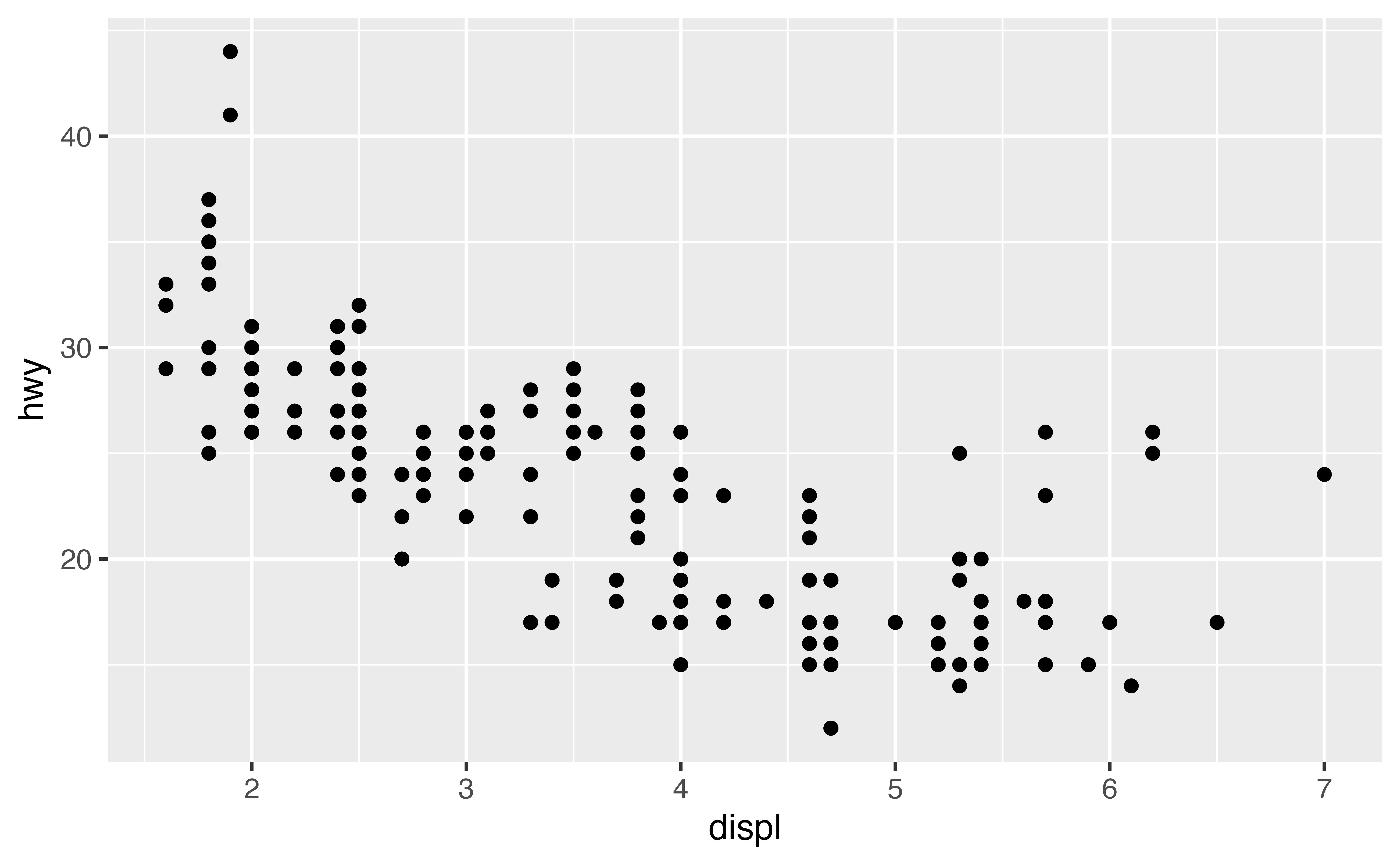
last_plot() +
  geom_smooth()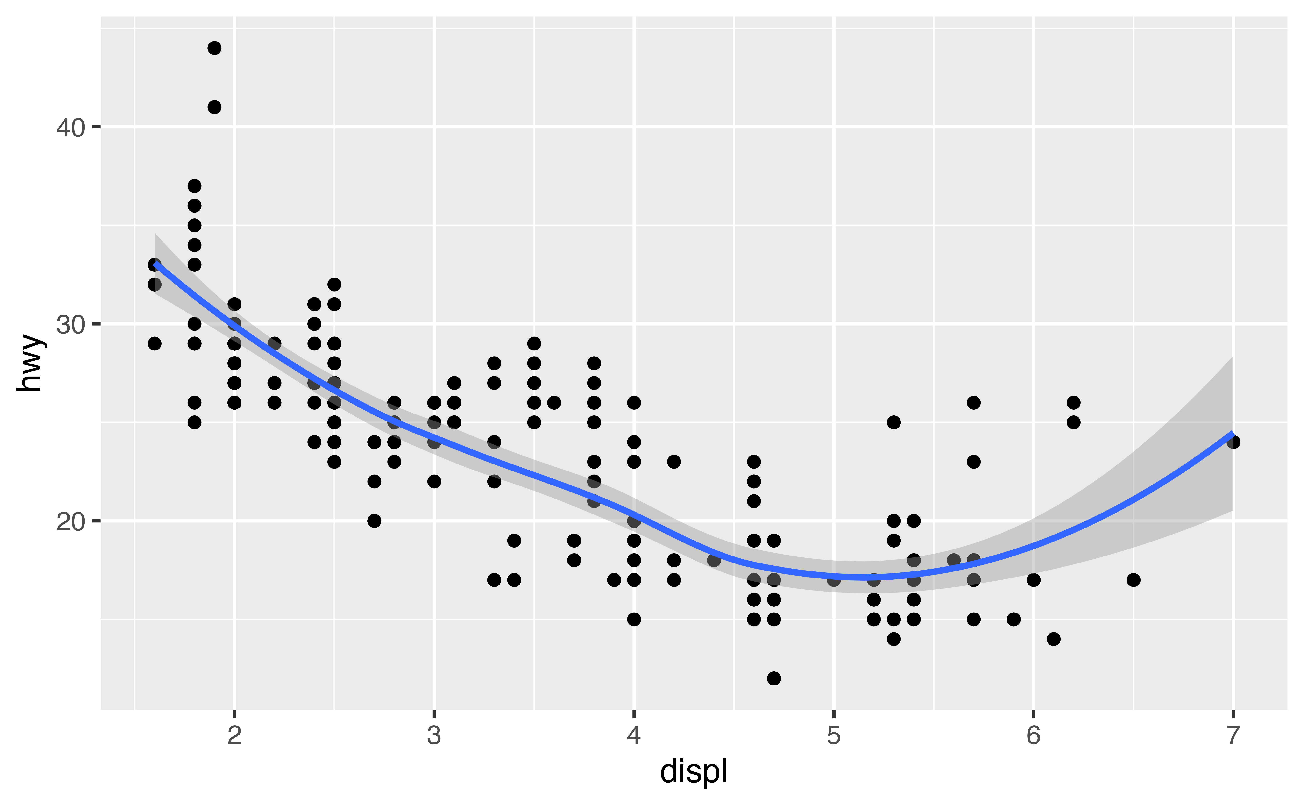
last_plot() +
  geom_smooth(method = "lm", color = "purple")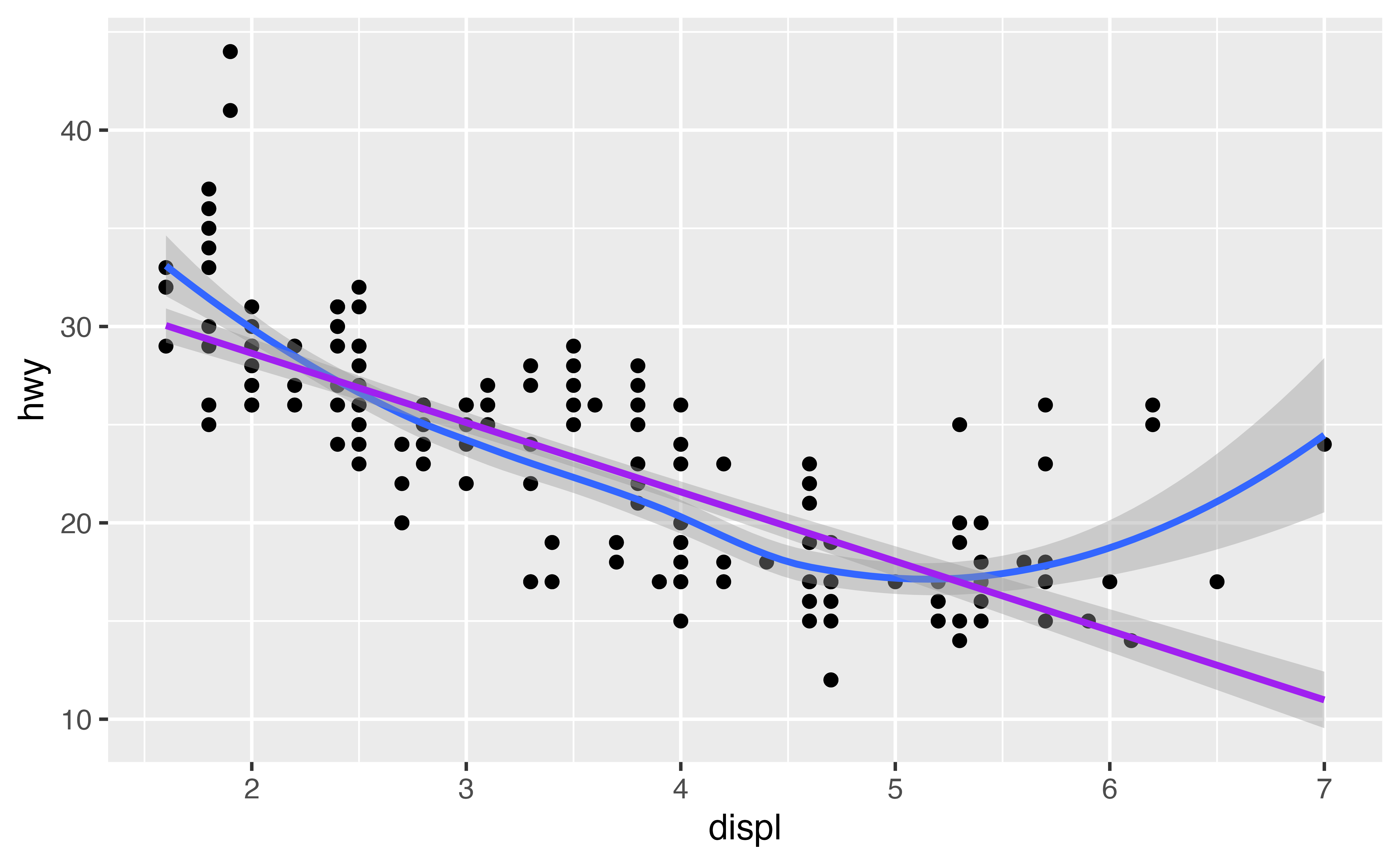
Saving plots
If you’d like to work with a plot later, you can save it to an R object. Later you can display the plot or add to it, as if you were using last_plot().
p <- ggplot(data = mpg) +
  geom_point(mapping = aes(x = cty, y = hwy))
Notice that {ggplot2} will not display a plot when you save it. It waits until you call the saved object.
p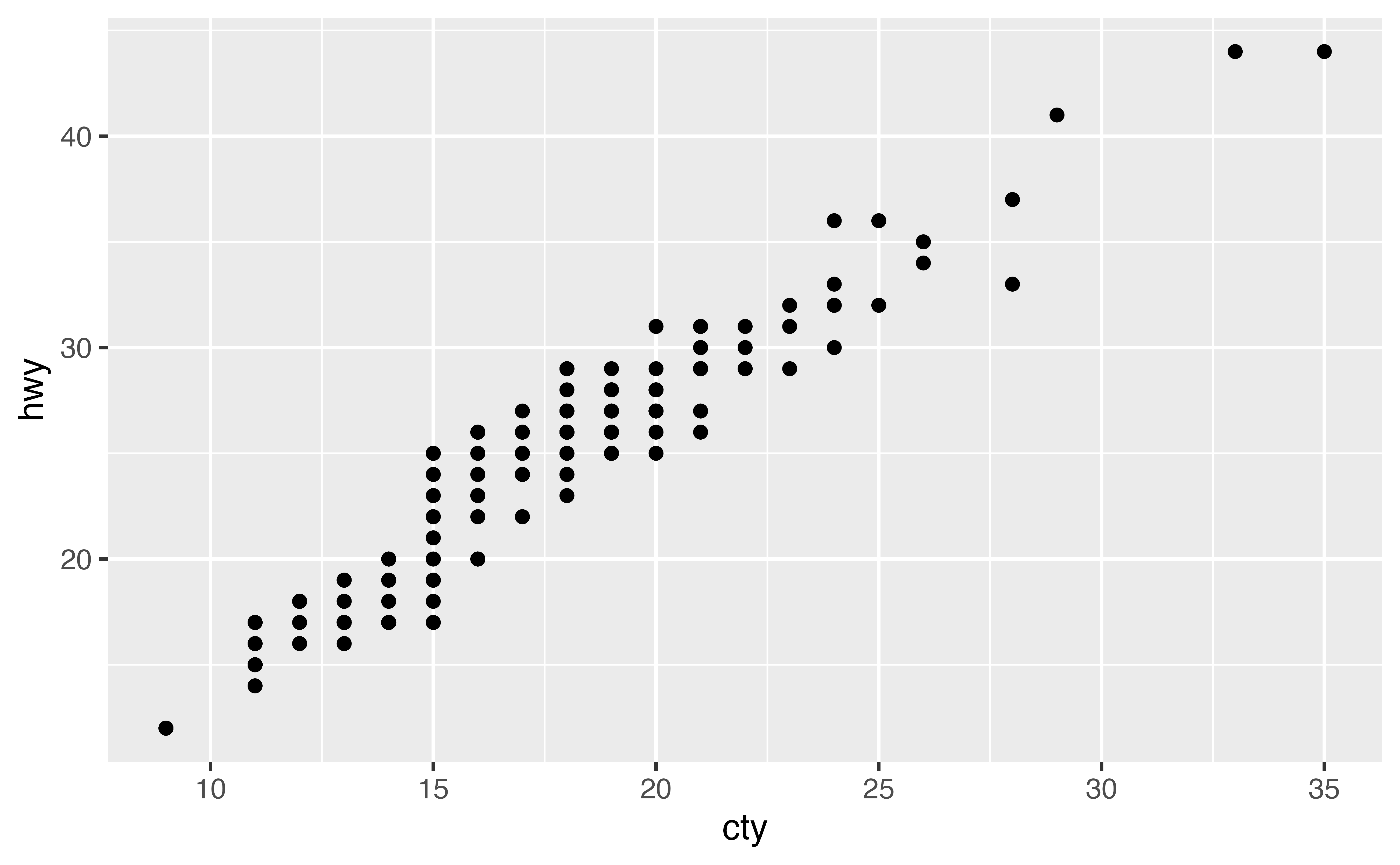
geom_rug()
geom_rug() adds another type of summary to a plot. It uses displays the one dimensional marginal distributions of each variable in the scatterplot. These appear as collections of tickmarks along the \(x\) and \(y\) axes.
In the chunk below, use the faithful dataset to create a scatterplot that has the waiting variable on the \(x\) axis and the eruptions variable on the \(y\) axis. Use geom_rug() to add a rug plot to the scatterplot. Like geom_point(), geom_rug() requires x and y aesthetic mappings.
ggplot(data = faithful, mapping = aes(x = waiting, y = eruptions)) +
  geom_point() +
  geom_rug()
Good job! Pass geom_rug() the parameter sides = "l" to limit the rug plot to just the left-hand axis (y) or sides = "b" to limit the rug plot to just the bottom axis (x).
geom_jitter()
geom_jitter() plots a scatterplot and then adds a small amount of random noise to each point in the plot. It is a shortcut for adding a “jitter” position adjustment to a points plot (i.e, geom_point(position = "jitter")).
Why would you use geom_jitter()? Jittering provides a simple way to inspect patterns that occur in heavily gridded or overlapping data. To see what I mean, replace geom_point() with geom_jitter() in the plot below.
ggplot(data = mpg) +
  geom_jitter(mapping = aes(x = class, y = hwy))
Good job! You can also jitter in only a single direction. To turn off jittering in the x direction set width = 0 in geom_jitter(). To turn off jittering in the y direction, set height = 0.
Jittering and boxplots
geom_jitter() provides a convenient way to overlay raw data on boxplots, which display summary information.
Use the chunk below to create a boxplot of the previous graph. Arrange for the outliers to have an alpha of 0, which will make them completely transparent. Then add a layer of points that are jittered in \(y\) direction, but not the \(x\) direction.
ggplot(data = mpg, mapping = aes(x = class, y = hwy)) +
  geom_boxplot(outlier.alpha = 0) +
  geom_jitter(width = 0)
Good job! If you like, you can make the boxplots more visible by setting the alpha parameter of geom_jitter() to a low number, e.g. geom_jitter(mapping = aes(x = class, y = hwy), width = 0, alpha = 0.5)