ggplot(data = diamonds) +
  geom_bar(mapping = aes(x = cut, fill = clarity))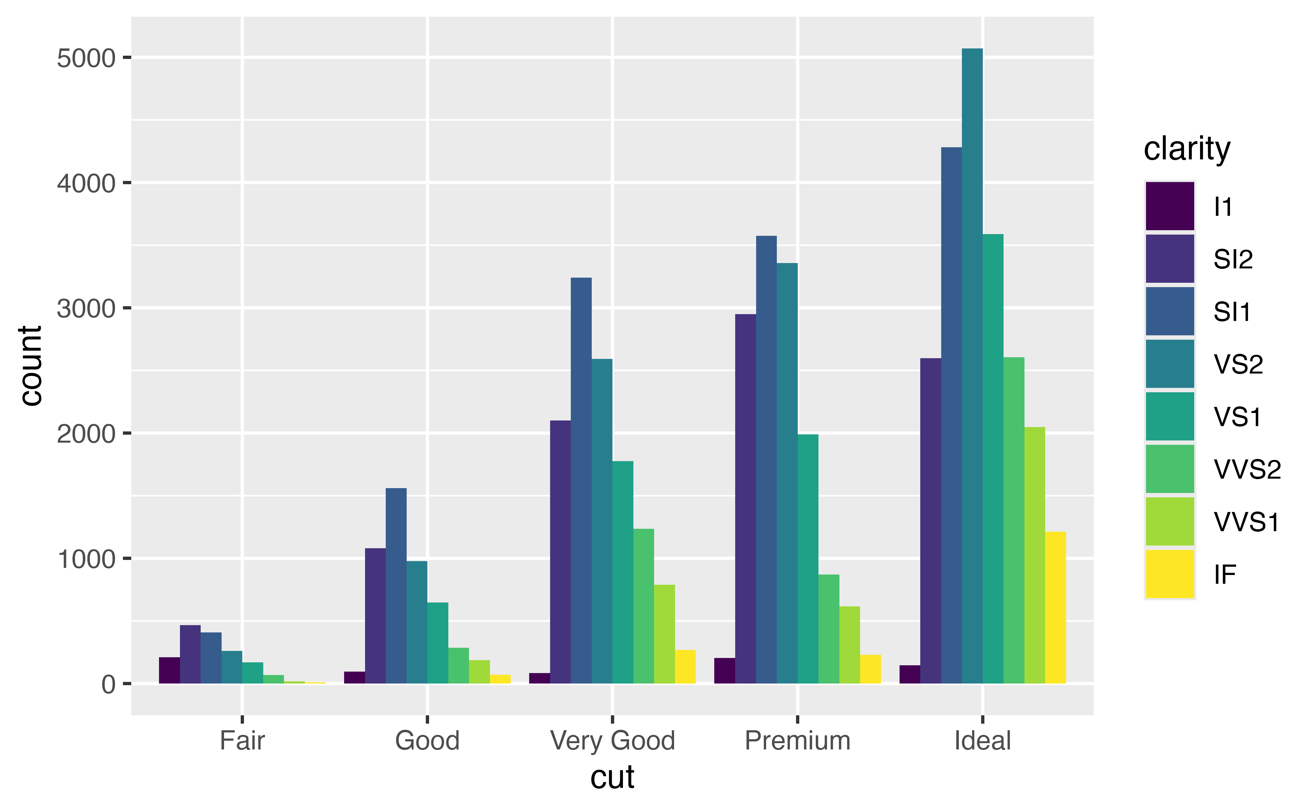
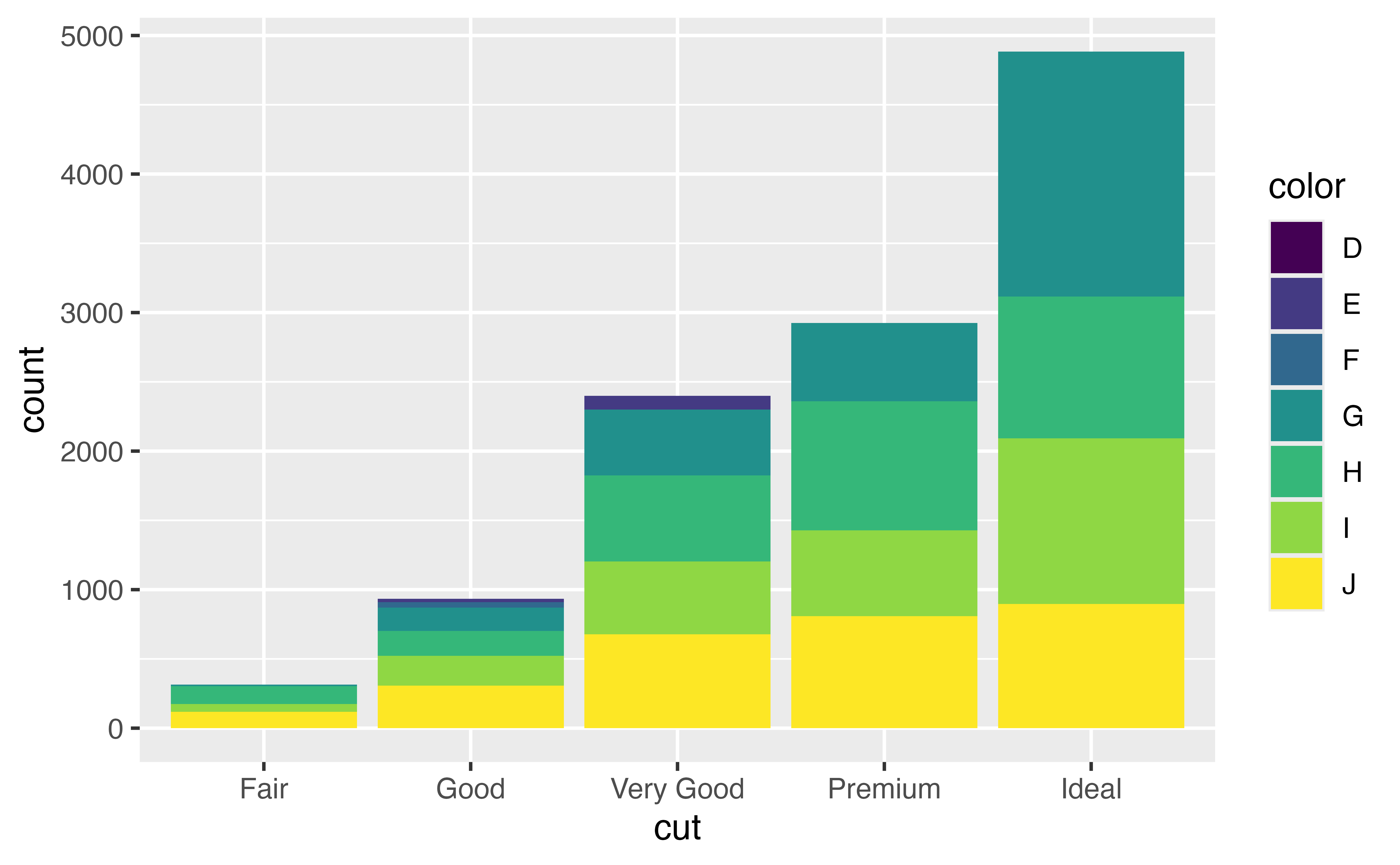
If you map fill to a new variable, geom_bar() will display a stacked bar chart:
ggplot(data = diamonds) +
geom_bar(mapping = aes(x = cut, fill = clarity))
This plot displays 40 different combinations of cut and clarity, each displayed by its own rectangle. geom_bar() lays out the rectangles by stacking rectangles that have the same cut value on top of one another. You can change this behavior with a position adjustment.
position = "dodge"To place rectangles that have the same cut value beside each other, set position = "dodge".
ggplot(data = diamonds) +
  geom_bar(mapping = aes(x = cut, fill = clarity), position = "dodge")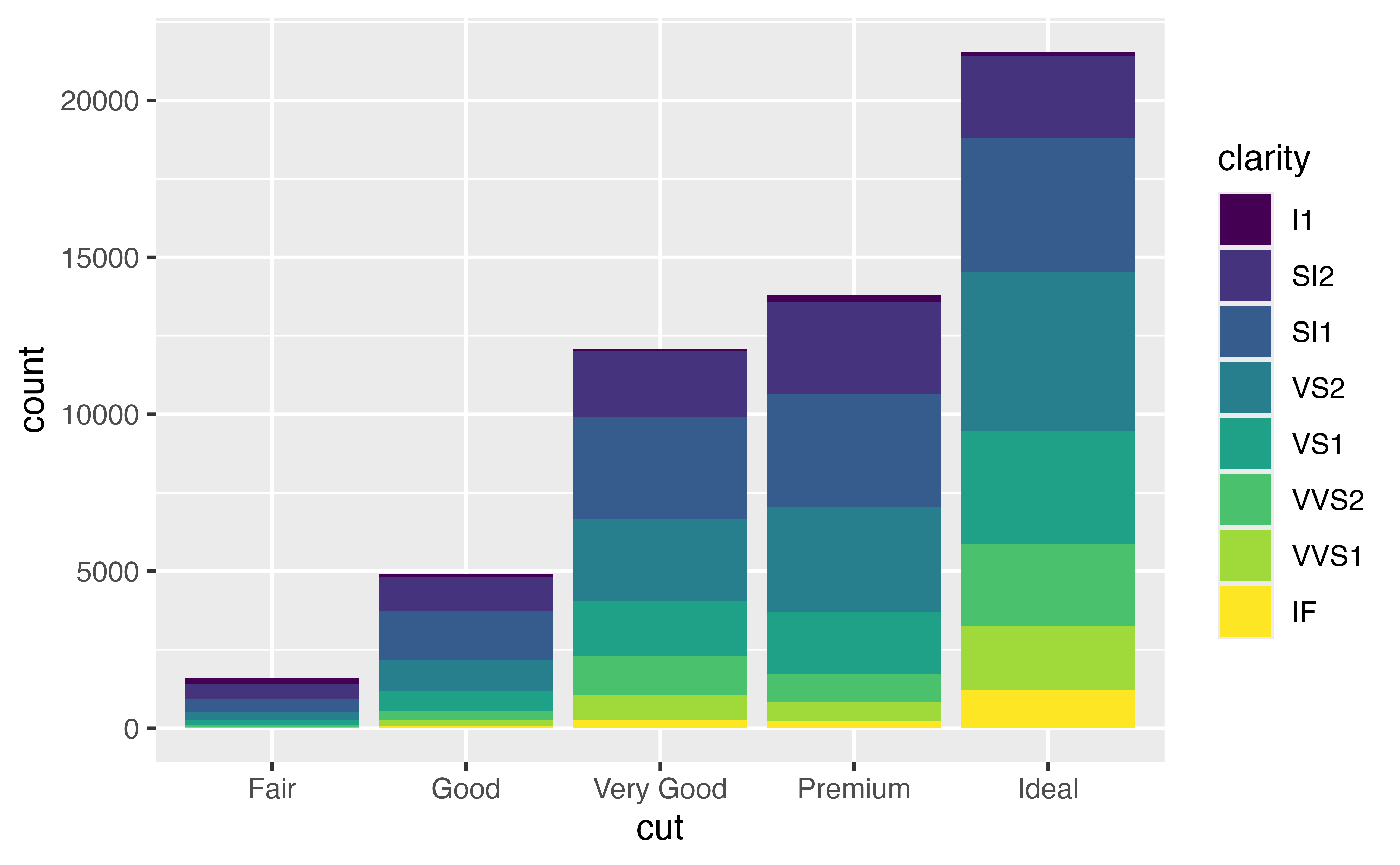
This plot shows the same rectangles as the previous chart; however, it lays out rectangles that have the same cut value beside each other.
position = "stack"To create the familiar stacked bar chart, set position = "stack" (which is the default for geom_bar()).
ggplot(data = diamonds) +
  geom_bar(mapping = aes(x = cut, fill = clarity), position = "stack")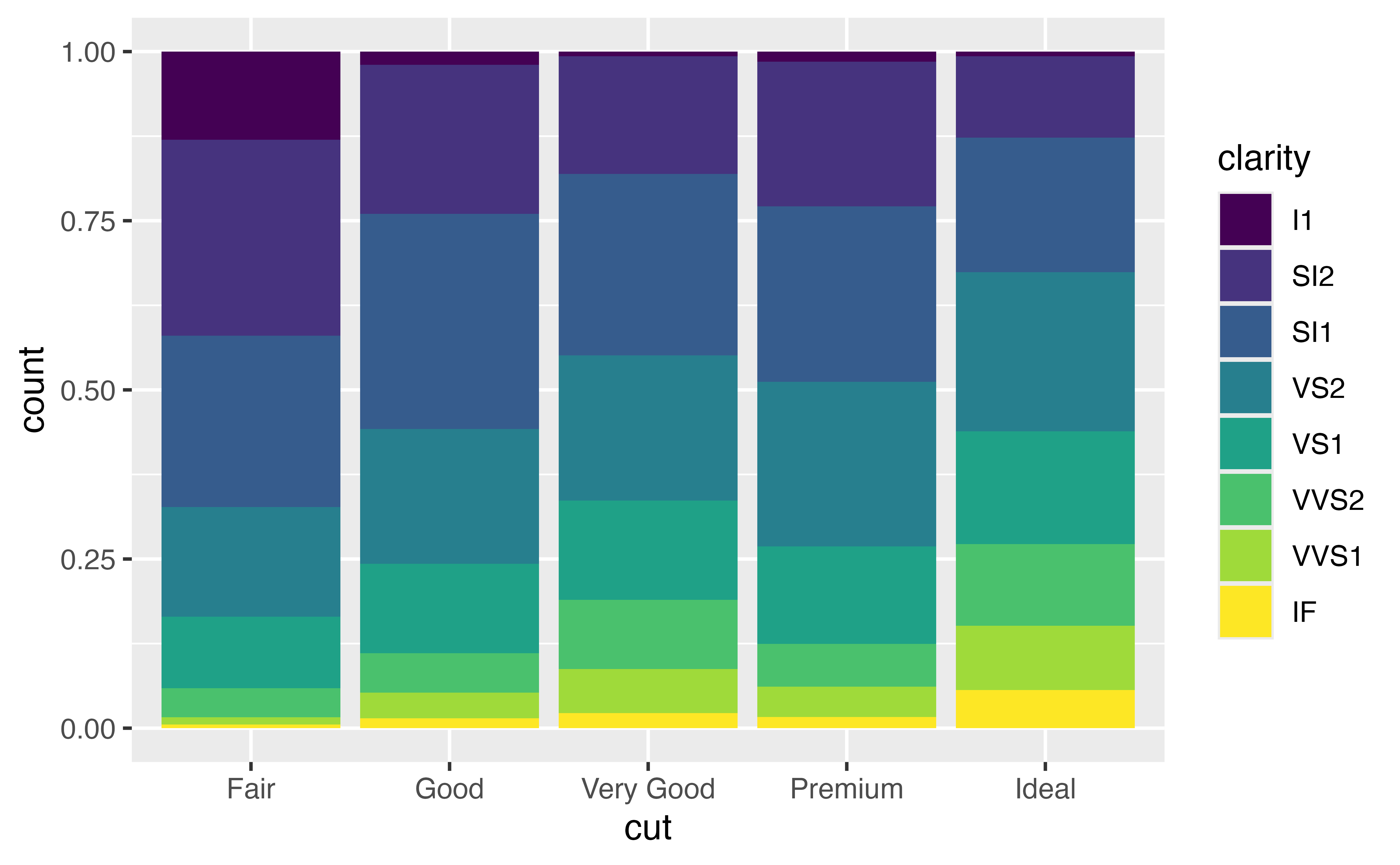
position="fill"To expand each bar to take up the entire \(y\) axis, set position = "fill". {ggplot2} will stack the rectangles and then scale them within each bar.
ggplot(data = diamonds) +
  geom_bar(mapping = aes(x = cut, fill = clarity), position = "fill")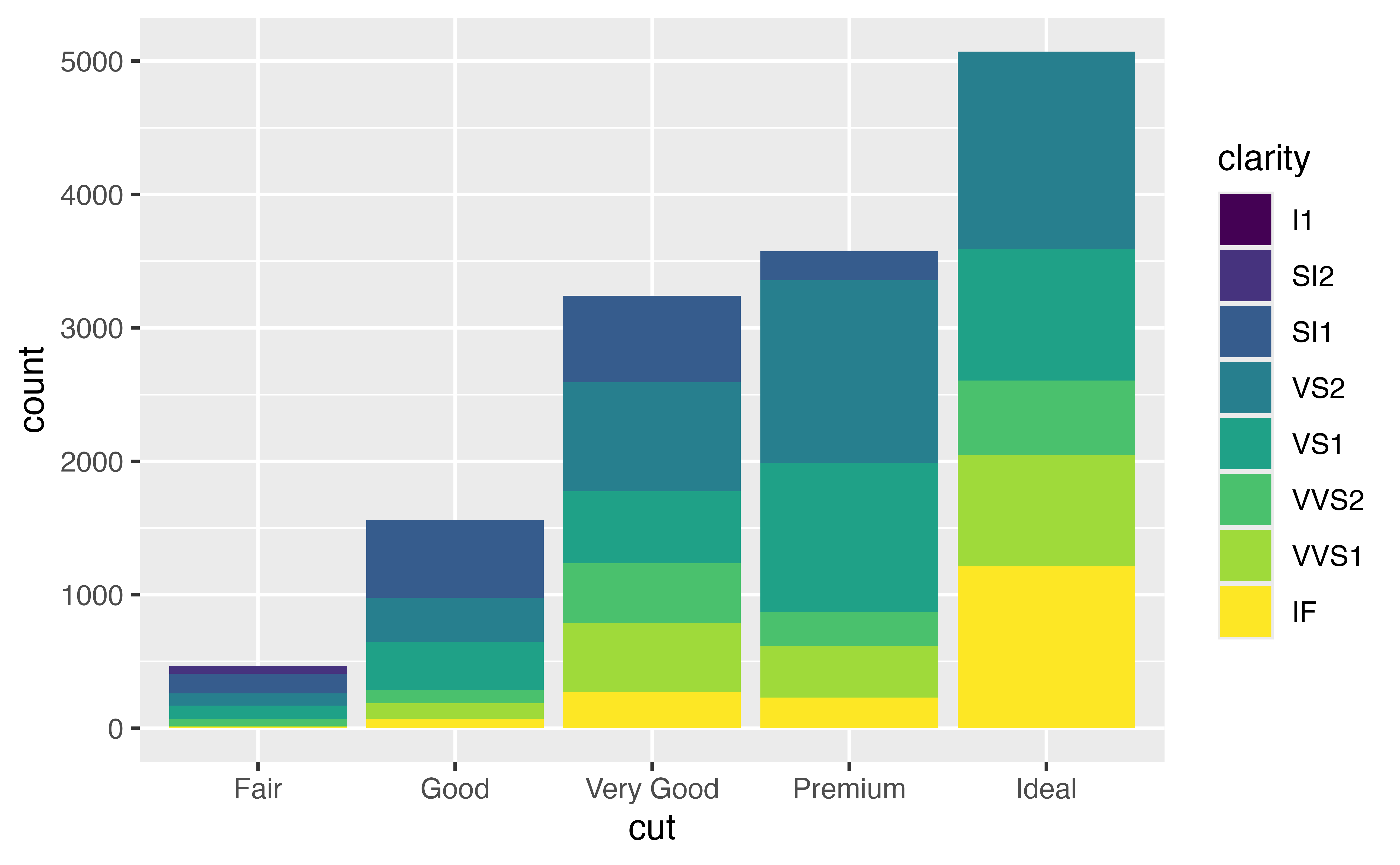
This makes it easy to compare proportions. For example, you can scan across the bars to see how the proportion of IF diamonds changes from cut to cut.
Every geom function in ggplot2 takes a position argument that is preset to a reasonable default. You can use position to determine how a geom should adjust objects that would otherwise overlap with each other.
For example, in our plot, each value of cut is associated with eight rectangles: one each for I1, SI2, SI1, VS2, VS1, VVS2, VVS1, and IF. Each of these eight rectangles deserves to go in the same place: directly above the value of cut that it is associated with, with the bottom of the rectangle placed at count = 0. But if we plotted the plot like that, the rectangles would overlap each other.
Here’s what that would look like if you could peek around the side of the graph.
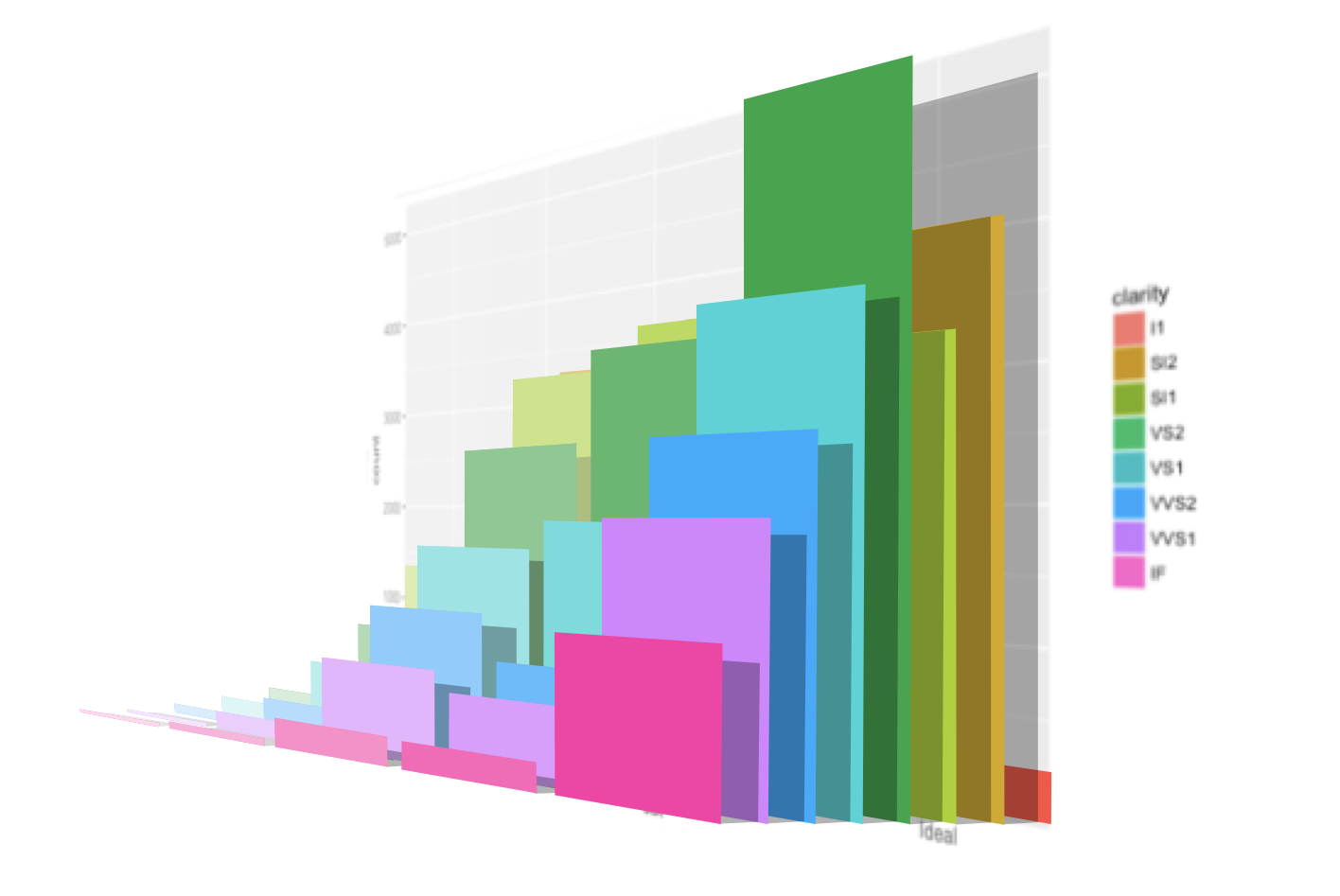
position = "identity"…and here’s what that would look like if you could see the graph from the front. You can make this plot by setting position = "identity".
ggplot(data = diamonds) +
  geom_bar(mapping = aes(x = cut, fill = clarity), position = "identity")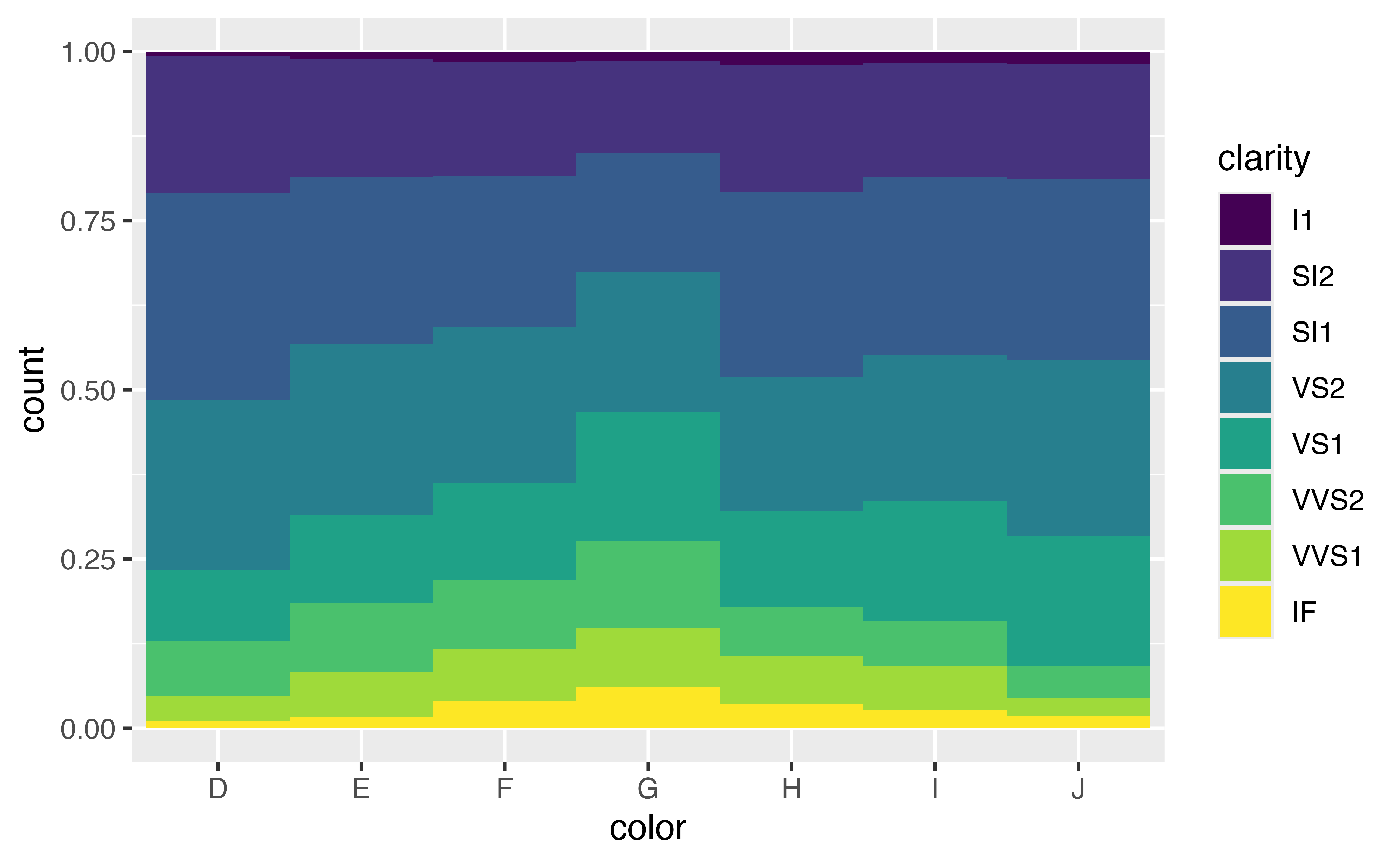
Position adjustments tell {ggplot2} how to re-distribute objects when they overlap. position = "identity" is the “adjustment” that lets objects overlap each other. It is a bad choice for bar graphs because the result looks like a stacked bar chart, even though it is not.
Use the code chunk to recreate the plot you see below. Remember: color is the name of a variable in diamonds (not to be confused with an aesthetic).
ggplot(data = diamonds) +
geom_bar(mapping = aes(x = color, fill = clarity), position = "fill", width = 1)Use the code chunk to recreate the plot you see below. Remember: color is the name of a variable in diamonds (not to be confused with an aesthetic).

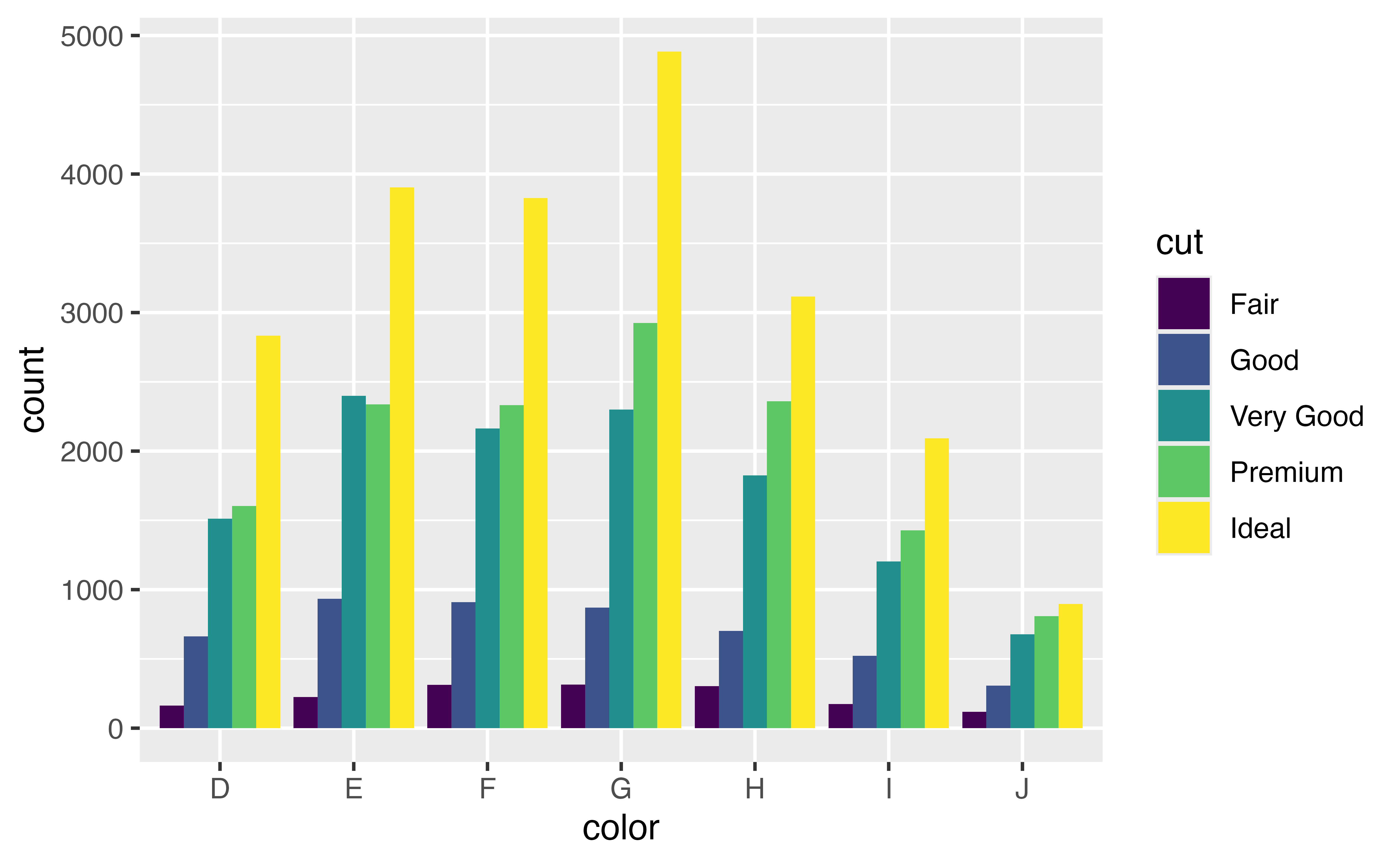
ggplot(data = diamonds) +
geom_bar(mapping = aes(x = color, fill = cut), position = "dodge")position = "identity"